Feature: Graphic design

Reputations: Irma Boom
‘I compare my work to architecture. I don’t build villas, I build social housing. The books are industrially made and they need to be made very well. I am all for industrial production. I hate one-offs. On one book you can do anything, but if you do a print run, that is a challenge. It’s never art. Never, never, never.’
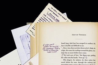
To have and to hold
The challenges of digital publishing have galvanised a new spirit in book design and production. Is it just the decadent flourish of a disappearing format?
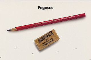
Powered flight
For fifteen years, Pegasus, an international biannual corporate magazine designed by Derek Birdsall, led a charmed life.

Another frame for the news
The redesign of RTL Nieuws makes a radical break with the conventions of television news graphics, crossing the now fluid boundaries between broadcast and online.
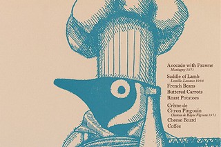
In the right place
In this extract from his book, Gerald Cinamon explains how he brought integrated book design to Penguin – first at his kitchen table in the 1960s; later as chief designer

An Atlas of Typeforms
As a sidebar to ‘Quiet man of letters’, Simon Esterson talks about his early encounters with this celebrated book by Alan Bartram and James Sutton
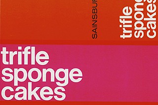
Sans serifs in suburbia
Sainsbury’s brought 1960s Modernism to the kitchen cupboard
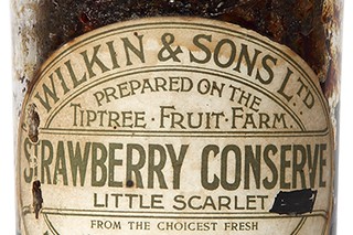
Identity preserved
The labels for Tiptree jams stand out by staying the same
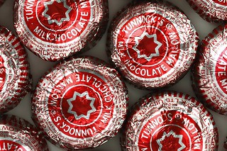
Sticky business
The dead-wrapped Tunnock’s Tea Cake is both hipster treat and Scottish design classic
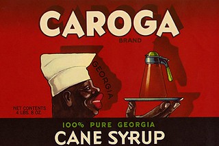
Leftovers with a bad taste
In the past century the use of ‘trade characters’ built brand loyalty while reinforcing stereotypes
