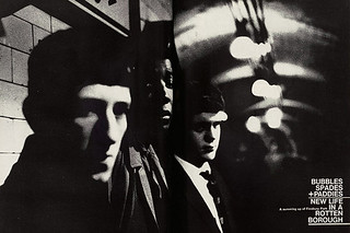
Feature: Magazines
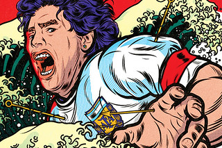
Serious goals
Art director Robert Priest turned editor to make Eight by Eight, an ambitious football title based in Brooklyn

Reputations: Gail Bichler
‘Our content is hard to come by. You are designing in real time about world events. The freedom we have in service of these articles is a special opportunity.’
The adverts
Adverts mark the difference between a journal and a magazine, claims Jane Grylls

The colophon
This is the page whose small gestures reveal who’s who, says John Morgan

The reviews
Evaluations by ‘trusted third parties’ are a mag staple, says John L. Walters
The features
A feature should have a spring in its step and a gleam in its eye, says Tim de Lisle
The front matter
This ‘bitty section’ requires a jigsaw of design and writing skills, says Vici MacDonald
The contents
An unglamorous page, true, but it’s also a clever multi-tasker, says Mark Porter

The cover
Great magazine covers are built on a sense of fearlessness, says Ian Birch

