
Feature: Typography

Street life
Bremen’s street magazine Die Zeitschrift der Strasse is a social project that benefits its student publishers as much as its homeless vendors. By Nick Kapica
Free for all
In designing the Ubuntu type family, Dalton Maag had to produce faces for print and screen in thirteen styles and numerous non-Latin languages – all under scrutiny from an online audience of millions. By John Ridpath

Character studies
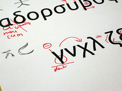
Michael Johnson’s project to make a ‘phonetic typeface’ that English speakers can understand

Allan Fleming: The man who branded a nation
At a pivotal moment in Canada’s history, Allan Fleming’s typographic designs for stamps, books, advertisements, logos and big civic projects shaped the look of the country, leaving a vital legacy
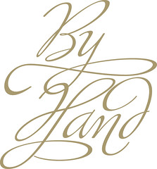
Different strokes
Sensitive details and technological ingenuity make Alejandro Paul’s script typeface designs both highly regarded and hugely popular
Pichação [EXTRACT]
The architecture of São Paulo, Brazil, is covered by a unique form of calligraphic graffiti
Typostalgie
Nostalgia for Germany’s old East has led to renewed interest in certain pre-1989 typefaces
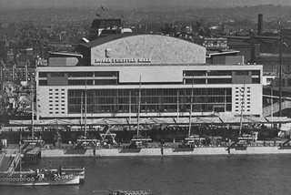
South Bank show
The Royal Festival hall has regained the thoroughly English lettering of its origins in the Festival of Britain – on one side only
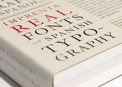
Memory of books
An elaborate, tactile catalogue – and a digital typeface – pay tribute to a golden age of Spanish typography.