
Feature: Typography
Set the letters free
Australian artist Rosalie Gascoigne turned discarded packaging type into ‘stammering concrete poetry’
Legible in public space
Whether as labelling, wayfinding or mere decoration, letters bring function and form to the built environment. By John D. Berry
Willem Sandberg: Warm printing
The Dutch pioneer’s catalogues for the Stedelijk show a tactile use of sensual materials and experimental typography
Reputations: George Lois
‘You can’t research a big idea. The only ideas that truly research well are mediocre ideas. In research, great ideas are always suspect.’
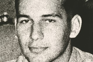
Malcolm, Peter … and Keith
The British New Wave was born at a boys’ school near Manchester
Pouchee’s lost alphabets
Ornament is no longer a crime and there is a
growing enthusiasm for decorative display.
Few contempory display alphabets equal those of Louis John Pouchée for vivacity and invention
Art and art direction (text in full)
imply two separate worlds, yet artists who use text employ the techniques of graphic design. And so for the pharmaceutical type pastiches in \'The Last Supper\', a series of screenprints, Damien Hirst employed designer Jon Barnbrook.
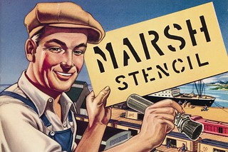
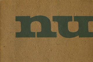
Marked by time
Two catalogues reveal much about stencil-making in Germany and the US in the mid-twentieth century, while offering clues to the industry's future in the decades following their publication.
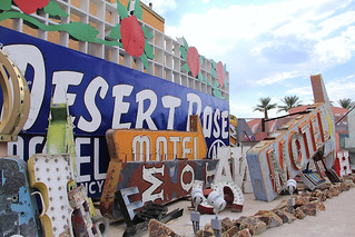
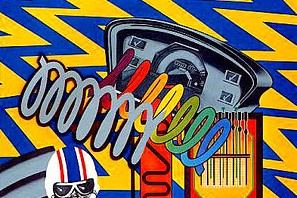
Las Vegas tangle
A junkyard is home to the stylish chaos and discarded carcasses of a golden age of signage
Penguin crime
Romek Marber’s 1960s paperback identity is a landmark of independent British design