
Feature: Visual culture
Normcore inferno
As brand mania reaches new heights the new logotypes of luxury brands become ever more remarkable in their blandness
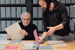
They made Canada
Working against the clock, with virtually no budget, Greg Durrell made a design documentary that shows how European immigrants created Canada’s visual identity

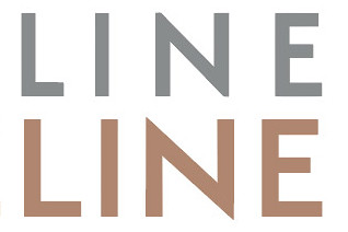
Return to the square
A chance discovery by some builders led to the adaptation and expansion of a 1930s alphabet by one of Switzerland’s foremost designers

Strategy of excess
Like a human algorithm, Hansje van Halem explores a huge number of variables until she finds the right ‘recipe’ for each project
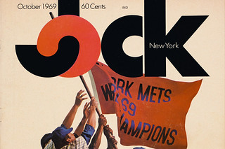
Lovable loser
A daring approach to sports journalism earned the short-lived Jock magazine a place in design history
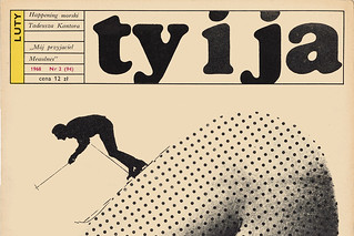
Pulling back the curtain
Published by the Communist Women’s League, Ty i Ja [You and I] was an ambitious 1960s title that brought the outside world to its Polish readers
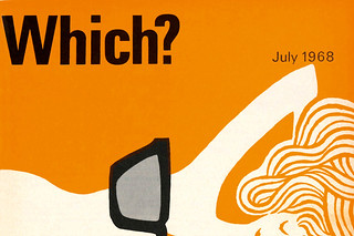
Two-colour haikus
Banks & Miles art directed Which? magazine, the Consumers’ Association’s flagship title and its covers. John Miles talks to Paul Harpin
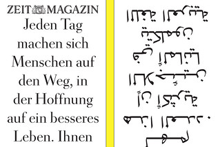
Double vision
Fast-paced, emotional, competitive, surprising – Germany’s ZEITmagazin is a print title for the digital age
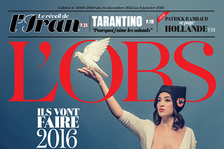
Liberté, égalité, typography
Serge Ricco, creative director of l’Obs, has shown this word-driven, left-wing French weekly the power of expressive type and images

Reputations: David Driver
‘That was the buzz one got about publishing. What do people want? Where are the gaps in the market? You wanted it to push boundaries … give people information that they never possessed before.’ Interview by Martin Colyer