Feature

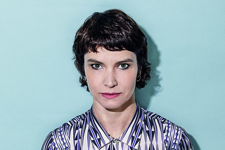
Elaine Ramos: The book designer
‘We overdose on communication, but “beautiful” design circulates only between the culturally literate.’

Milton Glaser: Design eminence
‘Buttons, flyers, posters, postcards, T-shirts and books. How primitive are the means we have to dissent. And yet I believe these modest tools can help change history.’

Françoise Mouly: The illustrator’s art editor
‘The covers are meant to capture the moment, but we want them to make sense next week, next decade, in a hundred years!’

Jessica Walsh: The influencer
‘We can’t be like artists, who can stick to one style and never adapt what they do based on what’s going on in the world. This doesn’t bother me, it excites me.’ [EXTRACT]

Moross: The hands-on boss
‘We work in the entertainment world where there are always a lot of time pressures. It’s a priority to manage stress and make sure people are fulfilled.’

Michael Bierut: The designer’s designer
‘Online, everything arrives with equal weight … everything can have a logo, everything can have an identity, everyone can do it in an untutored way.’

Bobby C. Martin Jr: Design Champion
‘We’ve come so far we’re not stopping now. Design has infused every part of our lives because of designers pushing to have a seat at the table.’

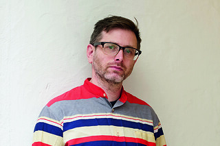
Fraser Muggeridge: The improviser
‘The role of printed matter has shifted from what it communicates literally to what it communicates subconsciously.’

Unity and justice and …
Jason Grant, of Brisbane’s Inkahoots, explains why he brought his New Anthems project to Berlin to collaborate with Anja Lutz’s A–Z gallery and the Buchstabenmuseum

Everyday people
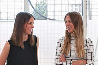
Emma Thomas and Kirsty Carter’s Apfel, A Practice for Everyday Life, brings design into the art world, and makes design an art
