
Feature
Penguin science fiction covers
David Pelham’s covers for Penguin’s science fiction titles gave a frowned-upon genre a strong literary presence
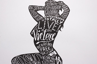
Writing on the wall: The posters of James Victore
With a visual polemic of angry scrawls that stop pedestrians in their tracks, this committed New Yorker tackles Shakespeare, safe sex and racism in personal (frequently self-financed) projects that hammer home graphic design’s potential to make a difference
The myth of genius
The myth of genius – which promotes the artist as a lone, (even mad) pioneer – emerged when craftsmen first strove to become respected members of an elite. But before designers get too excited about winning the status of the artist, perhaps some caution is required.
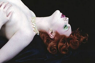
Envisaging soundscapes: classical album covers
When designers and marketing teams attempt to visualise serious music, they reach for fine art, photography or artist portraits. How do these selections affect the listening experience – and the buying impulse – when there are more classical recordings in the racks than ever before?

Magic box: craft and the computer
Long undervalued as a poor relation of art and design, craft is central once more. Essay by David Crow
Retro-sexism
The bleak reality of sexism, however 1970s, or ‘cool’, demands a critique
Pictures for rent
Stock photography receives little attention and wins even fewer awards, but it makes up a corporate vernacular that informs almost all levels of graphic design

Time, motion, symbol, line
Choreographers through the centuries have made brave, often beautiful attempts to visualise and record their work. Technology provides new means, but scoring a moving, dancing body in four dimensions remains elusive
Reduction
Is graphic design, with its allusions and clutter, fundamentally antithetical to minimalism?