
Feature
Reinterpreting the classics
For a handful of classical record companies, expressive design is a commercial priority.

Reputations: Jean Widmer
‘Signage reflects both the complexity of space and the way a place is organised. And it is very satisfying’
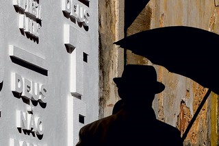
The Word on the street
Asked to make a graphic intervention for a Lisbon chapel turned gallery, design studio R2 turned to everyday irreverences
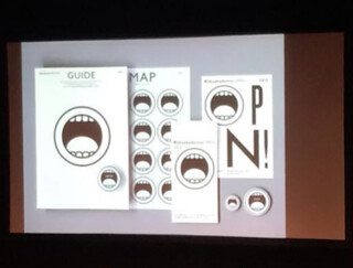
Sampling the Modern
Bill Mackay's lucid work for GF Smith established a design tradition now continued by SEA
Reputations: Stephen Banham
‘Helvetica has become the generic default, a safe formula under the guise of Modernism. It’s all smoke and mirrors.’
Neon
The properties of this medium make it the plaything of artists, a cinematic cliche and a familiar, endlessly renewable element of the urban nightscape.
Reputations: Gerard Unger
‘Papers have all kinds of information on the same page; very distressing and very joyful; gossip and facts. I wanted to bring that variety, that liveliness into the typeface design.’
Why Helvetica?
Despite the changes provoked by the digital ‘revolution’, designing a typeface for serious reading remains a time-consuming task. For the designer, choosing and setting a body text font can be equally daunting, resulting in some inspired, eccentric and provocative choices
Remove specifics and convert to ambiguities
As designer, writer and educator, Jeffery Keedy is a committed proponent of postmodernism
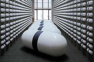
General Idea: Infiltrate, infect and mutate
Ignoring the boundaries between art and design, this Canadian trio worked in both fields with an eclectic mix of language, humour and commercialism