Feature
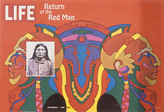
Keepers of the flame
US picture magazines of the late 1960s and 70s are still a vital source of inspiration

Adventures in motion pictures. ‘This is reality’
Tim Hetherington and Restrepo, the prize-winning documentary he made with Sebastian Junger

A certain smile
Sara De Bondt is a shaker and mover, who leads a studio with a decisively contemporary approach to identity design
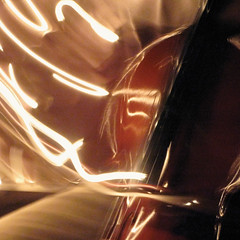
Interview with Dan Fern
Professor Dan Fern explains his pioneering ‘MAP / making’ course at the Royal College of Art, London
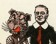
Once upon a time...
… there was a Big Bad President. How satirists use children’s tales to puncture the huffing and puffing of politicians
Surface to space
Maths, computers and the internet are bringing new life, form and purpose to a traditional paper art
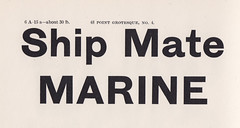
Reputations: Kris Sowersby
‘New Zealand is a young country and hasn’t had the time, or resources to develop a typeface culture. I am free to draw upon multiple influences. I haven’t been taught or exposed to any one particular typographic heritage, so my hand isn’t biased.’

