Opinion
Features
Kerry William Purcell
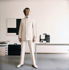
As the Design Museum launches a retrospective of Wim Crouwel’s work, Kerry William Purcell interviews the Total Design (TD) co-founder.
John L. Walters
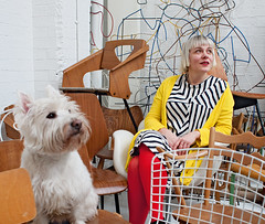
Morag Myerscough puts an eclectic graphic sensibility into public spaces, with colour, pattern and big type
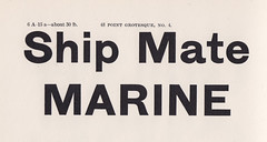
Mark Thomson
‘New Zealand is a young country and hasn’t had the time, or resources to develop a typeface culture. I am free to draw upon multiple influences. I haven’t been taught or exposed to any one particular typographic heritage, so my hand isn’t biased.’
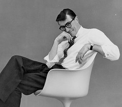
Martha Fleming
At a pivotal moment in Canada’s history, Allan Fleming’s typographic designs for stamps, books, advertisements, logos and big civic projects shaped the look of the country, leaving a vital legacy
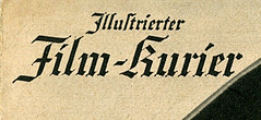
Steven Heller
The lettering on the covers of Germany’s most popular film magazine expressed plot and tone with exuberant, readable forms.

Dominic Hofstede
Les Mason art-directed The Epicurean, Australia’s first food and wine magazine, as an expressive gallery for adventurous graphic design.
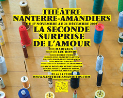
Sébastien Morlighem
New discoveries about Roger Excoffon’s virtuoso typefaces for Fonderie Olive prompt a fresh look at the legacy of this dynamic designer and the foundry itself.
John L. Walters
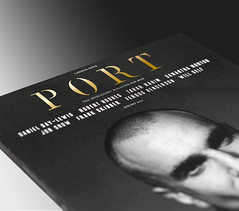
Who would dare to launch a glossy men’s magazine during an economic crisis? The team behind Port discuss their new quarterly

Steve Rigley
With shorter, more commercially driven degrees under serious consideration, Steve Rigley argues that design students need more space to speculate and make mistakes.

