Opinion
Features
John L. Walters
‘What other profession do you end up in where you learn so much about other people’s businesses than in graphic design? It’s remarkable. Clients will tell you everything. It’s like being a therapist. That’s really exciting. You never know what’s going to happen from one week to the next.’
Tony Brook
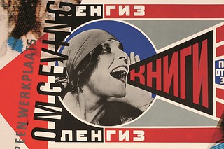
Spin’s founder, the subject of Reputations in Eye 86, talks about his passion for poster collecting
Catherine Dixon
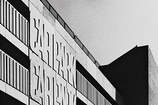
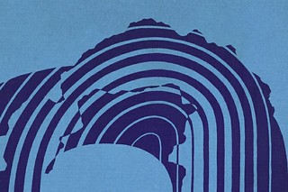
Alan Bartram brought a perceptive eye to alphabetic detail in public spaces. Catherine Dixon pays tribute to the co-author of An Atlas of Typeforms
Simon Esterson
As a sidebar to ‘Quiet man of letters’, Simon Esterson talks about his early encounters with this celebrated book by Alan Bartram and James Sutton
Eric Kindel
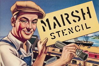
Stencil typefaces – late arrivals on the typographic scene – are going in new directions and rediscovering their history.
Caroline Roberts
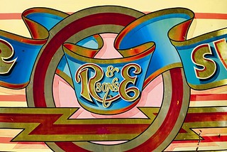
Fred Fowle was the UK’s foremost fairground artist. His go-faster graphics and futuristic lettering live on – in museums and working steam fairs
Eye editors
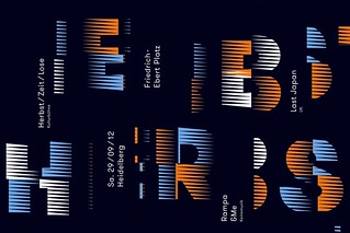
TDC hails the wider world of empathetic wine labels, typographic IDs and retro stationery
John Coulthart
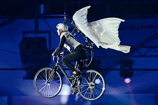
Steampunk’s florid industrial nostalgia might yet be the defining aesthetic of our time

Jane Lamacraft
A generation before home computers, Letraset’s dry transfer lettering made desktop typography possible – and gave a small group of type designers new insights into letterform construction through the art of stencil-cutting
Linda Kwon
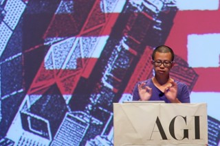
Linda Kwon reports on a design conference that aims to fight the ‘velvet rope syndrome’

