
Summer 2024
Art of darkness
Indie magazine Hellebore channels folk horror and the occult with an alchemical sense of graphic style. Critique by Rick Poynor
Hellebore magazine, launched in 2019, was slow to come to my attention, but sudden when it did. On a visit to the Magalleria bookshop in Bath, I saw the first ten issues (no. 11 has since appeared). I was simultaneously intrigued and dubious about the subject matter – folk horror and the occult – but what stopped me in my tracks was the panache of the design.
Hellebore, named after a species of flowering plant, many of which are poisonous, manifests its dark sympathies and inhabits this subcultural netherworld with total conviction. It is the most impressive fusion of a distinctive and original editorial vision with expressive, interpretative magazine design I have seen in years.
So far as I can tell, Hellebore is unlikely to be familiar to designers, despite its outstanding design, unless they happen to share its interest in folk horror – now a globally established genre or ‘mode’ – or identify with the inexorable rise of the new paganism that mainstream media has tended to overlook. In London, bookshops specialising in occult literature stock the title, rather than outlets for stylish independent magazines such as magCulture and Magma. The journal-sized issues appear twice a year, with occasional extra ‘Yuletide’ special issues in December.
All spreads and cover from Hellebore
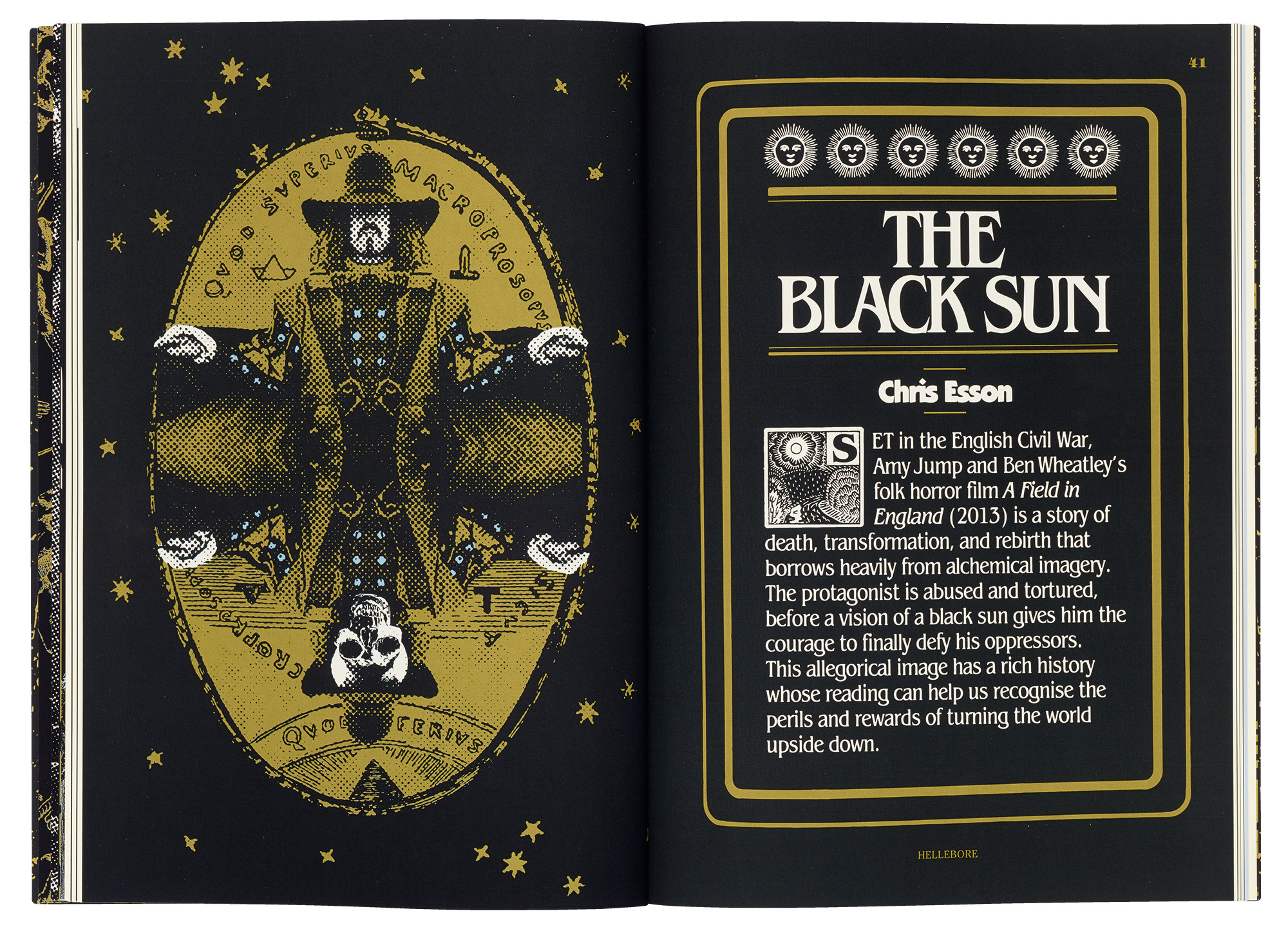
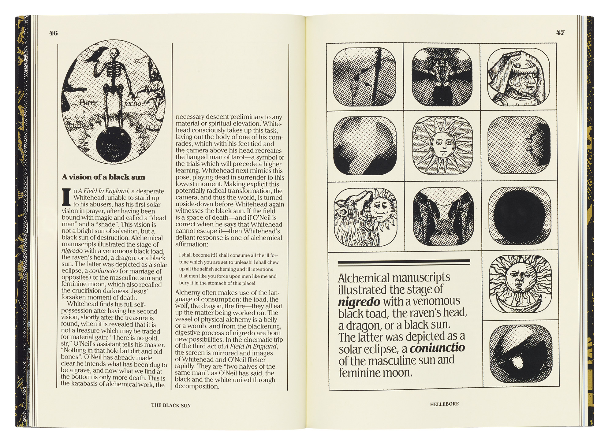
no. 10, 2023, Art direction by Nathaniel Hébert.
Top and right are an article about the folk horror film A Field in England.
Hellebore – tagline: ‘A summoning of ancient terrors’ – is the twilight brain-creature of its editor, Maria J. Pérez Cuervo, a Spanish writer who lives in the UK. The magazine’s self-styled ‘Visual Wizard’, Nathaniel Hébert, a former Goth, like his editor, reportedly works in a cabin in the ‘wilds of Québec’. As part of her briefing process, Cuervo shared some notably well informed references for how Hellebore might look on a private Pinterest board. These prompts included Czech and Polish film posters from the 1960s and 1970s, a soupçon of Surrealism and psychedelia, some earlier occult magazines, and Cuervo’s desire for ‘an old fanzine finish’, although Hellebore has a much greater control of stylistic nuance than many a zine.
The weirdly bony masthead typeface is Hébert’s adaptation of Herold from 1901, which was used on a poster by Rudolf Němec for the Czech film Valerie and Her Week of Wonders (1970), a brooding avatar of Gothic Surrealism. Intentional or not, Hellebore’s aesthetic shares a bloodline with Polish designer Roman Cieślewicz’s similarly haunted book design for the Guide de la France Mystérieuse (1964), which I wrote about for Design Observer.
Cuervo has gathered a formidable coven of writers. Contributors bring expertise in archaeology, literature, fiction writing, film studies, history, folklore, pagan studies and witchcraft. If they don’t already have a PhD, they are working on one. The writing is always accessible and often enlivened by a political stance. As an article in the first issue argues, ‘re-enchantment’ – recapturing a sense that nature and the land are sacred – is a form of resistance. In ‘Lucifer over Lancashire’, a title borrowed from a song by The Fall, a case is made for understanding witches as a ‘model of resistance for the disenchanted and disenfranchised’. Another article, ‘Supernatural Subversion’, argues that throughout history, ‘curses and spells have been used to resist oppressive forces, and to promote progressive politics and social change.’
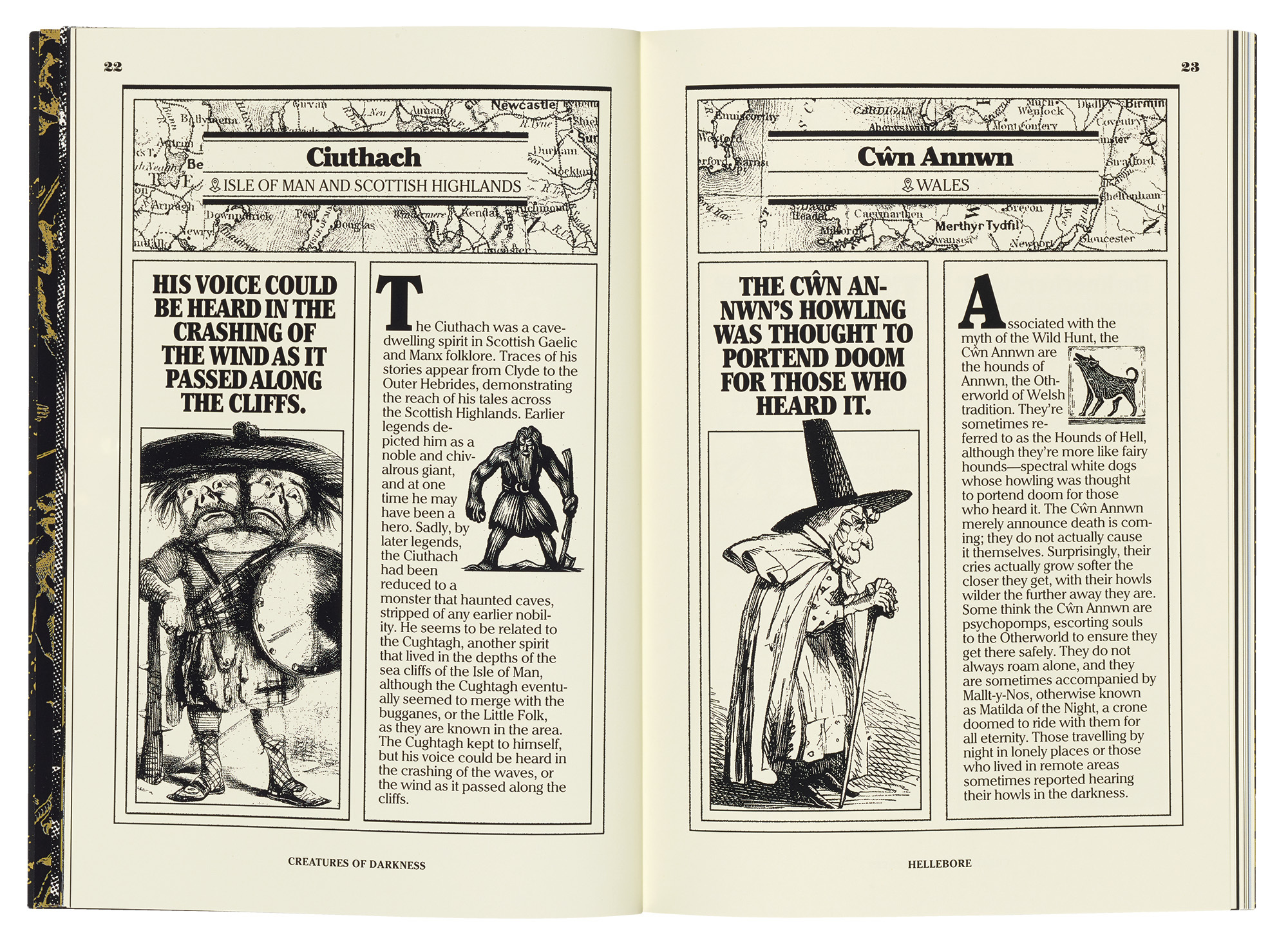
A guide to creatures of darkness in British and Irish folklore.
It isn’t necessary to want to take part in strange ritual dances to find Hellebore fascinating. On one level, it is simply a crucible for an arcane branch of cultural criticism.
There are articles that focus on comic book writer Alan Moore, psychedelic folk music, and the Pan-like ‘doomed’ rock gods Syd Barrett and Brian Jones. The writers dissect The Wicker Man (1973), a folk horror landmark, the 1970s TV classic Penda’s Fen, which stunned me as a teenager, and Ben Wheatley’s hallucinogenic feature film A Field in England. They revisit the disquieting supernatural tales of M. R. James, Oscar Wilde’s The Picture of Dorian Gray, and – new to me – Lolly Willowes, Sylvia Townsend Warner’s novel about a woman who becomes a witch.
Hébert reacts to this steaming brew with feverish imagination. Hellebore is small but exquisitely fretworked with images, its design constantly morphing with the subject matter. He fashions opening spreads using every manner of ornamental frame, shape-shifting from Victorian to Art Nouveau to psychedelic, and sates the hungry eye with a parade of type styles for titles, cross-heads and pull-quotes. Cuervo studied journalism and the editorial craft is exemplary.
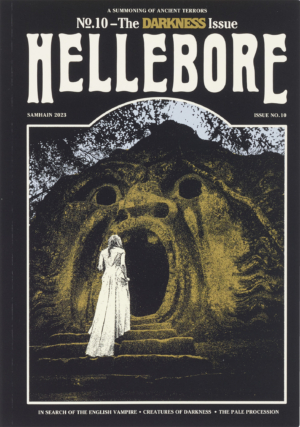
Cover of Hellebore no. 10.
The alchemical command of atmosphere leaves few pictures unedited. Resisting the banality and lack of mystery of full colour, Hébert prefers dot screens, spot colour and the magical transformations of collage. This can sometimes reach the point of overload; issue no. 10 (shown here) is more restrained than some, and better for it. Occasionally, he commissions an illustrator, but their work is rarely as well matched to Hellebore’s crepuscular ambience as Hébert’s own picture choices and image-making. The full-on Gothic cover photography, which he helps along with a graphic nudge or two, ushers the reader through the portal and into the Helleborean world.
Rick Poynor, writer, Eye founder, London
First published in Eye no. 106 vol. 27, 2024
Right. Opening spread of an article about nightmares as a form of diabolical visitation.

Eye is the world’s most beautiful and collectable graphic design journal, published for professional designers, students and anyone interested in critical, informed writing about graphic design and visual culture. It is available from all good design bookshops and online at the Eye shop, where you can buy subscriptions and single issues.