
Summer 2009
Bad timing

In a new Obama-led world order, Omega’s lust for luxury seems as misplaced as a licence to kill. Critique by Rick Poynor
The British Film Institute’s May programme came with an unexpected attachment. The BFI Southbank film theatre was showing a series of James Bond movies and Omega, the Swiss watchmaker, must have thought it would be a good moment to distribute copies of the third issue of Omega Lifetime magazine, devoted to the imperishable secret agent and published to coincide with the release of Quantum of Solace last year.
Bond, you see, is one of its ‘brand ambassadors’, and here’s Daniel Craig on the cover, taking aim with an automatic weapon while gripping the wheel of a speeding car with its door missing, his bruised hand decorated by a glittering Omega Seamaster Planet Ocean watch. It’s just another of those everyday 007 moments when Bond – to quote the magazine’s excitable prose – ‘indulges in the ecstasy of luxury while triumphing over terrorism’.
I had just seen the film and Omega Lifetime’s exaggerated enthusiasm for a movie that proved to be a letdown after Craig’s memorable debut in Casino Royale seemed as misplaced as the BFI’s assumption that its typical member has the budget for wrist watches with mother-of-pearl dials and inset diamond hour-markers. The timing could have been better, too. The G20 meeting was taking place in London that week and protesters angry at the global downturn set in motion by the dubious practices of the inadequately regulated financial sector were converging on the City. Omega watches are exactly the kind of extravagant status symbol that unapologetic bankers with outrageous bonuses might be expected to favour and, sure enough, there is an Omega boutique alongside Tiffany, Cartier and Bulgari in the Royal Exchange, next door to the Bank of England. The Omega outlet had copies of the Bond issue piled in the window.
Magazine spread, Photograph by Rasmus Dengsø.
Top: Cover of Omega Lifetime no.3, the James Bond Edition, 2008
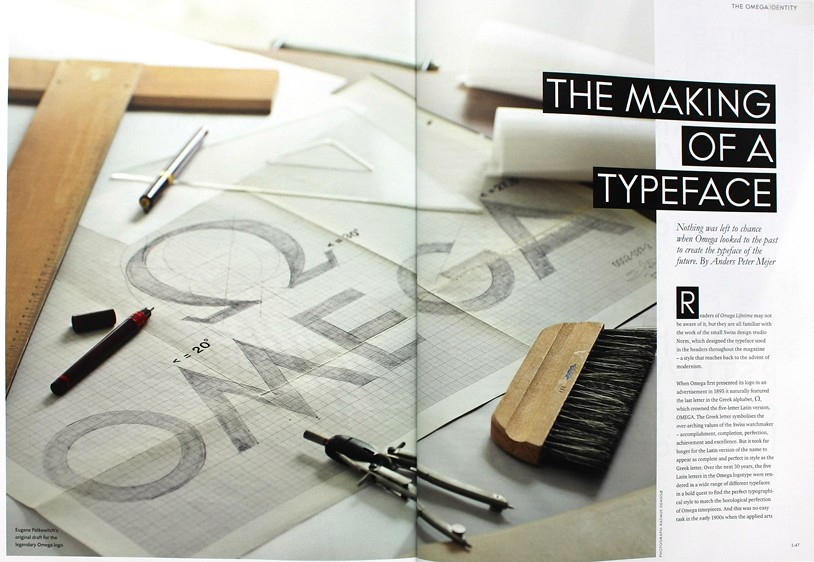
Omega Lifetime is produced in Copenhagen and printed in Lausanne: 90,000 copies in English, 20,000 in Chinese, 10,000 in Japanese. Anders Peter Mejer of Embryo Design handles both editorial and creative direction. The magazine – more accurately, ‘magalog’ – follows the conventions of design for wealthy, demanding readers seen in the FT, The Economist or Monocle (see Critique, Eye no. 64 vol. 16). The text type is elegantly understated in a way that purrs ‘seriously expensive’; it’s small but luxuriously leaded, leaving a blandly soothing impression that the pages are rich with content, while also making a virtue of their spaciousness – silky white space remains one of the most telling indicators of exclusivity and class available to a designer. The one quirky detail is supplied by the tiny folios: every page is chronometrically linked to a passing second, from 0:01 (the cover) to 2:02 (the last page).
Headlines are set in the Omega typeface designed by Dimitri Bruni and Manuel Krebs of Norm (see Eye no. 70 vol. 18) and based on Futura, used in the Omega identity since the 1940s. The issue includes an article by Mejer discussing the history of the logo and the development of the new face. Its flinty, angular forms, sometimes reversed out of black bars, add to the publication’s demeanour of rigorously engineered precision.
Articles about the making of the film, Bond’s gadgets, Ian Fleming, Lawrence of Arabia (‘The Thinking Man’s Spy’) and Nicole Kidman, another brand ambassador, are really just the filling that holds the catalogue pages and product stories together. You can get the travel items, new-release featurettes and fawning star profiles anywhere.
The real reason for picking up a copy of Omega Lifetime is to ogle the product shots. The striped dials of the Seamaster Aqua Terra collection – ‘Designed as much for the marina as for sea adventure’ so remember to bring your yacht – are enlarged to the size of ships’ clocks. As if perfectly lit, chromatically true studio photography couldn’t be entirely trusted to render the luscious desirability of these over-specified timepieces, they have been retouched into a state of hyper-reality.
These images are more like emblems of what they are supposed to represent than documents of tangible things. We can only assume that this kind of image inflation works for go-getters who might be in the market to accessorise themselves with an Omega, but peering hard at the flawless features of the 38.5mm model in 18ct red gold with a Teck grey dial and highlighted vertical lines, I failed to summon so much as a twinge of what BusinessWeek likes to call ‘product lust’ – not a flicker. If anything, I thought the watches looked a bit naff at this scale. I even found myself wondering idly how anyone can justify this kind of indulgence right now. Yes, I know. It must be me.
Photograph: Greg Williams.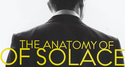
Rick Poynor, writer, founder of Eye, London
First published in Eye no. 72 vol. 18 2009
Eye is the world’s most beautiful and collectable graphic design journal, published quarterly for professional designers, students and anyone interested in critical, informed writing about graphic design and visual culture. It is available from all good design bookshops and online at the Eye shop, where you can buy subscriptions and single issues.
