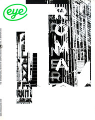
Winter 2004
Editorial Eye 54


One of the themes discussed in Eye 53, our ‘Brand madness special issue’, was the idea of imposing an identity, from the top down, on cultural, commercial and social institutions – and even cities and countries.
This issue, which follows the looser theme of lettering and typography, includes a curious echo of this. ‘Excoffon's autograph’ by Matt Soar, examines the way that the handwriting typeface Mistral ‘brands’ the streets of Montréal, as if Roger Excoffon, Mistral’s designer, bequeathed his signature to the city. Soar looks at this in relation to a self-conscious (and controversial) project to design a typeface for the twin US cities of Minneapolis and St Paul.
After all, you can’t visit a city without seeing signs and lettering. And the ways in which such letters survive, decay and / or resurface provide another theme. In ‘The frozen past’, designer Jessica Jenkins looks at the traces of commerce that re-emerged briefly after the fall of the Berlin Wall, while in ‘Letter rich Lisbon’, Phil Baines and Catherine Dixon show the way that public lettering has evolved and endured in the period since Nicolete Gray visited the city in the 1960s.
You could argue that ‘Forensic Types’, Alice Twemlow’s profile of the Hoefler & Frere-Jones type foundry, is also about a city – New York – since much of the duo's work is informed by their love of ‘non-typographic lettering’ found in Manhattan. (We show some of Frere-Jones’s photographs of letterforms on the inside covers. Yet this is also a story about the relationship between type design and graphic design, since H&FJ are so firmly enmeshed in the New York design community.
The distinction between typography and lettering is continued by ‘If the image of the text has more value than its content …’, the dialogue by Wigger Bierma and Ewan Lentjes. Bierma discusses what happens ‘when the mores of lettering begin to infiltrate the domain of typography’ and the knock-on effect on design education: ‘If teachers can only show what they do without being able to explain how they think, they are giving only half the lesson.’
We close the feature well with something completely different: Roger Sabin’s ‘Understanding silly books’ on the design of Monty Python books. In print, their elliptical satire, parodies and rude jokes rely in large part upon type and lettering – subverting familiar forms such as Penguin books, the London Underground diagram, teen mags and the small ads you see in The Stage. Three decades later, though dated, their cheap shots at politicians and the advertising industry are still welcome.
John L. Walters, editor of Eye, London
First published in Eye no. 54 vol. 14, 2004
Eye is the world’s most beautiful and collectable graphic design journal, published quarterly for professional designers, students and anyone interested in critical, informed writing about graphic design and visual culture. It is available from all good design bookshops and online at the Eye shop, where you can buy subscriptions and single issues.

