Spring 2006
Editorial Eye 59

Relational aesthetics, advertising, type design, photography, identity and Richard Hollis; the editor attempts to summarise the latest issue
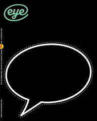
The covers of Eye are not obliged to say everything about the contents, but few have been more enigmatic than this issue’s front. Ji Lee’s blank speech bubble is featured in ‘Part of the process’ (pp.18-25), the Parrinder / Davies essay about ‘relational aesthetics’ in design. On the street, this Bubble Project has taken on a social life of its own, as people scrawl inside the stickered blanks on billboards and posters, yet it began while Lee was still working as an art director for one of the biggest advertising agencies in New York. Stefan Sagmeister once observed that Lee’s campaign could ‘be seen as a nightly atonement for sins committed during the day.’
And it’s the social and cultural impact of advertising creatives such as Lee’s former colleagues that concerns Lynne Ciochetto as she travels the world with her point-and-shoot camera and her notebook to hand. As developing countries accelerate towards an information-rich adaptation of Western affluence, their media tend to emulate the developed world’s universal visual codes of light skin and skinny limbs, a trend discussed in Ciochetto’s essay ‘Advertising and globalisation of aspiration’ (pp.60-64).
But there is no obvious single theme to this quarter’s issue. Perhaps, in the spirit of relational aesthetics, I could ask you, the reader, to provide your own personalised theme as you browse the contents. There’s type design, courtesy of Cyrus Highsmith (pp.42-47) and Jason Smith’s Inspiration (p.73), which reveals another link between sex and typography; there’s photography with former illustrator-designer Veronica Bailey (pp.52-55) and curator Karl Baden (pp.56-59); history and website design (Critique, pp.4-5), and branding in Picture (pp.2-3). Nick Bell’s appraisal of the Walker Art Center’s new identity gives him the opportunity to expand upon ideas he developed in his essay ‘The steamroller of branding’ (Eye no. 53 vol. 14).
One might even trace a secondary theme of ‘open air’ design: Ciochetto’s slide show of advertising; Richard Hollis’s confident typography for the Hackney Empire; Volume and MendeDesign’s ‘relational’ fly-posting campaign; Jamie Hobson’s wayfinding marks; and the Highfield Art Club (‘Harare’s unsung type heroes’, pp.36-41), obliged to continue their screenprinting while exposed to the elements in a makeshift studio.
And some of you may view this as the long overdue ‘Richard Hollis issue’. Christopher Wilson, who interviewed Hollis over a period of several months for the Reputations interview (pp.26-35), expressed unease about the assignment: he commented in a private email that there is ‘an irony that Hollis should be the subject of a Reputations slot when he has avoided having a reputation . . . his Graphic Design: A Concise History is a worldwide bestseller on the subject, but the vast majority of its readers have never and will never see any piece of RH’s work. He is important, but there’s a (partly self-imposed) Hollis-shaped hole in design history.’
Yet those of us who have worked with Richard, and encountered his design methods first-hand, regard him with awe and affection. Many of our new design student subscribers (to whom we extend a warm welcome) will doubtless recognise his name from undergraduate reading lists; many more of you will have enjoyed his writing in Eye and elsewhere. Now you have an opportunity to learn how his insights as a critic and historian are informed by a long and innovative career as a graphic designer; and that is another kind of inspiration altogether.
Eye is the world’s most beautiful and collectable graphic design journal, published quarterly for professional designers, students and anyone interested in critical, informed writing about graphic design and visual culture. It is available from all good design bookshops and online at the Eye shop, where you can buy subscriptions and single issues.
