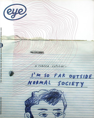
Spring 2005
Irony is not enough

When design’s concerns form the content of an artist’s book, does ‘good design’ matter? Critique by Rick Poynor
In the twenty years it has been in existence, the independent London art book publisher Book Works has made an exceptional contribution to the artist’s book. While the point of the genre is to make art works accessible to a wider audience than exists for large-scale gallery art, in practice many books remain esoteric and comparatively costly items. Book Works’ numerous productions have moved a significant step nearer to that elusive public. In appearance, their projects can often be mistaken for trade paperbacks. The edition size – usually 1000 or 1500 – allows for a competitive price.
The other quality that sets most Book Works’ projects apart is their design. These volumes are unfailingly elegant, with tastefully restrained typography and ample amounts of white space. Yet the projects they contain can be as demanding as anything encountered on the video screen or gallery floor. The books tend not to feature the cover blurbs provided by commercial publishers and readers are left to decide for themselves what they are about.
Mark Titchner’s 96-page Why and Why Not contains ten texts written by the artist and illustrated with the kind of typographic images he has exhibited in galleries on lightboxes and vinyl banners. Titchner draws on the writing of figures such as eighteenth-century theologian Emanuel Swedenborg, renegade psychiatrist Wilhelm Reich, and primal therapy exponent Arthur Janov – a heady concoction of religion, mysticism, psychoanalysis and dubious theories.
In chapters such as ‘Discipline Maketh the Man’ and ‘I Refuse to Die’, Titchner rants at his listeners like a soapbox prophet. His diatribes have the desperate conviction of a self-published pamphlet pressed into your palm by a wide-eyed stranger purporting to offer the true path to salvation. They are cleverly enough composed – and, in the main, well enough edited – to stop you rejecting them out of hand as a crackpot’s ravings. For those familiar with the artist’s work, who understand that this is an ‘artist’s book’, the only way to take these texts is with a large pinch of irony. Art-world advocates offer the customary line about how Titchner is ‘investigating’ and 'reinterpreting’ these now discarded philosophies, but the pressing need to do this in 2005 remains unexplained. Why and Why Not lacks the humour and charm of David Byrne’s The New Sins, which it in some ways resembles (see Eye no. 43 vol. 11).
Titchner’s images, used to illustrate his arguments, pose another problem. They take the form of short phrases delivered in blocky capitals centred on backgrounds of leaves, clouds and skeletal hands that glow with a sickly, radioactive light. The graceless letterforms have heavy outlines and crude, bevelled edges. They are like homilies and directives from some celestial office of communication badly in need of a decent designer. Art people see this as a reference to the graphic language of consumerism, but designers such as the late P. Scott Makela, Jonathan Barnbrook and Elliott Earls have produced much more refined and typographically inventive digital constructions, while commenting on the consumer culture that spawned such overheated imagery.
When it comes to questions of design rhetoric, this kind of consideration is usually absent from any assessment of the work’s effectiveness as art. If only designers are likely to perceive such flaws, do they really matter? Yes, they do. Titchner has chosen design’s territory as part of his content and he uses design’s visual resources as a central element in his work. The heavy-metal tackiness of these typographic images might be an entirely controlled effect, but there is plenty of room for doubt. Book designer Robert Johnston’s text typography has a level of finesse that only serves to highlight the rawness of Titchner’s design gestures. The artist’s chapter titles explode from a single point, like doodles on the back of a school exercise book, and images in negative such as the person in a ‘No Means No’ T-shirt seem to belong to a different project.
How would a reader who knew nothing about art or design react to Why and Why Not? Book Works is moving in the right direction, but until such time as volumes like this find their way into ordinary bookshops, it’s not an encounter that is likely to happen. Titchner’s work is intriguing. Like so much art, though, it proceeds as if it had the capacity to involve and confound an audience that doesn’t currently exist for it.
Rick Poynor, writer, founder of Eye, London
First published in Eye no. 55 vol. 14 2005
Eye is the world’s most beautiful and collectable graphic design journal, published quarterly for professional designers, students and anyone interested in critical, informed writing about graphic design and visual culture. It is available from all good design bookshops and online at the Eye shop, where you can buy subscriptions and single issues.
