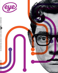
Winter 2007
Picture a story

Katy Homans’ daring and ambitious cover designs for New York Review Books confound expectations. Critique by Rick Poynor

Penguin wrote the rule book when it comes to the design of covers for classic literature. No need to keep changing the typeface: a single type style and a consistent title position will emphasise the continuity and unchanging, timeless value of the series. As for imagery, there is no better way to place the book in its historical moment, or to evoke its style, mood and setting, than by borrowing an adroitly chosen detail from some equally accomplished painting, photograph, drawing or sculpture. At Penguin, in the 1960s, the late Germano Facetti (see Eye no. 29 vol. 8), an art director renowned for his encyclopedic knowledge of art history, was a master of this kind of picture editing.
Only a limited number of imprints attempt to publish classics on the same scale as Penguin. The handful that do – most notably Oxford World’s Classics – follow the same design formula, but without the same degree of visual panache. In recent years, Penguin has reasserted its generic hold on the classic cover by updating its templates and mixing commissioned illustrations with off-the-gallery-wall imagery. This willingness to experiment might suggest that even Penguin thinks that the classic way of outfitting a classic is beginning to look a trifle démodé now, if not yet completely threadbare.
All the while, though, an American publisher, New York Review Books, has been using the Facetti formula to construct covers for a series of more than 200 classics that match the achievements of the man in his prime. One might go further and say that the NYRB Classics, published since 1999, often attain a level of imagination in their use of ready-made imagery that exceeds even the revitalised Penguin Classics.
New York designer Katy Homans, who has many years’ experience designing art books, devised the format. (Some readers will recall her trail-blazing article about Robert Brownjohn in Eye no. 4 vol. 1.).
Homans’ title box, based on Meta caps, always sits in the same central position about a third of the way down; its depth depends on the length of the number of lines in the title, but most boxes conform to one of two basic sizes.
Image: Sigmar Polke, Do the world a favor and eat a bullet, 2002. Cover: 2006.
Top: image: Alighiero e Boetti, Airplanes (detail), 1989. Cover: 2007.

Where Penguin uses consistent colour to reinforce its series identity, NYRB makes a spectacular virtue of variety. The box background colour – bright, zippy and unexpected on a literary title – reappears on the spine and back cover, and the colour used for the author’s name and title returns on the inside covers. The books flash at you like stage lights, especially when seen in a shop next to others in the series. Perhaps this is why NYRB can afford to be so cavalier about its identity, shunning Penguin and Oxford’s example by leaving the small, capsule-like logo (developed by designers Red Canoe) off the front cover.
The old-fashioned placement of the title-piece, like a label, might seem a clumsy handicap to impose, since it will interrupt and obscure any image put behind it. Homans manipulates this brilliantly, somehow contriving to turn the clash between the two elements into a source of growing fascination the more books in the series you encounter. Edwin Frank, the series editor, a poet in his own right, will usually suggest an image or direction. Twice a year, he and Sara Kramer, who formerly handled production, visit Homans’ studio to look through her library of art books. Sometimes she proposes an artist or image but, wherever the cover picture comes from, her cropping can transform already surprising image choices into literary objects with magnetic allure.
Homans likes to use the title box to obscure a crucial part of the image – to preserve a reclining nude’s modesty, or as an informal announcement, like a placard, beneath someone’s chin on the cover of a biography. Often, when cropping, she pushes a figure or group of people out to the edges, creating disruption and tension across the design. On Boredom by Alberto Moravia, the title partially conceals a picture frame hanging at an angle on the wall behind it – a sharp visual pun. On Peter Handke’s A Sorrow Beyond Dreams, the title looms like a black warning sign above a bed in an otherwise empty chamber, becoming a presence not just in front of the image, but within it.
Equally impressive is the NYRB team’s assured and inventive handling of fine art. Illustrators should worry that off-the-peg art chosen and framed this expertly makes anything less ambitious look boring. Warlock, an epic western by Oakley Hall, first published in 1958, finds graphic form with a Sigmar Polke featuring two peculiar, wobbly, half dematerialised cowboys.
Original, unpredictable, un-patronising, goofy yet serious, childlike yet mature – why isn’t there more graphic design around like this?
Image: Aleksandr Rodchenko, endpaper design for Red Army, 1939. Cover: 2003.

Rick Poynor, writer, founder of Eye, London
First published in Eye no. 66 vol. 17 2007
Eye is the world’s most beautiful and collectable graphic design journal, published quarterly for professional designers, students and anyone interested in critical, informed writing about graphic design and visual culture. It is available from all good design bookshops and online at the Eye shop, where you can buy subscriptions and single issues.

