Wednesday, 12:00pm
27 May 2020
Recolouring the past

At a time when image falsification is a source of concern, the digital colourisation of documentary photographs is a retreat from the truth.
Photo Critique by Rick Poynor

Photo Critique by Rick Poynor, written exclusively for Eye magazine.
The desire to give black-and-white photographs a colour boost has a long history, as contemporary exponents and defenders of colourisation like to point out. The hand-colouring of pictures dates back to the 1840s, and the Autochrome process, patented in 1903, produced stunning artificially coloured images. But the recent enthusiasm for digitally colouring black-and-white originals is something else again. In the late 1980s and 90s, many old black-and-white films – even classics such as Bringing Up Baby (1938), Stagecoach (1939) and On the Waterfront (1954) – were colourised for reissue, leading to accusations of ‘sacrilege’ and even legal action.
Few think today that overhauling a distinguished film-maker’s vision is a good idea, or even an economical one. The vogue for ‘upgrading’ feature films has passed, though documentary footage is another matter. Lord of the Rings director Peter Jackson’s transfusions of colour into scenes from the First World War in They Shall Not Grow Old (2018) were widely admired, and Channel 5’s Edwardian Britain in Colour (2019) brought the trend to TV. The historical documentary image looks set to be the next focus of necessary debate about the merits and ethics of colourisation.
In tandem with this moving-image trend, a new generation of photographic colourisers has emerged. One of the most visible is Jordan J. Lloyd, founder of Dynamichrome, and author – with Retronaut founder Wolfgang Wild – of the collection The Paper Time Machine: Colouring the Past (2017). The following year, Marina Amaral, a Brazilian artist and colouriser, and the British historian Dan Jones unveiled the even more compendious The Colour of Time: A New History of the World, 1850-1960, with images by Amaral and captions by Jones. The colour enhancements – from the Charge of the Light Brigade to the attack on Pearl Harbor – were praised without reservation in the press. Amaral and Jones’s follow-up, The World Aflame: The Long War, 1914-1945, an undeniably handsome and equally ambitious project, runs to more than 400 pages.
Jordan J. Lloyd, colourised version of Dorothea Lange’s Country store on dirt road, Gordonton, North Carolina, 1939.
Top. Marina Amaral, colourised version of Alexander Gardner’s picture of Allan Pinkerton, President Abraham Lincoln and Maj. Gen. John A. McClernand, Battle of Antietam, 1862.

For reviewers, as it seems for many ordinary viewers, the colour can only be a gain. The point is repeatedly made that the pictures, once infused with colour, feel closer, as though the events they show had only just happened. This closeness allows viewers to ‘understand’ the images in a way that was apparently not possible when they were in black and white. Advocates of colourisation claim this gives these remixed pictures an important educational purpose.
It is hard to deny the power of many colourised images to stop you in your tracks and this is not always the result of high drama. For me, one of the most arresting moments in The World Aflame came when I turned the page to find a full bleed spread showing a group of British children clutching suitcases and dolls, and waiting patiently on a railway platform to be evacuated for a second time in 1940. Amaral’s expert injection of colour seems to give the picture an electrifying degree of clarity and nearness in time, and the sensation can be deeply moving, although I haven’t seen the black-and-white original to make a comparison.
Even so, the claim that black and white is intrinsically distancing makes little sense. Was the vast history of black-and-white photographic documentation really so ineffective, constantly thwarting the viewer’s ability to feel anything? Clearly that wasn’t the case in the past when black and white was normal, particularly for news pictures. For those who grew up with black-and-white still and moving images, alongside colour (as I did myself), a monochromatic image has never been an obstacle to identifying with the humanity of the people in the picture, or to understanding their predicament. It is clearly the case, though, that viewers who have come to expect every kind of image to arrive in high-resolution colour might feel this sense of ‘distance’ and a corresponding reluctance to make an imaginative connection.
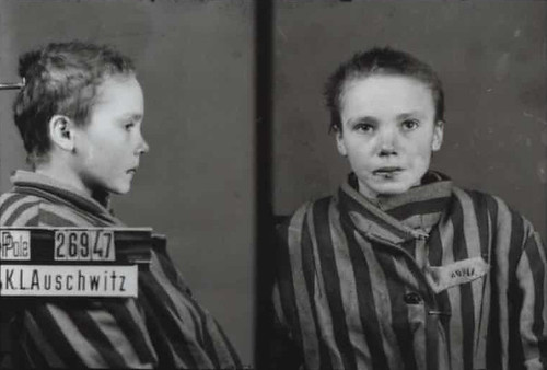
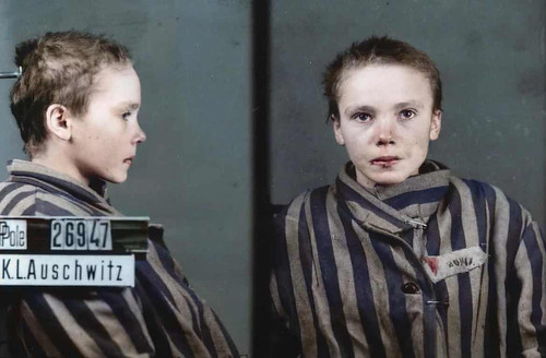
A good test case is provided by three identification photos of a fourteen-year-old Polish girl, Czesława Kwoka, taken on arrival at Auschwitz-Birkenau (The World Aflame shows two). Immediately before the pictures, she was beaten by a female guard and her lip is cut. The wound and her fear are clearly visible in black and white, so what is gained here by colourisation? Can we only fully feel her distress if we see the red of her blood? In an interview with the Guardian, Amaral concedes that the original picture is ‘very powerful’, but contends, ‘Colour allows us to understand the reality in a much deeper sense.’ Much deeper? What wasn’t sufficiently clear about the terrible fate of this child, who was murdered a month later?
Wilhelm Brasse, identity photograph of Czesława Kwoka, Auschwitz, 1942.
Marina Amaral, Czesława Kwoka, colourised version, 2020.
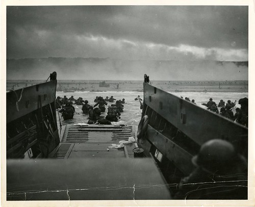
Colourisers such as Amaral and Lloyd go to great lengths to ensure the colour is as accurate as their research can make it. But the illusion that a colourised picture is ‘real’ depends on seeing only their version of the scene. The World Aflame includes a picture of the D-Day landing on Omaha beach – usually titled Into the Jaws of Death – by Robert F. Sargent, a US Coast Guard photographer. Lloyd has also colourised this picture (for sale on his website) and other versions exist, such as one by Avi A. Katz. As soon as these variations are seen side by side, especially next to the original print, the fictional nature of the entire process becomes apparent. What colour would the landing craft appear to be in this light? Even experienced colourisers must make a guess, and there is much less accomplished work to be found online. At some point, thanks perhaps to a circulating press copy of the photo, the sky above the beach became heavily darkened and the colourisers repeat this. The original print is much lighter [see links below].
Robert F. Sargent, Into the Jaws of Death, France, 6 June 1944. Source: Coast Guard Historian’s Office.
Marina Amaral, colourised version of Sargent’s picture, 2020.
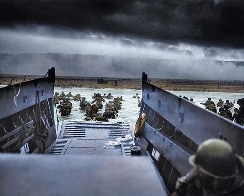
Jordan J. Lloyd, colourised version of Sargent’s picture, ca. 2016.
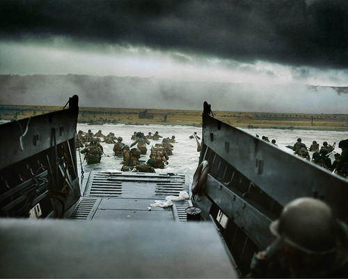
Avi A. Katz, colourised version of Sargent’s picture, 2014.
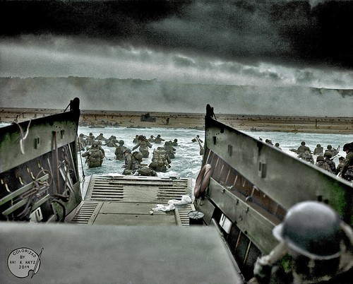
Lloyd and Amaral are cautious with their claims. ‘My intention is not to replace the original, but to give people the opportunity to see history from a different perspective,’ says Amaral. Lloyd wants his version of the past to sit ‘alongside the original. But it’s not a substitute, it’s a supplement.’ This reluctance to entirely supersede the original image raises a question. If the colourised version truly is more effective for a contemporary audience, encouraging greater identification and insight, then what and who is the original for? Do we expect the fabricated hues to serve as a way of capturing the uncommitted viewer's attention before somehow leading them on to an appreciation of disappointingly monochrome pictures initially experienced in fake colour?
A deeper understanding – of anything – always requires investment and effort. What we need is not to remake the historical record along lines more convenient for contemporary visual taste, but to expand our notion of visual literacy and sensitivity to include the millions of images that exist in non-colour form. This immensely rich archive of visual history is there for anyone to discover. At a time when the manipulation of images is already a source of huge concern, digital colourisation is a step away from, not towards, the reality of the past.
Rick Poynor, writer, Eye founder, Professor of Design and Visual Culture, University of Reading
Eye is the world’s most beautiful and collectable graphic design journal, published quarterly for professional designers, students and anyone interested in critical, informed writing about graphic design and visual culture. It is available from all good design bookshops and online at the Eye shop, where you can buy subscriptions and single issues.