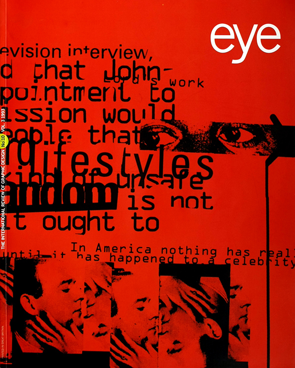
Autumn 1993
Some kind of joke?
Letter from Jeffrey Keedy in Eye 10
In Eye no. 8 vol. 2 (‘The [layered] vision thing’ by Mike Mills) I learned that deconstructive design is about the tired formal gimmick of layering text and images, with a little inscrutable language theory thrown in to intimidate the uninitiated (uneducated?). Once it is so simplistically defined and labelled, it is easily dismissed as ‘post-Cranbrook work’ (when did the school close?), thus allowing Rick Poynor to discover even ‘newer’ work in ‘Whatever became of the content?’ (Eye no. 9 vol. 3).
Poynor’s example of this ‘new work’ is Dan Friedman’s Artificial Nature catalogue, featuring typography in the mainstream art world style pioneered by Barbara Kruger, who ‘appropriated’ the style from graphic design (she used to be a graphic designer before she became famous). The use of imagery in the catalogue is handled in à la Jeff Koons and Richard Prince, who also appropriated their styles from slick-o graphic design. Your second example, the magazine Colors, designed by M&Co., adopts the popular art world stance that good intentions count for more than originality, skill and imagination. The magazine is not just selling sweaters to rich teenagers; no, it is telling everyone who can afford it how to be a good citizen. This way artists or lazy designers don’t have to deal with content, because they have a subject matter that is unassailable – this also was originally a design strategy, wasn’t it?
It is not surprising that you would encouraged designers to imitate art in their form and (lack of) content – that is what the Modernist project in graphic design has always been about. But to do so now seems like some kind of post-modern joke. You discourage designers from developing their own theory and criticism in their own ‘forcing houses’ like Cranbrook and CalArts, and instead recommend that we imitate the art world’s appropriated version of graphic design.
Like so many others, you have confused the subject of some graphic design for the content of all graphic design. Obviously if designers took your advice and pursued only ‘messages that matter to the reader’, we would all need a second job. Is Piet Zwart considered a good designer because his work was about floor tiles? Or A. M. Cassandre, because his work was about train travel and liquour?
‘In an era of astonishing special effects’, it is easy to pretend that one can separate form from content, dismiss the form, and praise ‘appropriate’ subjects as the content of graphic design. I guess it is just another one of those postmodern ironies that most of the work Rick Poynor, Mike Mills and Steven Heller find ‘ugly’ or superficial has graphic design as its own subject matter.
Eye is usually an excellent magazine, but the last two issues have me wondering ‘whatever became of the content?’
Los Angeles, USA
First published in Eye no. 10 vol. 3 1993
Eye is the world’s most beautiful and collectable graphic design journal, published for professional designers, students and anyone interested in critical, informed writing about graphic design and visual culture. It is available from all good design bookshops and online at the Eye shop, where you can buy subscriptions and single issues.

