Summer 2008
Strange Attractors

Who cares about graphic design history?

Catelijne van Middelkoop comes from The Netherlands, and graduated from the University of Amsterdam in 1996, followed by studies at the Royal Academy of Art (KABK), The Hague, 2000 and Cranbrook Academy of Art, Bloomfield Hills, US, 2002, where she met Ryan Pescatore Frisk, from New York State, who graduated from Savannah College of Art and Design, Georgia, US in 1999, with subsequent studies at Cranbrook, 2002, and at KABK, 2005.
Q1. What do you think is meant by ‘the canon of graphic design history’?
For example: The Bauhaus? Beck’s Underground diagram? Alvin Lustig’s book covers? Swiss Modernism? George Lois’s Esquire covers? Wim Crouwel’s New Alphabet? Milton Glaser’s ‘I [heart] NY’? Barney Bubbles? Ray Gun? Do you ever think about the canon, or buy design history publications?
A1. The canon is now an endless list. The only thing that changes is the ranking. Since (almost) all ‘classics’ and archives have become accessible through the Web and now draw much more immediate connections to the present and future, their order within the canon is subject to continued change and growth.
Design history exists because of external reasons. Either directly, to educate / inform people in the field – or to convince ‘outsiders’ of the importance of design – or indirectly, within the ‘serving aspect’ of our profession, to communicate a message.
Leonardo Da Vinci’s Vitruvian Man, Piet Zwart’s PTT book, blogs such as Design Observer, the manual to an IKEA kitchen, an LP sleeve for Led Zeppelin, the Obama music video, all of these now fit within the canon of graphic design history. Theory and pop culture go hand in hand and should be presented like that. Besides a huge collection of (typo)graphic vernacular, we own several classics, including the Bauhausbücher, Ladislav Sutnar’s ‘Design and Paper’ series, some beautiful issues of Emigre, Art Spiegelman’s graphic novel Maus, Anthon Beeke’s nude alphabet, etc.
Q2. Is design history relevant to your own design practice?
A2. Of course, we need to be intimately aware of what has come before us, and why. You need to be aware of history in order to be able to move ahead. This doesn’t mean that you should copy or ‘borrow’ straight from history. To become a classic nineteenth-century engraver is not our goal. However, to rethink and understand the original intentions and meaning of the act itself is. Only in that respect can one value and recognise the quality of work we make today.
Q3. Where did you learn about graphic design history?
A3. There used to be, and often still is, a huge difference between design education in Holland and the US.
Ryan writes: In school. Before I was able to take classes in ‘graphic design’ I was required to study a healthy dose of art and design history. From looking at the past, it’s easier to understand design as a product of specific means, context and time.
Catelijne adds: In Holland, classes are much more practice-based, while American colleges pay much more attention to theory and history. When I studied graphic design at KABK in the late 1990s, I was told that our profession was so young that there was no history, or at least no historical writing about it. We had classes on Victorian furniture instead. Now I can see how those chairs do fit in my understanding of the history of graphic design, but at the time I really felt let down. Because I studied art history before I went to the academy, I used my thesis project to stress the relationship between art and typographic design, in an eager attempt to reevaluate our profession.
After I graduated I went to Cranbrook where Ryan handed me Philip B. Meggs’ History of Graphic Design and made me develop a new and welcome perspective.
Today, I teach at the same Royal Academy and see that things are changing. There still is too much of a disconnection between the practical and theoretical classes, but (in the worst case) at least students are able to use the internet and make those connections themselves – if they are curious enough. That might be the one ingredient lacking in students today! We have access to the entire world, but not enough people seem to care.
Q4. Does history have any relevance to the new technology and techniques you’ve had to master in your work?
A4. Yes, great relevance. First there is the importance of craftsmanship. New technology and techniques have simplified design processes but they have also made them accessible to people without any design education. A thorough practical training is therefore no longer sufficient. In order to distinguish oneself as a designer, you have to be aware of the past, you have to acknowledge the origin of our craft, take great care of details, and be willing to dig below the surface level of appearance.
Take something as simple as kerning: people who set type without having experienced lead characters have no immediate reason to change the kerning in a badly designed character set. Photoshop filters simulate (not replicate!) effects that can be found outside the computer, such as lens flares, which makes some people forget about the origin and therefore stop questioning whether what they create has a real effect. Stencil fonts, for example, are used for stylistic reasons, and have nothing to do with using spraypaint. Another example is the fake overprint setting in Illustrator and InDesign or adjusting focal length in After Effects. It reminds us of children who no longer realise that milk comes from a cow and not from a carton.
Q5. If you were in charge of a design education programme, what aspects of design history would you teach?
A5. We would teach about the various triggers of design history, for example, the reasons for founding the Bauhaus, Emigre, etc. Once students and designers are aware of what caused these important moments in design history to evolve in the form they did, it will be possible to recognise contemporary triggers and to create new results.
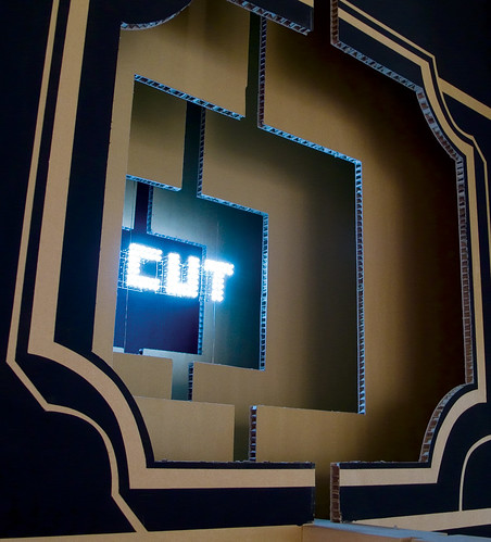
Top: Big Type Says More, a typographic installation for ‘Cut for Purpose’, an exhibition at Museum Boijmans van Beuningen, Rotterdam, 2006. Design: Ryan Pescatore Frisk and Carelijne van Middelkoop, Strange Attractors. The designers explain: ‘Over the course of five weeks, using industrial handheld jigsaws and paint, we manually produced an installation five layers thick, 2.83m high and more than 17m wide.’
First published in Eye no. 68 vol. 17 2008
Eye is the world’s most beautiful and collectable graphic design journal, published quarterly for professional designers, students and anyone interested in critical, informed writing about graphic design and visual culture. It is available from all good design bookshops and online at the Eye shop, where you can buy subscriptions and single issues.

