Summer 2021
Word play

Sarah Boris
New North Press
Richard Ardagh
Graham Bignell
Graphic design
Posters
Typography
Sarah Boris’s letterpress collaboration with New North Press reflects the turbulence of 2020.

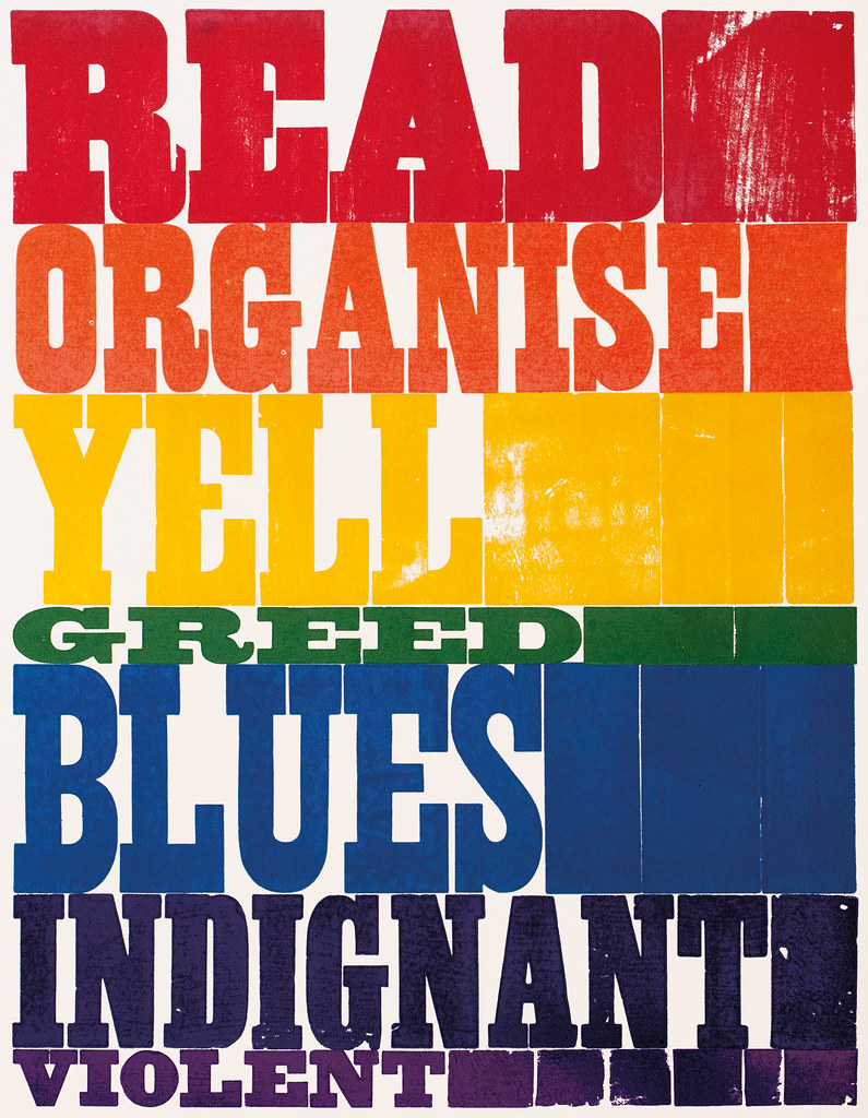
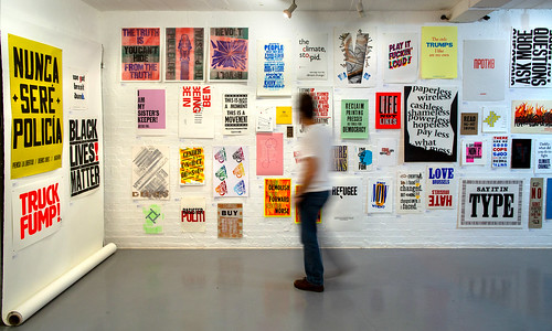
The colourful urgency of this letterpress poster by Sarah Boris grabbed the attention of anybody lucky enough to visit ‘Reverting to Type 2020: Protest Posters’ during its disrupted run at London’s Standpoint Gallery. The 200-plus posters included 26 collaborations between curators Richard Ardagh and Graham Bignell of New North Press (NNP) and guests such as Extinction Rebellion’s Art Group (see Eye 100), comedian Stewart Lee, political artist Peter Kennard, an anonymous asylum seeker and Sarah Boris, who relished the opportunity to work in New North Press’s letterpress workshop, which she describes as magical. ‘There’s something really inspiring and immersive in this space,’ she says.
Right. ‘Reverting to Type 2020: Protest Posters’ at the Standpoint Gallery, London, 2020-21. Installation photo: Alice Doušová.
Top. Untitled, letterpress poster by Sarah Boris, printed with New North Press, 2020, dimensions 500 x 655mm.

Many of the collaborations were conducted remotely because of the pandemic, but Sarah Boris, a Swiss / French / English designer-artist, was free to spend the time she needed there. ‘The piece wouldn’t have been what it was if I hadn’t spent time in the studio playing with all the wood type,’ she tells me when I chat to her and Ardagh about the project.
‘I was struck by the rainbow that had been chosen as a symbol of hope during Covid,’ she says, ‘and so I kept thinking about the rainbow and the idea of spreading hope rather than protesting.
‘Then, when I was laying out the letters, they were all shifted around, and instead of having “Orange” I had “Organise”, and with “Yellow”, I couldn’t find the “o” so it became “Yell” – these accidental words that echo the colours. They came from handling the wood type, almost like playing Scrabble.’
The choice of words, closer to concrete poetry than a slogan or sentence, reflects the turbulence of 2020. The other protest posters in the exhibition, whose run was delayed several times and then abruptly truncated, raged against everything from Trump to Brexit, with global warming and Black Lives Matter as prominent themes. The walls reverberated with powerful, printed work from Ben Blount, Armina Ghazaryan, Dennis Gould, Alan Kitching, Helen Ingham and many more. Thanks to an Arts Council grant, Ardagh has made a website (revertingtotype.com) that extends the show’s global reach.
Boris enjoys the limitations of letterpress, the way her choices of wood letter, type sizes and words were shaped by what was available at NNP. ‘For example “Greed” is squished between the others, and the more positive words are on the more luminous side of the spectrum,’ she says. ‘One important part of the collaboration was when we mixed the colours with Graham. Sometimes you just give Pantone swatches to a printer and you expect the colour to be this or that. The process of being there really changed the colours.’
The handsome exhibition catalogue designed by Richard Ardagh Studio, was printed by Dennis Maps in Frome, Somerset, and folded like a map. It was published alongside Long Primer, a booklet of essays and interviews with the poster-makers in the show.

John L. Walters, editor of Eye, London
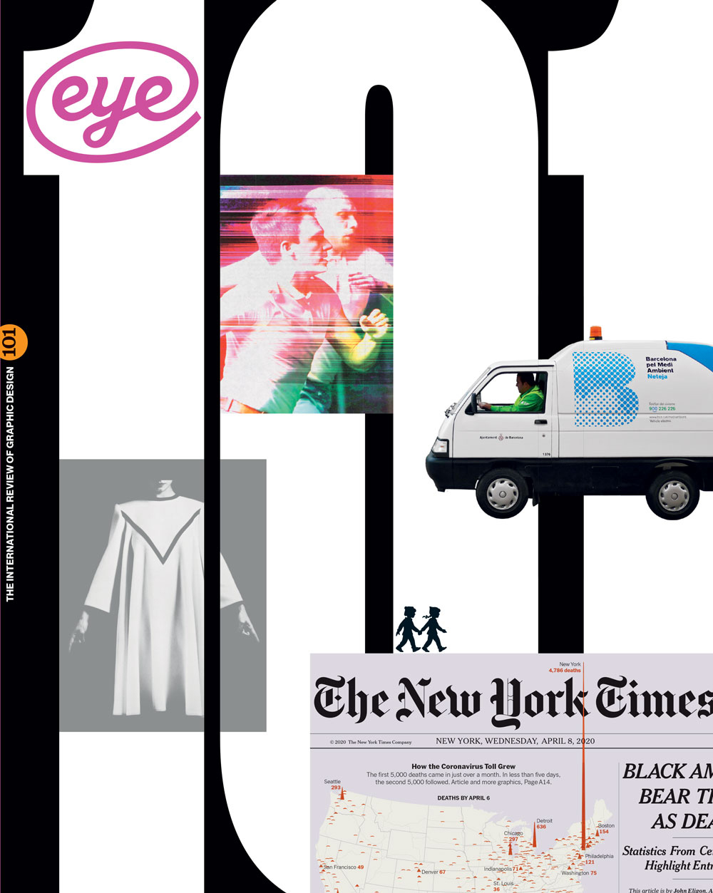
First published in Eye no. 101 vol. 26, 2021
Eye is the world’s most beautiful and collectable graphic design journal, published for professional designers, students and anyone interested in critical, informed writing about graphic design and visual culture. It is available from all good design bookshops and online at the Eye shop, where you can buy subscriptions and single issues.

