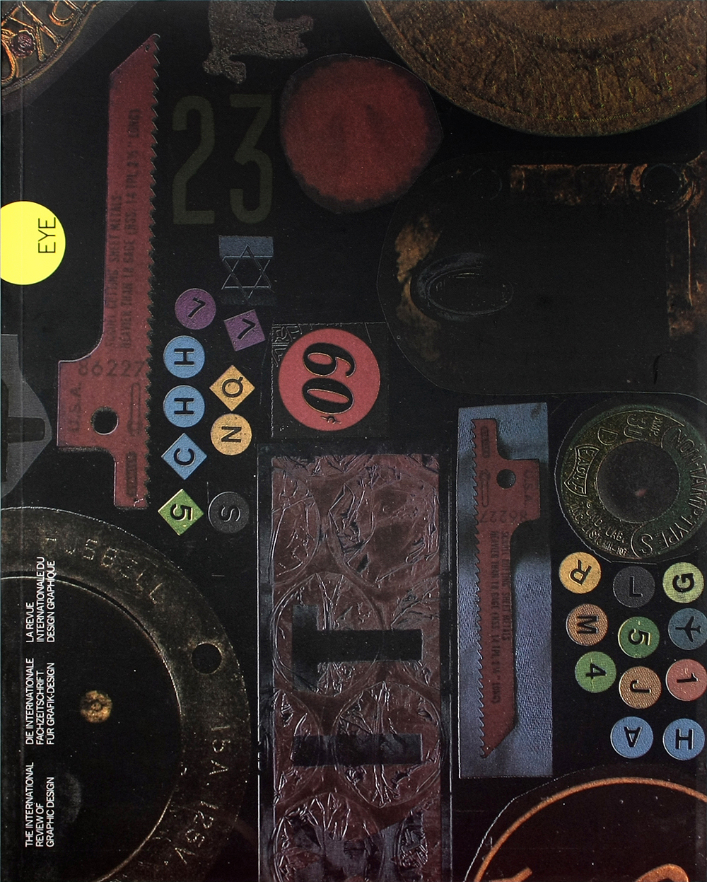
Winter 1990
A grid for all occasions
Design: Vignelli
Essays by Germano Celant, Mildred Constantine, David Revere McFadden and Joseph Rykwert, Rizzoli, £37.50Lella and Massimo Vignelli design by the grid, but they also live and work by the grid. To visit the offices they created for themselves on Tenth Avenue, New York, is to enter a temple of visual enlightenment from which disorder has been banished. Vignelli design is a highly cultivated bloom, pruned into discipline. One might complain that the pair were guilty of arid perfectionism if the results were not so ravishing.
Massimo Vignelli has often lamented graphic design’s lack of theory. ‘Without history, without theory and criticism, our profession will never come to define itself,’ he once said. But the Vignellis’ thick new book about themselves contents itself with being an unusually spectacular practice brochure. From first sight of its cover (a reprise of their earlier book for Knoll), it is clearly a Vignelli-conceived and designed production rather than the independent venture that a real piece of history, theory or criticism would demand. Apart from captions, text is restricted to four short essays by contemporaries and friends. Exhibitions are listed, but there is no bibliography, making the book a poor tool for the student or researcher.
The Vignellis’ guiding principle is simple to state (it takes them only a page), but considerably harder, in the age of the specialist, to implement. ‘A designer,’ they write, ‘should be able to design anything, ‘from the spoon to the city’.’ Although they both trained in Italy as architects, the Vignellis have not so far managed a city or even a building, but they have designed furniture, interiors, tableware, glassware and cutlery, as well as graphics of exceptional purity and intelligence. Massimo takes the lead in two-dimensional design, Lella in objects and interior design.
To their wide-ranging brief of Vignellis bring a trinity of goals: discipline, appropriateness and ambiguity. The last quality, which became a feature of their graphics (and furniture) in the 1980s, is the most interesting. If Massimo Vignelli still talks about the time he crumpled and mailed a tissue paper invitation to an exhibition of Vignelli work, it can only be because the assault on linearity, rationalised in the book as an attempt ‘to demystify the whole rhetoric of formalism’, was a cathartic release after years of adherence to the rules of the grid. To the programmatic functionalism of the 1960s and 1970s, the manoeuvre added a more than welcome frisson of uncertainty.
Vignelli design really comes into its own in the procession of information. Large-scale public projects, such as the National Park Service publication programme (1977), are models of organisational clarity. Massimo Vignelli’s designs for books, magazines and newspapers (Skyline, Oppositions, American Heritage, Architectural Record) are exemplary exercises in visual system-building. Anyone considering a career in editorial design could learn from their architectural sense of structure, their finely attuned variations of pace and scale, and the fluidity with which they organise and interpret content.
There are times, however, when the Vignellis’ obsession with graphic form tips over into formalism. A caption insists that their 1970 redesign of the New York subway map is ‘beautiful’ and, considered purely on the level of aesthetics, it is. But the map is not as legible, or usable, as the more conventional design related to the city streetplan that replaced it in 1979. Similarly, if Massimo Vignelli intended the use of Century Expanded Italic body text to give Design: Vignelli a certain classical hauteur, it must be counted a success. However, it also makes the book a good deal less readable than it could have been.
The Vignellis’ imperial urge to clarify has lately spread to that most unruly of media, television. The designers’ graphic programme for Tg2, an Italian newscast, reinterpreted TV’s unbroken image-stream as a kind of moving page. ‘We wanted to put a stop to all the nonsense by eliminating “special effects”, preserving the integrity of the printed word on the screen, and creating a meaningful relationship between words and images,’ explain the Vignellis. In practice, this meant dividing the screen into a central image band, and solid information bands carrying continuous details of names and locations. Other Tg2 programmes were restructured along the same lines.
It comes as no surprise to learn that Tg2’s resident graphics department was less than impressed by what must have looked like a complete misunderstanding of the medium. According to the Vignellis, they flatly refused to co-operate. The channel went ahead, though, and implemented proposals that included studio lighting modelled on Caravaggio’s paintings and austerely minimal sets not so different from the Vignelli’s New York offices. It begins to look as though this indefatigably tasteful duo might succeed in imposing the grid on the visual chaos of television after all.
Rick Poynor, writer, Eye founder, London
First published in Eye no. 2 vol. 1, 1991
Eye is the world’s most beautiful and collectable graphic design journal, published for professional designers, students and anyone interested in critical, informed writing about graphic design and visual culture. It is available from all good design bookshops and online at the Eye shop, where you can buy subscriptions and single issues.

