Spring 2009
A life in parallel columns
Adrian Frutiger Typefaces: The Complete Works
Edited by Heidrun Osterer, Philipp Stamm, Swiss Foundation Type and Typography<br> Birkhäuser, £79.90, €99.90<br>

Adrian Frutiger (Switzerland, b. 1928) is one of the most important type designers of the latter half of the twentieth century (see ‘Reputations’, Eye no. 31 vol. 8). His Univers was the first rationalised type system; his OCR-B broke new grounds in automatic character recognition; and his alphabet for the Paris airport is a milestone of contemporary type design. This book, compiled in close collaboration with Frutiger, retraces his life through his typeface creations in chronological order. As Frutiger’s career spans all the different typesetting technologies – from lead composition to the current OpenType digital font format – it also is a unique document of the practice of type creation from the 1950s to the present day.
The book as an object is quite impressive. The oversized, heavy tome – casebound in a hard cover covered with red cloth, with a stylishly understated uncoated dust jacket – rests nicely in one’s lap. It is beautifully designed by Feinherb, Visuelle Gestaltung (aka Philipp Stamm and Heidrun Osterer). The functional layout combines its parallel narratives and the extensive image captions into one coherent flow.
The quality of the content is amazing. After an initial section focusing on Frutiger’s early life and education, each chapter is dedicated to a typeface – ranging from established classics over lesser-known releases to so-far-unpublished projects. Each typeface is critically assessed in interviews with Frutiger and placed within its context. The typefaces are comprehensively documented, including creation history, technical specifications and measurements, design details, comparisons with similar or related typefaces, release history, and so on.
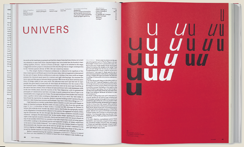
India ink drawings of assorted Univers characters with pencilled annotations and corrections. The book shows hitherto unseen production drawings and previously unpublished type design projects.
Top: Spread from Adrian Frutiger Typefaces: The Complete Works.
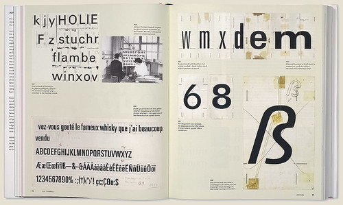
With 1000-plus illustrations there is plenty to look at. The images are exceptional and beautifully reproduced. They include some real gems – sources of inspiration, early sketches and production drawings, reproductions of vintage advertisements and original specimens, photographs of typefaces in use, and numerous sample settings. Reading the book is very much like uncovering a long-lost treasure, as a significant number of them are previously unpublished. Seeing for the first time the fold-out reproducing the India ink drawing of an early sans serif, dated February 1950, complete with pencilled annotations and corrections, sent shivers down my spine.
When approaching a highly specialist area like type design one could easily end up with an obtuse and hermetic volume. Yet the editors have succeeded in making it both accessible for graphic designers and enthusiasts with only a cursory knowledge of typography, and relevant and insightful for experienced typographers. They managed this by inserting short technical sections that offer background information on the relationship between the design and production of typefaces, to help non-experts follow the more technical discussion of type design and production in the main chapters. The book also showcases Frutiger’s logos, which are gathered on separate pages in between the other chapters. The end pages feature comprehensive notes and lists.
Yet it is not just the quality of content that makes this a remarkable document. The main text has been distilled from monthly conversations the editors had with Adrian Frutiger over a two-year period. They also carried out extensive research in specialist magazines, archives, libraries, museums and collections in several countries. They could have combined these two elements into one text, but instead opted for a parallel structure, with the interviews in the main column and their academic research in a narrow column alongside.
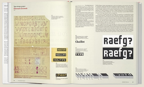
Element-Grotesk is a modular system which allows the user to build characters using basic ‘bricks’ – similar to fontstruct.com.
Keeping these conversations pretty much unchanged was nothing short of a stroke of genius. Apart from minor edits – ‘transforming the transcripts into proper German’, as Frutiger explains it – these are his own words you are reading (here rendered into English by a team of four translators). It genuinely feels as if you are listening to the master himself talking; not in an auditorium but at his kitchen table, at home. He relives his creations, putting his design decisions into context and explaining the rationale behind them, criticising the recent tampering with his work, pointing out significant details and bringing up anecdotes involving household names such as A. M. Cassandre, Jan Tschichold, Akira Kobayashi and the like. The reader is irrevocably drawn into the story, and it makes for an engrossing read. I cannot overstate how valuable and important this book is, both for type novices and typographic aficionados. Thoroughly researched, and extensively documented and illustrated, this weighty volume offers an unprecedented insight into the creative mind of one of the giants of twentieth-century type design.
Not only is this arguably the most important type-related book of the past decade(s), it also considerably raises the bar for future publications in the area. This celebration of the life and career of Adrian Frutiger is a glorious achievement, and a definite must-have.
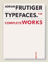
Cover from Adrian Frutiger Typefaces: The Complete Works.
Yves Peters (Bald Condensed), graphic designer, typography writer, Ghent, Belgium
First published in Eye no. 71 vol. 18 2009
Eye is the world’s most beautiful and collectable graphic design journal, published quarterly for professional designers, students and anyone interested in critical, informed writing about graphic design and visual culture. It is available from all good design bookshops and online at the Eye shop, where you can buy subscriptions and single issues.

