Spring 1997
A monument made of money

thinkbook
Irma Boom and Johan Pijnappel<br>SHV Holdings, not for sale

It came in a cardboard box of about a cubic foot, containing a smaller, rather clumsily folded corrugated box. I knew right away what it was. Five years in the making, it had been gossiped about and commented on many times in the past six months. It had caused the impact of a small earthquake in the world of Dutch graphic design and had generated interest outside it, although few people have actually seen it. It is not for sale and only a few thousand have been printed. How to review, or adequately describe, such an object? What terms, what frames of reference, should be applied?
This is a publication that commemorates the centenary of one of the Netherlands’ largest multinationals, SHV – a holding company owned by one family, the Fentener van Vlissingens, since it began. The Dutch public knows very little about SHV or its activities and this object is similarly mysterious. Its pages form a daunting stack of almost ten centimetres. It has no obvious title, no page numbers, no table of contents, no chapters, no index, no colophon. Its chronological structure runs in reverse.
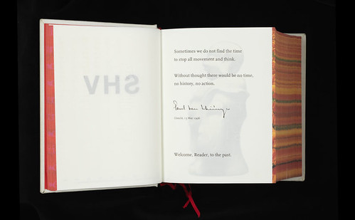
Spread from SHV’s thinkbook 1996–1896, 1996. Design: Irma Boom.
Top. Cover of SHV’s thinkbook 1996–1896, 1996. Design: Irma Boom.
What Irma Boom and her co-editor, art historian Johan Pijnappel, describe as a ‘study,’ focuses on the most salient examples of the SHV ‘mentality.’ The project was created in collaboration with SHV chairman Paul Fentener van Vlisseingen and his personal style can be recognised in its foreword: ‘Sometimes we do not find the time to stop all movement and think. Without thought there would be no time, no history, no action. Welcome, Reader, to the past.’ The past, as we experience it here is huge and amorphous. The book’s hidden title is thinkbook, but the thought that explains this past verges on the imponderable.
thinkbook contains three kinds of information: pictures, original documents – internal memos, minutes of meetings, price lists and press releases – and newly typeset texts in English. Text and pictures each take up roughly half of its 2,136 pages. Scattered throughout are questions set in larger type: ‘Is this a question for you?’… ‘Where do our emotions separate from our thinking?’… ‘Has change produced progress?’ The typographic presentation is elegant and reserved but there is no indulgence in typographic play. The layout is conservative, with one exception: the margins are extremely small.
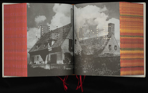
Spread from SHV’s thinkbook 1996–1896, 1996. Design: Irma Boom.
The illustrations – also taken from SHV’s archives – rarely have captions. All are covered with a fine horizontal screen rendering them slightly out of focus, as if viewed on a television screen. The colours are often unnatural. There is an impressive series of photographs of company workers taken in a coal mine around the turn of the century. But these people have no names. The people with names are the shareholders and their families, transfigured in pale, heavenly blue.
thinkbook is a monument built to withstand time, but in some ways it is like a newspaper. It records the economic history of trade and commerce and, like a newspaper, shows social actions and offers public information about daily life. But there are big differences, too. The material in SHV’s book is from an everyday reality that few people outside the company witnessed at the time, and even now, just as few will have access to it.
With a few exceptions, the text was not written specially for the book. Journalists, on the other hand, write articles and take pictures with the intention of publishing. They comment, interpret and create context for understanding the facts they present. This book looks within, but does not help the reader to discover, understand or interpret what is on offer. It gives no background, or comment – other than through the selection of the material and its design presentation – and provides no external frame of reference. The pages bear watermarks with hidden phrases such as ‘KEEP THINGS SIMPLE,’ but in this and other ways the book is a contradiction in terms.
Spread from SHV’s thinkbook 1996–1896, 1996. Design: Irma Boom.
thinkbook reveals and conceals at the same time. It presents a linear history (albeit in reverse), yet cloaks it in an unstructured abundance of pictures, colours, shapes and decoration. It is both prosaic and lofty, vulgar and poetic. It talks about contracts, turnover, dividend, ships, machines and liquid gas, while posing questions of would-be philosophical import. To my surprise, the design of the book is neither adventurous nor surprising. It is beautiful, but in a fin de siècle sort of way. There are technically daring tricks such as the printing of a poem on the side of the book. The paper is cotton and feels superb and the printing is spotless. But enjoyable, expensive, or experimental? Not really.
Of course, it must have been a pleasure and an adventure for the designer and art historian. Perhaps compliers and client hoped that confronting the world of economics with the contrasting concerns of aesthetics might help to position and explain entrepreneurship as a cultural phenomenon. For me, though, the gap between the two worlds remains too wide. Here, archaic pomp and power are aestheticised by the application of the intrinsically modern and democratic means of the printing press.
Irma Boom and Johan Pijnappel took on a great responsibility when they set out to document the history of this reticent multinational. They put their professional skills in the service of a commercial commissioner – as designers often do – but they did not maintain sufficient distance between themselves and the client, who in this case also happened to be their subject. In the end, Boom and Pijnappel made the classic ghost-writer’s mistake. Like moths, they were captivated by the blinding light that this great company and its charismatic leader emit. They flew too near to the centre of power.
First published in Eye no. 24 vol. 6, 1997
Eye is the world’s most beautiful and collectable graphic design journal, published quarterly for professional designers, students and anyone interested in critical, informed writing about graphic design and visual culture. It is available from all good design bookshops and online at the Eye shop, where you can buy subscriptions and single issues.


