
Winter 2017
A sharp eye for Brazilian design
Brasil Hoje: Como se pronuncia design em português?
MUDE at Palácio Condes da Calheta, Jardim Botânico Tropical, Belém, Lisbon, Portugal<br> Curated by Frederico Duarte<br> 24 September – 31 December 2017<br>
The short title of this exhibition – ‘Brasil Hoje’ [Brazil Today] – gives an idea of its ambitions, which is to cover nearly 100 objects, projects, concepts and books made by contemporary Brazilian designers from all over this vast, often misrepresented country. The long title, which translates as ‘How to pronounce design in Portuguese?’, continues a question first asked by MUDE’s 2014 exhibition of Portuguese design.
The exhibition’s contents – 49 projects and 45 books – embrace digital design, street art, political action, type design and typography, product design, documentary, historical interpretation, design education, posters, editorial design, packaging and architecture – just about everything the contemporary practitioner is called upon to make. Curator Frederico Duarte has devoted an impressive level of critical scrutiny and energy to this big show.
As a Portuguese visitor to Brazil, Duarte is an outsider who speaks the language, and he has been able to approach the materials from first principles, documenting the form, the brief, the context and the processes behind each element. There is little that could be said to be in any existing design canon. Despite the breadth of geography, sector, style and manner, ‘Brasil Hoje’ has a sharp focus on the way design can affect the lives of ordinary people, including schemes for recycling water, a crutch and a lightweight washing machine for low-income families.
On the staircase, before you reach the main exhibition, visitors encounter the work of Coletivo Projetação, founded during the Rio demonstrations of 2013, and an example of ‘light-touch’ graphic activism, using political typographic video projections to make a mark on public space.
José Antônio Verdi’s map for Belo Horizonte’s BRT (Bus Rapid Transit) system reveals what Duarte calls the ‘failure of public-private partnerships in Brazil’. The city council’s own bus service was originally represented on the map by a bright blue line, but its tint was reduced by 30 per cent at the request of the client – the private transport operators – so that it didn’t ‘outshine’ their commercially run services.
An installation to mark the achievements of Escola Superior de Desenho Industrial (ESDI), the world’s first Portuguese-language design school (established 1962) reveals its current crisis. Its parent body, the State University of Rio Janeiro (UERJ) is in dire straits, with scholarships and professors’ salaries remaining unpaid for several months. The official start of the new term was suspended indefinitely at the end of July, but students and teachers still occupy the building. (See Eye Education, pp 14-15.)
The speculative, dystopian vision of ‘Brasil, Julho 2038’ was presented onscreen alongside a single small artefact – a sinister ID card that includes DNA and medical details to expose each citizen’s genetic risk group. Designers Luiza Prado and Pedro Oliveira, who are engaged in doctoral research at the Universität der Künste Berlin, envisage the social and political tensions Brazil might face should a highly conservative and neoliberal coalition rule the country in twenty years’ time.
‘Argonautas’ books on anthropology published by Ubu, founded by Florencia Ferrari, Elaine Ramos and Gisela Gasparian in 2016.
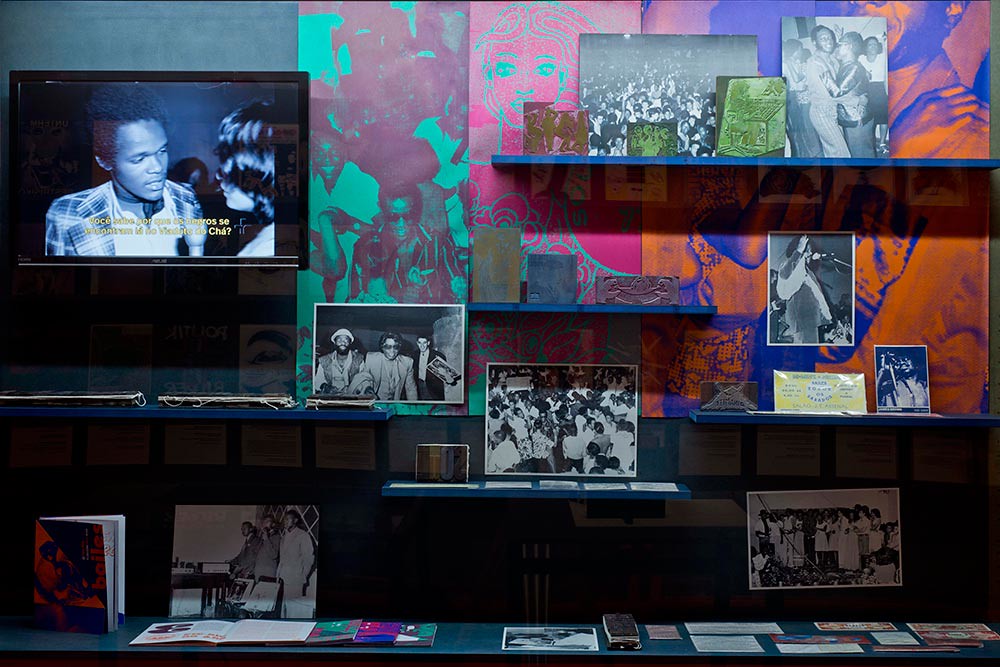
Top: An installation at ‘Brasil Hoje’ for Danilo de Paulo’s fanzine series Bailes: an immersion into the black dances of the 1960-70s in São Paulo.
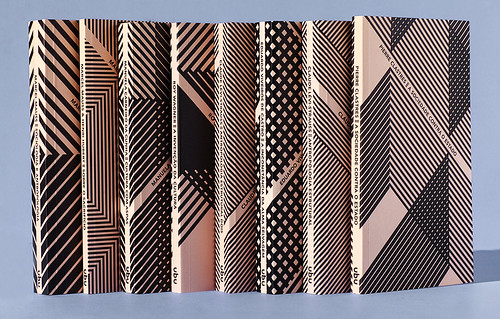
‘Brazil Hoje’ is not all doom and gloom. On a table are all the books released to date by Ubu, a new publisher that sprang from the ashes of Brazil’s former leading design publisher, Cosac Naify. Founded in September 2016 by Elaine Ramos, Florencia Ferrari and Gisela Gasparian, Ubu has already re-published some significant design books, starting with Design para Um Mundo Complexo [Design for a Complex World], by Rafael Cardoso, described by Duarte as ‘the best book on design written in the Portuguese language’.
There are essentially optimistic projects such as UnB Office and UnB Pro, Gustavo Ferreira’s free typefaces for the University of Brasília, and be.bo’s multicultural design for the beauty chain quem disse, berenice?. This illustrative identity rubs shoulders with forward-thinking commercial ventures such as SOU (designed by Questto|Nó and Tátil Design), which aims to revolutionise shower gel and shampoo packaging by making it less wasteful. DoDesign’s gold-foiled packaging for Tupyguá honey, not recognised as genuine in Brazilian law, makes a subtle protest.
‘Bailes’ is a joyful research project mounted by Danilo de Paulo, a display of photos and ephemera that pays tribute to the discotecários and the black dance music culture of 1960s São Paulo.
There’s a partial recreation of the cardboard installations for the Brazilian pavilion at the 2013 Frankfurt book fair, which challenged the ‘exotic’ stereotypes often associated with Brazil. Continuing the literary theme, another big panel shows Rico Lins’s exuberant covers for KulturRevolution, a twice-yearly journal of literary theory published by the University of Bochum, Germany. Lins, with studios in both Rio and São Paulo, has designed every cover since the journal’s foundation in 1982, so we see the evolution of techniques from analogue to digital design for print as well as the trajectory of Lins’s eclectic approach to design and illustration.
An important element in the exhibition’s final room is a reading room, with a terrific display of Portuguese-language books, plus a bookshop that greatly extends the reach of ‘Brasil Hoje’. The selection includes Capas de Santa Rosa and Timespaces, about the environmental designer Muti Randolph.
The Home Project Design Studio’s exhibition design eschews a ‘white cube’ aesthetic in favour of MDF panels stained with muted colour pigments and alcohol. Home Project’s Álbio Nascimento sought to ‘give dignity’ to a humble material; these warm surfaces help establish a different mood for the exhibition within the chilly, colonial splendours of the Palácio Condes da Calheta, MUDE’s temporary quarters.
Coletivo MUDA’s Tropical Molotov commission for the new Aquilino Ribeiro Machado Park, on Avenida do Brasil will not make its mark in full until the exhibition is nearly over. The Rio-based Coletivo is known for its unique street art, made not from spray paint but ceramic tiles, a quirkily appropriate way to speak design in the accents of both Brazil and Portugal.
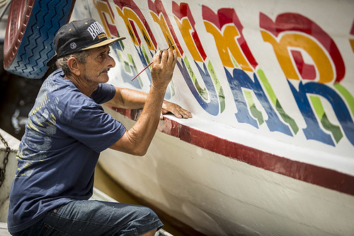
Ramito Pintor featured in Fernanda Martins’ Letras Que Flutuam [Floating Letters], a 2017 documentary about Brazilian signpainters. Photo: Nailana Thiely.
John L. Walters, editor of Eye, London
First published in Eye no. 95 vol. 24, 2018
Eye is the world’s most beautiful and collectable graphic design journal, published quarterly for professional designers, students and anyone interested in critical, informed writing about graphic design and visual culture. It is available from all good design bookshops and online at the Eye shop, where you can buy subscriptions and single issues. You can see what Eye 95 looks like at Eye Before You Buy on Vimeo.