
Summer 2014
A small ‘M’ modern master
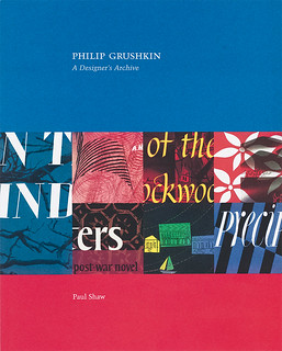
Philip Grushkin: A Designer’s Archive
By Paul Shaw<br> Glenn Horowitz Bookseller, Inc., $25<br>
The history of graphic design has many gaps and omissions, whether through shifting tastes, technology and fashion or straightforward neglect. Philip Grushkin (1921-98) was a prolific mid-century book jacket designer – for Knopf, Random House and others – whose work is rarely mentioned in the graphic design histories and anthologies that cover his era.
One reason for this, suggests Paul Shaw in his book Philip Grushkin: A Designer’s Archive (Glenn Horowitz Bookseller, Inc., $25), is that Grushkin was modern with a lowercase ‘m’ rather than a Modernist. Shaw writes: ‘Grushkin … forged his own brand of modernism, a unique mixture of bold typographic hand-lettering, dynamic background patterns, vibrant colors, and abstract symbolism that owed nothing to the work of Rand, Lustig, or … Herbert Bayer.’
One significant influence, however, was the German-born George Salter (1897-1967), whose book covers Grushkin collected: a selection is shown at the back of the book. Grushkin sought out Salter and studied calligraphy and lettering with him.
What makes this title quite different from other articles or books that plead the case for yet another forgotten figure is indicated by the presence of the word ‘archive’ in the title. The Grushkin archive contains many roughs, comps and mechanicals alongside his finished, printed book jackets. Paul Shaw and designers Kind Company have done a creditable job of displaying the materials in a way that shows us a great deal about the processes and technologies that lay behind the business of making book jackets in Grushkin’s heyday, the 1940s and 50s.
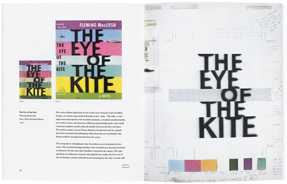
The spread showing the comps, final jacket and mechanical for The Big Wheel is fascinating for its presentation of pre-digital print specification, including spacing corrections and colour notations. A similar spread for The Eye of the Kite (top) includes colour swatches and notes made in blue pencil. Shaw’s useful glossary at the back of the book explains that ‘Non-repro Blue’ is a ‘light cyan color ignored by the orthochromatic film used to make printing plates in offset lithography’.
At the centre of Grushkin’s work was his calligraphy – something about which Shaw (see ‘To the letter’, Eye 75) has specialist knowledge. Much of Grushkin’s hand-lettering is derived from a palette of familiar typefaces – Shaw talks about (for example) ‘capitals indebted to Weiss Initials’ (for The Age of Longing’) or ‘a quirky variant of Ultra Bodoni’ (for The Generous Heart).
Behind the type, Grushkin’s backgrounds are typically abstracted patterns created with an airbrush. However a few photomontages, such as his jackets for Horace Greeley: Voice of the People (1949) and Death in the Wind, (1957) are evidence of the mainstream industry’s shift towards photographic covers.
Paul Shaw, Philip Grushkin: A Designer’s Archive.
John L. Walters, Eye editor, London
First published in Eye no. 88 vol. 22 2014
Eye is the world’s most beautiful and collectable graphic design journal, published quarterly for professional designers, students and anyone interested in critical, informed writing about graphic design and visual culture. It is available from all good design bookshops and online at the Eye shop, where you can buy subscriptions and single issues. You can see what Eye 88 looks like at Eye before you buy on Vimeo.