Autumn 1994
A world of shape and flat colour
Tom Eckersley: His Graphic Work
The London Institute, 11 May to 24 June 1994<br>
The recent exhibition of Tom Eckersley’s posters was the most comprehensive retrospective of his contribution to date. Together with a book published and printed by his colleagues at the London College of Printing (LCP), it constituted a warm and sincere appreciation of his work by his friends.
The exhibition spanned Eckersley’s career from a series for the Royal Society for the Prevention of Accidents in 1942 to the many posters he designed while at LCP. Thanks largely to his own thematic interests, many of the designs, especially those from this LCP days, fit into series: posters for the World Wildlife Fund, the National Business Calendar Awards, for college dances and lectures, even a set of simplified portraits of Hollywood legends intended to be purely decorative. The posters were presented without commentary, so though it is possible to discern a progression within each series, one-off images are difficult to place within any overall scheme.
Tom Eckersley was born in 1914 and raised in Lancashire. He attended Salford School of Art, where he met Eric Lombers, with whom he formed a partnership, moving to London in 1934 to work as freelance poster designers. The 1930s was a remarkable decade for poster design; the form was regarded as the most prestigious area of advertising art and great designers from many countries produced powerful images. Rival Modernist approaches emerged: the painterly (Cassandre, Loupot and Colin in France, Purvis and Kauffer in England) and the typographic (Zwart, Schuitema and Werkman in Holland and Rodchenko in the USSR).
The painterly approach exploited the possibilities of colour lithography, incorporating the dynamism of the Futurist and Vorticist painters and building on the legacy of Cubism. The low points-of-view, outrageous perspectives and blurred images provide a dizzying vision of a modern urban utopia. In the typographic approach, the combination of letters, space and illustration produce an image that works on its own, and, especially, in opposition to the picture posters around it.
The posters Eckersley-Lombers produced before the war, rooted in the designers’ painterly backgrounds, are generally more in tune with the first genre. These early posters are marked by soft contours, subtle changes of tone and a dark palette relieved by bright primary highlights. ‘Scientists Prefer Shell’ (1935), sadly missing from the exhibition, is probably the most accomplished, its night sky in black and blue contrasting with the texture of the combed geological strata and the hard outline of the laboratory glass. The contrast with ‘Winter Shell’ from 1936 could hardly be greater. The flat colours and photomontage of knitted mitten and bold lettering work against the grain of the contoured images of lithography, so the poster remains irrevocably two-dimensional, distinguishing it dramatically from other images of the period.
The Second World War forced Eckersley and Lombers to break their partnership, though Eckersley was able to continue to work alone. A fine series warning against damaged tools, sloppy stacking and foolish practices was commissioned by the Royal Society for the Prevention of Accidents, to be displayed in workshops, factories and garages throughout Britain. Eckersley also produced posters for the Air Ministry and the Post Office. His contribution was such that he was awarded an OBE in 1947 and elected to the membership of the Alliance Graphique Internationale [AGI] in 1950.
Eckersley was appointed head of design at LCP in 1957, but continued with his design work at the same time as teaching, a point of honour inspired in part by his admiration for the Bauhaus. The posters from this period reveal a strongly held set of convictions about simplicity, directness and visual economy. From 1957 onwards he has attempted to create works that use only the same few tools and devices – flat areas of colour, sharp outlines and finely honed economy – to create an illusion of simplicity that many of his students must have come to understand as deeply sophisticated.
Eckersley admits that his association with LCP has afforded him the luxury of being able to design his own style without the compromises that are part and parcel of work in the commercial sector, allowing him to follow his distinctive look to its logical conclusion. Several of the posters are notable for their persistent flattening out of the images, so that they become uncompromisingly two-dimensional, and for their play on depth, produced by a tonal difference created by overprinting colours. This is especially striking in ‘Lincolnshire’ for British Railways (1961), where the volumes of the trees and buildings are set within a determinedly flat plane. A similar effect of space is evident in the cover design for Director (1954), where the torn-paper shapes of the trees and sky contrast with precision cut-outs of the viaduct and train. The majority of Eckersley’s posters since 1960 achieve their effect by denying, ever more rigidly, the volumes and spaces of binocular vision.
Eckersley’s posters create their own world: a world described by flat colours, precise outlines and simplified shapes that we have learned to decode. Nowhere is this more evident than in the ‘Hollywood Greats’ series of portraits. The most successful of these – Harold Lloyd, Groucho and Garbo – show the star by the angle of the head, the shape of the spectacles, an allusion to the corporeal. None of these images would make sense to someone who had no prior knowledge of the subject matter – an assumption that allows Eckersley to take risks in reducing images to their essentials that the world of commercial compromise might not have allowed.
Eckersley’s single-minded approach demands a more analytic treatment than it has been accorded by the organisers of this tribute. Faced with these images, one constantly asks ‘how does that work?’ Unfortunately, neither exhibition nor book attempts to answer the question. Eckersley deserves better.
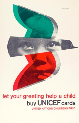
Top: Eckersley’s poster of a bird carrying a message for UNICEF was designed to work in series, 1968.
Paul Rennie, poster historian, Folkestone
First published in Eye no. 14 vol. 4 1994
Eye is the world’s most beautiful and collectable graphic design journal, published quarterly for professional designers, students and anyone interested in critical, informed writing about graphic design and visual culture. It is available from all good design bookshops and online at the Eye shop, where you can buy subscriptions, back issues and single copies of the latest issue. You can also browse visual samples of recent issues at Eye before You Buy