Winter 2016
Activism follows anger

See Red Women’s Workshop: Feminist Posters 1974-1990
By See Red members. Foreword by Sheila Rowbotham. Designed by Claire Mason. Four Corners books, £19.99
How do you channel anger into effective activism? This question remains urgent in an era of media spectacle and ‘clicktivism’. So now is a good time for this history of See Red, the London women’s workshop. Using bold and often funny posters, this radical collective addressed visual aspects of women’s liberation and other struggles against oppression. The book includes hundreds of original works and a vivid account by See Red members of tactics, production processes and premises, collaborations and discussions.
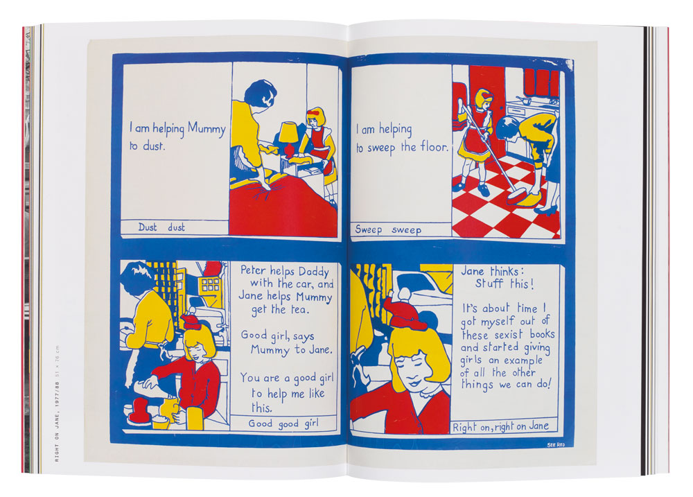
The name is the hook. ‘Seeing red’ evokes both the motivations for making posters and what the audience should feel or take away with them. They wanted their audience to question social oppression and feel armed with the information or tools to harness that anger. This is captured in Right On Jane (1977 and 1988), a parody of the Ladybird children’s books: ‘Jane thinks: “Stuff this! It’s about time I got myself out of these sexist books …”’
Back in 1974, the political ‘left’ didn’t recognise the importance of Women’s Liberation to wider struggles across the world. Even in radical meetings, women were expected to make the tea. See Red believed that ‘the personal is political’– this foundational argument of second-wave feminism enabled issues of sexuality, identity and implicit forms of oppression to be tackled. Women-only groups were needed for these new understandings to emerge, as seen in Sisters! Question Every Aspect of Our Lives (1977). This poster is illustrated with images of the kinds of ‘everyday sexism’ that today are shared on the brilliant website everydaysexism.com.
A core concern was how you combat sexist images of women and promote alternatives – a balance that captures both the anger and hope needed for activism. Questioning negative images and stereotypes exposed the how and where of oppression, and positive and challenging images showed a way forward, as seen in Girls Are Powerful (1979) with its active images of girls doing sport and alternative occupations.
See Red’s visuals used collage and juxtaposition to compare and connect personal experiences and facts. Take a Pill Mrs Brown (1977) combines photography and illustration to show a woman trapped in a pill bottle surrounded by facts about pharmaceutical methods of control.
Influences are clear: the punchy factory rooflines and fists of Atelier Populaire posters from Paris in 1968 (subject of another Four Corners book, Beauty Is in the Street, see Eye 80); and in Protest (1974), the girl spewing images of brides, bras and Miss World riffs off Seymour Chwast’s 1968 anti-Vietnam poster End Bad Breath. However, See Red show a different sensibility to the more commonly published canon of graphic design protest, with its gallery-ready simple marks, ‘one big idea’ and abstract slogans.
See Red has more in common with other co-operative groups in which collective working was essential to developing new modes of expression and demystifying the artistic process, such as Inkahoots or the Post-Film Collective (see ‘Form follows purpose’, in Eye 46, and ‘Up against the wall’ on the Eye blog). It also has something in common with the Whole Earth Catalog, with its philosophy of ‘access to tools’ that informed the Internet generation. Members recall, ‘The themes we worked on were our lives, and the commitment kept us going.’
See Red Women’s Workshop provides a hands-on affirmation of the seriousness of intent, contextualised action and self-conscious reflection so necessary to activism – like a baton to be passed on. There is plenty more to be done.
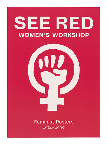
Cover from See Red Women’s Workshop showing the collective’s fist logo, featured on posters and placards.
Top: Spread showing Right On Jane, 1977 and 1988.

Monika Parrinder, writer, Senior Tutor, Royal College of Art, London
First published in Eye no. 93 vol. 24, 2017
Eye is the world’s most beautiful and collectable graphic design journal, published for professional designers, students and anyone interested in critical, informed writing about graphic design and visual culture. It is available from all good design bookshops and online at the Eye shop, where you can buy subscriptions, back issues and single copies of the latest issue. You can see what Eye 93 looks like at Eye before You Buy on Vimeo.

