Winter 2008
Aldridge takes a trip

Alan Aldridge: The Man with Kaleidoscope Eyes
Curated by Nina Due<br>Design Museum, London, 10 October – 25 January 2009The Man with Kaleidoscope Eyes
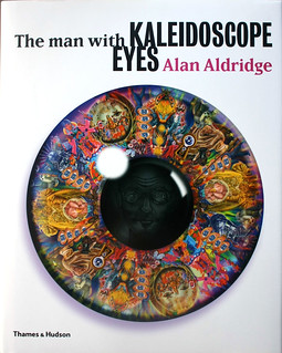
By Alan Aldridge<br>Thames and Hudson, £24.95<br>

How many Sixties were there? There was the decade experienced by the bulk of the population, which involved the everyday drudgery of making a living. Then there was the celebrated decade of social protest, Vietnam and the counter-culture. And then there was Alan Aldridge’s Sixties – featuring the Beatles, Swinging London and painting blue and red circles around naked ladies’ breasts.
There was quite a bit of crossover between them, but Aldridge occupied an ambivalent space – never quite counter-culture; sexy, but not quite alternative. He wanted to make a living, all right, and was unapologetically a graphic designer for hire: his 1960s oeuvre reached a peak with his illustration of the Beatles’ lyrics (see Eye no. 57 vol. 15) but also included designs for Penguin fiction covers, and some terrific advertising and magazine work. No wonder he preferred to talk about himself as a ‘graphic entertainer’ rather than a commentator on his times (a commentator like, say, Robert Crumb – even though both men have since been dubbed with the epithet ‘Mr Sixties’).
The Aldridge career retrospective at the Design Museum and the accompanying book (‘an illustrated autobiography’) are brash, colourful, groovy affairs – as one might expect. They are not interested in contextualising him in terms of ‘the other Sixties’, or indeed in terms of graphic design history. Rather, we are taken on a nostalgia trip; to a time when Strawberry Fields were forever and when it was no embarrassment for a designer to substitute an elephant’s trunk for a man’s dick. Are we entertained? Very much so.
It should be noted that as ‘retrospectives’, both book and show devote considerable space to Aldridge’s post-1960s work, including his best-selling children’s book The Butterfly Ball, his designs for Elton John’s Captain Fantastic and the Brown Dirt Cowboy album, and his more recent forays into branding (e.g. for the Hard Rock Café). But it is his early output for which he will be remembered, and it is this that stands out.
The Penguin covers are beautiful. One 1967 example, for a Clifford Simak time-travel odyssey, sees a mustachioed dandy with a huge clock around his neck riding a rocket-propelled scooter through space. ‘Psychedelic’ is one way to describe it, with the black background accentuating the rich blues, mauves and oranges. How this kind of thing ever got past the Penguin editorial board is a mystery.
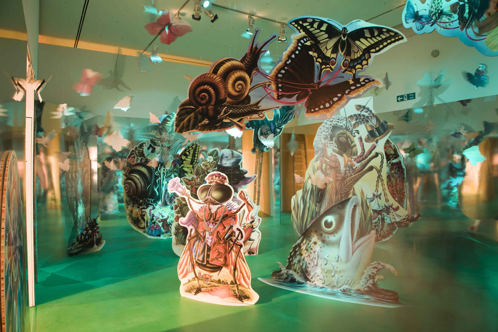
The Beatles illustrations continue this look. Certainly, the floaty, balloon-trousered cartooning style had been in evidence in US underground comix for a while (think Skip Williamson), but the colour work is enhanced by an airbrush’s gently graded tones – so easy to achieve on a computer today but so cool-looking then. The exhibition makes the most of this phase in Aldridge’s career, and is all the better for going all-out for an immersive experience – every inch of space is covered in artwork, including the floors, while Beatles hits are piped through the loudspeakers.
Yet too much of the cosmic-era Aldridge is, well, ‘too much’. The exhibition can feel like a fairground ride at times, and the candyfloss quality of some of the art can lead to a risk of sugar rush. To say it lacks the intellectualism and edge of Crumb (and his ilk) is true, but they were attempting different things. Similarly, to say that Aldridge was simply a ‘house hippie to the middle classes’, as some have, is to betray a snobbery about commercial graphic design.
The book and exhibition tolerate no such criticisms. The former is put together by Phil Baines and thoughtfully arranges the 528 illustrations into a chronological narrative, while the latter, through clever staging, makes a show that by rights should have been at the V&A seem perfect for the Modernist angles of the Design Museum. Both spend too long on Aldridge’s recent work (would he have played ball otherwise?) and both are a tiny bit bland – products fit for hyping in the Sunday supplements. But if you can read them critically, then you emerge with a new respect for a man who successfully navigated the tricky terrain between blowing deadlines and blowing minds.
Top: Installation at the Design Museum featuring Alan Aldridge’s illustrations for The Butterfly Ball and the Grasshopper’s Feast, his 1973 book based on an 1807 poem by William Roscoe. Exhibition design by Morag Myerscough.
Below: The cover to The Man with Kaleidoscope Eyes combines some of Aldridge’s best-known images.
Roger Sabin, writer, lecturer, Central Saint Martins College of Art and Design, London
First published in Eye no. 70 vol. 18, 2008
Eye is the world’s most beautiful and collectable graphic design journal, published quarterly for professional designers, students and anyone interested in critical, informed writing about graphic design and visual culture. It is available from all good design bookshops and online at the Eye shop, where you can buy subscriptions and single issues.

