Autumn 2001
Another self-indulgent design monograph
Stefan Sagmeister, Made You Look
Peter Hall<br>Booth-Clibborn Editions<br>

A wall of Stefan Sagmeister’s work / live apartment in New York bears the handwritten legend: ‘style equals fart.’ This slogan has been the Austrian designer’s mantra for some time, included in his eye-grabbing ‘headless chicken’ poster / programme for the 1997 AIGA conference and dropped into many other artefacts for designers as a kind of signature in-joke. So, appropriately, this is both a stylish and a flatulent book, ‘Another self-indulgent design monograph’ in Sagmeister’s own words and hand, scrawled on the title page above the writer credits and below a little cartoon of a naked person frying a slice of one of their own buttocks.
What makes it more readable and interesting than most designer self-indulgence is the juxtaposition of portfolio images with Peter Hall’s thoughtful text and the designer’s handwritten diary entries. You may feel you have seen enough of Sagmeister’s high-profile work in yearbooks and design magazines, not to mention bits of his body. However, Made You Look makes you think as well, informing the reader how many hours each project took, how much the studio got paid and how the designer grades each project on a scale from 1 (highest) down to 5.
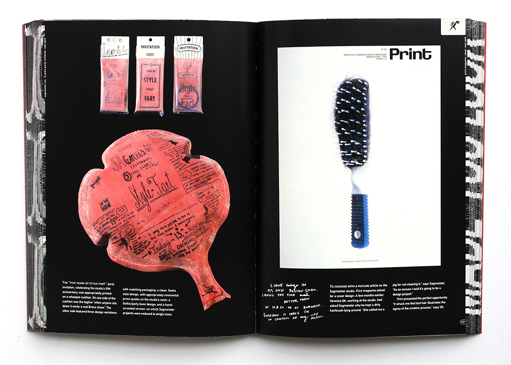
A ‘big idea’, photographic cover for Print magazine is graded a miserable 4, while a fly poster printed to welcome a schoolfriend to New York (‘Dear Girls! Please be nice to Reini’) gets a straight 1. For similar, four-figure fees, Pat Metheny’s Imaginary Day CD (graded 1-2) took a heroic 298 hours, while the notorious ‘cut-up chick’ cover for Pro Pain’s The Truth Hurts (ungraded) took a mere 135. Sagmeister expresses his reservations about the cover’s potential influence on impressionable fans in the aftermath of the Columbine School massacre: ‘I learned that this is very much a matter of context. When the [Jeffrey] Silverthorne image is hanging on the walls of the New Museum of Contemporary Art – which it has – that is perfectly fine. But I really think it is wrong to use as a CD cover.’
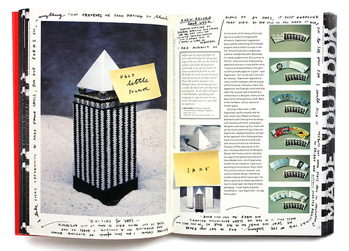
Cairo perfume bottle and packaging (left) and memphis brochure (right), Pratt Institute, New York.
Top: The ‘Five Years of Style=Fart’ invitation (left) and cover design for Print magazine (right), March / April, 1996.
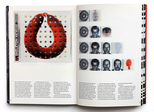
For the Skeleton Key album Scratch.
Back of the poster for the AIGA national conference themed ‘Jambalaya’, New Orleans, 1997.
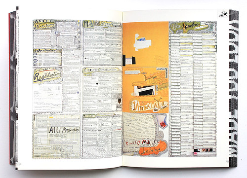
Hall tells the five-chapter story of Sagmeister’s gradual progression from Austrian high-flyer to born-again New Yorker (via the Pratt Institute, Vienna and Hong Kong) in a straightforward manner, using descriptions of education, work, clients and materials as a vehicle for more general discussions of style and content. Testimonials from the likes of David Byrne and Jan Abrams are inserted from time to time: you feel that Sagmeister is easily bored, and worried that the reader will go away unless something new and arresting is introduced on each new spread. And the agonised diary entries, frequently returning to Sagmeister’s theme tune: can graphic design touch someone’s heart? Answers from designers - inspiring, touching, a bit sad – are inserted vertically in tiny print near the inside margins of some pages. ‘Playgirl magazine, 1978,’ says Chip Kidd. ‘The Beatles’ Sgt. Pepper cover,’ says Paula Scher. ‘Not graphics, but pictures of great gestures,’ says Uwe Loesch. Another little bonus is the occasional insertion of a totally irrelevant prose passage, such as the one involving Ted and ‘stunning blonde’ Sheri, perhaps just a trick to make sure readers are paying attention.
In a scrawled diary entry (near a floppy disk label reading ‘We are happy to guarantee 100% Phillippe Starck free offices’), Sagmeister sets out his guiding principles. ‘Receiving a piece of graphic design is like going on a date. If my date turns out to be dressed very well (=has style) I am most certainly happy. And if she is beautiful (=great form) well, all the better. But if it turns out she has nothing to say (=bad content, no concept) or has a mean heart, it is going to be short relationship anyway.’
Neither Sagmeister or Hall follows up this statement by discussing the one-night stands that keep designers in work and win awards. The self-grading system implies that Sagmeister has had several less than meaningful graphic experiences – with CD-ROM packaging, for instance. Made You Look progresses inexorably towards Sagmeister’s plan, in mid-2000, to close the studio for a year so that he can work on personal projects and get a little closer to his goal of touching someone’s heart. By opening up his own studio practice, his mind and his heart, Sagmeister has put his career on the line, and some may think that there isn’t quite enough outstanding work (even by the designer’s own grading system) to justify a book as heavy and expensive as this. It is a book that has all the irritating faults of every other design monograph, but these are redeemed by a heavy dose of humour and humanity. The adventures of Socko (a Pratt assignment) made me laugh out loud, as did his Frightfully Real! photo story about a typical day in the life of a designer, complete with clients who want ‘more bang in the explosion’ and a bad case of self-administered spray mount. Sagmeister and Hall could have justifiably called their book Made You Smile, and that’s more than a smile in the mind.
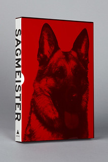
Sagmeister: Made You Look written by Peter Hall, designed by Sagmesiter Inc., 2001.
John L. Walters, Eye editor, London
First published in Eye no. 41 vol. 11, 2001
Eye is the world’s most beautiful and collectable graphic design journal, published quarterly for professional designers, students and anyone interested in critical, informed writing about graphic design and visual culture. It is available from all good design bookshops and online at the Eye shop, where you can buy subscriptions, back issues and single copies of the latest issue.

