
Winter 2017
Artists’ letters
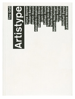
Artistype
By Tino Graß<br> Grass Publishers, €29.80<br>
Despite the importance of words and letters in the history of art, few critics – and fewer books – have paid serious attention to the role of typography in fine art. This new collection of interviews and statements by contemporary artists using words and type is a welcome arrival in this surprisingly sparse critical landscape.
Artistype (Tino Graß, Grass Publishers, €29.80) is a small-format, 160 x 120 x 20cm, collection of interviews with fourteen contemporary artists, including Fiona Banner, Ed Ruscha, Lawrence Weiner and Liam Gillick. In his introduction, designer / typographer Tino Graß states that art and visual communication ‘employ the same tools … which then lead to similar or identical forms of expression.’
Graß’s six questions – almost exactly the same for each artist – interrogate the artist’s creative process and the importance of context. Ed Ruscha reveals that he designed his own typeface, Boy Scout Utility Modern, with the aim of achieving a neutrality that would ‘suffice for virtually any given situation’. Liam Gillick and Tsang Kin-Wah have similar goals in mind, but take a different route by consciously employing Helvetica and Arial Black – typefaces they consider ‘raw’ and straightforward, that avoid conspicuous mediation of their messages.
Martin Boyce’s answers are full of insight, as he presents a view of type as an aesthetic and experiential tool of expression that the viewer has then to decipher. Boyce states that: ‘Rather than a functional carrier of information, the works that employ my typography are often a conflation of sculpture and language.’
With a nod to one of the design community’s most currently discussed topics, Graß concludes with the question: ‘What do you think is the future of type?’ The responses are surprisingly well informed and wide-ranging, and bring new angles to this complex conversation.
Presenting, unfiltered, the artists’ own words and interpretations of Graß’s questions offer insights into their work, something not possible in a work of scholarly criticism. However, at times the lack of specificity of the questions fails to illuminate crucial elements of an individual artist’s oeuvre. For instance, Lawrence Weiner (see Eye 29) touches only briefly on the subject of designing his own typeface, introducing new characters to represent physical gestures, an element vital to understanding his use of type as well as appreciating his approach to language.
While Artistype cannot be considered an in-depth analysis of the evolution and role of type in art, Graß’s short book achieves what several earlier works, such as Simon Morley’s Writing on the Wall: Word and Image in Modern Art, have failed to do. Artistype discusses typography as a tool for art-making from the viewpoint of graphic design, which makes it unusual and refreshing. And while it leaves the reader wanting more, it is a pleasant and revealing read that may invite more in-depth conversations between artists and designers.
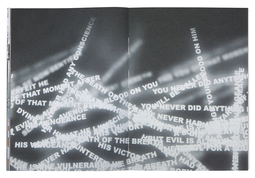
Cover and spread for Artistype by Tino Graß.
Arianna Tilche, designer, London
First published in Eye no. 95 vol. 24, 2018
Eye is the world’s most beautiful and collectable graphic design journal, published quarterly for professional designers, students and anyone interested in critical, informed writing about graphic design and visual culture. It is available from all good design bookshops and online at the Eye shop, where you can buy subscriptions and single issues. You can see what Eye 95 looks like at Eye Before You Buy on Vimeo.