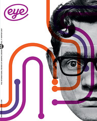
Winter 2007
Back to our roots

Hands On: ATypI Brighton 2007
<br>Faculty of Arts and Architecture, <br>University of Brighton<br>2–16 September 2007The theme of the 51st ATypI conference, ‘Hands On’, provided an opportunity to look for inspiration and innovation beyond the all too familiar route of new technology. By looking back, down various under-explored avenues – be it stone-carved lettering, calligraphic penmanship, traditional sign painting, architectural interventions – this receptive audience of type aficionados was offered much food for thought to tempt their refined palates.
For many, the man of the moment was local boy Edward Johnston, who, along with his colourful comrade Eric Gill, lived in the village of Ditchling, a uniquely creative environment just outside Brighton, from where he commuted daily to teach at the Royal College of Art. Gerald Fleuss pondered on how Johnston’s research into the working methods of medieval scribes might be relevant in this digital age, and Richard Hollis presented a close textual analysis of Johnston’s highly influential book, Writing & Illuminating, & Lettering (1906). Hollis pointed out Johnston’s concern with ‘elements that keep a reader reading’, with using writing to emphasise speech, and his recommendation that illustration be integrated into print design so as not to be merely a decorative aside. All of these issues are still high on the agenda for contemporary typographers and graphic designers.
Scholarly research was to the fore at this conference; but not simply for its own sake, as lessons were to be learnt. Sumner Stone looked for the origins of sans serif type in Egyptian and Roman letterforms, derived from a system of strokes simplified from pictograms, and named Johnston as having innovated lower-case sans serif. During questions a difference of opinion was voiced by James Mosley, who as the former librarian at St Bride Library, London, may be considered an industry ‘flame keeper’. Mosley pointed out the influence of Greek ‘monoline’ letterforms on the development of sans serif sign-writing and architectural lettering in early nineteenth-century England, and its representation in artworks by sculptors and painters, prime exponents being John Soane and John Flaxman. But, while the public was enthralled by these new forms, as witnessed by letters written to the press, the commercial type foundries ignored such innovations, and it was another century before the printing trade had access to sans serif forms.
In his own lecture, looking at English vernacular letterforms of the eighteenth and nineteenth centuries, Mosley set out to redress an imbalance that he said had ‘impoverished the range of examples for modern makers of letters to draw on’. While recognising Johnston as ‘meaning well’, with his recommended usage of the broad pen for lettering, an aesthetic that translated into a number of popular typefaces, Mosley pointed out that there was an alternative tradition, that of the pointed pen and its ‘swelling line’. Indeed, the work of English calligraphers, engravers and lithographers was so influential in that period that it was formalised as a style known as l’écriture anglaise or la lettera inglese, and became the basis of typefaces designed by, among others, John Baskerville.
Then, by documenting examples of the inaccurate restoration of lettering on historic buildings all over Britain, Mosley demonstrated how a dominant aesthetic can literally rewrite history; his argument being that too close an investment in one option leads to a paucity of alternative examples appropriately used.
Demonstrating how primary research into historical forms may provide a working methodology, and visual inspiration, for contemporary typeface design, Artur Frankowski related his experience of developing a new typeface for Silesia in Poland. Over the centuries, Silesia has been redefined by the political ups and downs of empires, states and their boundaries, and, with its long tradition of coalmining, metalworking and manufacturing, possesses a distinct cultural heritage from the rest of modern Poland. The regional government needed a bespoke display typeface to use on official documents and communications; Frankowski and his team asked, ‘How can we express the Silesian character in a typeface?’ Their solution was to document the visual legacy of written and printed letterforms from the region, in both Polish and German, so they could design within that tradition and produce a typeface with recognisable roots. Frankowski showed slides of blackletter manuscripts, Art Deco architecture, Pop Art signage, locally printed books, and the flags and insignia of trade unions and workers’ parties. The resulting typeface is elegant and decorative, but decidedly eclectic. It has proved so popular with the locals that it now adorns a range of businesses (it was made available free). Meanwhile, a text face is being developed.
By and large conference offerings come in two varieties: the show and tell, an inspirational talk by a charismatic speaker that sets out to entertain; and the learned lecture, that intends to inform but may not be deemed relevant by an audience of practitioners.
At ATypI , however, this mould was broken, as the majority of lectures proved inspirational while demonstrating just how crucial research of all kinds is to establishing a methodology for contemporary type design. And the audience was enthralled, although few questions were asked. Far from signifying apathy, though, it was pointed out that thanks to a profusion of blogs, forums and discussion groups dedicated to typography, the barrier between speakers and audience has been eroded, as the conversations continue long after everyone has gone home.
First published in Eye no. 66 vol. 17 2007
Eye is the world’s most beautiful and collectable graphic design journal, published quarterly for professional designers, students and anyone interested in critical, informed writing about graphic design and visual culture. It is available from all good design bookshops and online at the Eye shop, where you can buy subscriptions and single issues.
