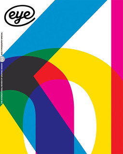
Summer 2012
Bible of babel

2012 European Design Awards
Decodeunicode

The 2012 European Design Awards, the winners of which were announced in Helsinki on 26 May, attracted nearly 900 entries. Founded and run by editor Demetrios Fakinos and logistics expert Jonas Uddman, the awards were judged by a fifteen-strong jury of design magazine editors (including me) and art directors.
The criteria for judging each piece of design, from a wide variety of sectors, were relevance, creativity and quality of execution.
There was some exemplary work, such as Abril by TypeTogether (from the Czech Republic), which won gold in the original typeface category; and Gummo’s Stad van Nederland [Cities of the Netherlands] stamps, which won the Jury Prize. These Dutch architectural stamps use AR [augmented reality] to trigger 3D images of five futuristic buildings when the stamps are brandished in front of a computer’s built-in camera.
Dutch agencies, including Trapped in Suburbia and the ‘agency of the year’, Silo, dominated the awards, but there were strong contributions from all over Europe, such as Tsto’s campaign for the Flow festival in Finland, and the debossed labels for Stina wine from Croatia’s Bruketa & Žinić. The Portuguese studio R2’s ingenious design for an exhibition of sketches by architect Eduardo Souto de Moura also attracted much praise.
‘Best in Show’ was awarded to the 656-page Decodeunicode: Die Schriftzeichen der Welt (Verlag Hermann Schmidt), edited and designed by Johannes Bergerhausen and Siri Poarangan.
The Unicode Consortium sprang from a utopian ambition to encode all the characters in the world’s languages, and Bergerhausen set up the decodeunicode.org website to explain and ‘decode’ Unicode, also making postcards and giant posters (see Eye 64).
This monumental book, made using 66 different fonts and showing 109,242 characters, furthers the cause. Peter Biľak drew more than 2000 missing characters; these are generally displayed on a 16x16 grid in black, with each Unicode number below in a colour. Some characters are enlarged and shown white out of colour in grids of nine, or four, or with just one to a page.
The spreads above, reproduced along with the book’s cover (top left), show Egyptian hieroglyphs (top right); and miscellaneous symbols and pictographs.
The pacing of these pages makes Decodeunicode a visual treat, a kind of ‘bible’ (with some pages printed on bible paper) that speaks in every tongue imaginable. It’s also an impressive piece of print production, born of the computer age, that presents Unicode’s complexities with a light touch.
First published in Eye no. 83 vol. 21 2012
Eye is the world’s most beautiful and collectable graphic design journal, published quarterly for professional designers, students and anyone interested in critical, informed writing about graphic design and visual culture. It is available from all good design bookshops and online at the Eye shop, where you can buy subscriptions, back issues and single copies of the latest issue.

