Winter 2000
Biography of a special case

Anthony Froshaug: Typography & texts / Documents of a life
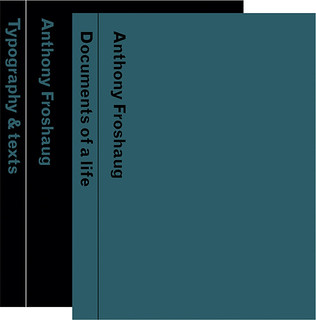
Edited by Robin Kinross<br>Hyphen Press, £40<br>

Robin Kinross’s book about Anthony Froshaug has been anticipated in typographic circles for many years. He began work on it as long ago as 1984, with the task of sorting out Froshaug’s papers after his death. Several times it has seemed to be on the verge of publication by Kinross’s Hyphen Press; then nothing. The ‘book’ is actually two volumes, delivered in an austere cardboard slipcase. As a feat of research alone, the project is a design history landmark. Few bodies of work have been subjected to such exacting and meticulous review. At every moment, one feels Kinross’s presence: weighing each layout or leaf of print in the hand, applying ruler and typescale to check internal measurements, discovering a discrepancy, pondering what this means in terms of his subject’s growth as a typographer.
Froshaug himself has always seemed a special case, someone to be spoken about in awed tones, even though few outside his circle could claim more than a glancing knowledge of his output. Kinross shows a couple of forms in Modern Typography and there have been occasional articles, again usually by Kinross. A large part of Froshaug’s continuing reputation, mainly in Britain, comes from his vivid hold on the memories of those who were taught by him, or were on the staff with him at the Central School, the Royal College of Art, or Watford School of Art. Talking to these people, one gets a sense that Froshaug was indeed an exceptional individual – lucid, charismatic, almost priest-like, totally uncompromising, a natural teacher whose passage in your life could be sufficiently electric to inspire and change you, to leave you in some way permanently marked.
This is certainly true of Kinross, who was astonished by his first sight of Froshaug’s work in 1973, at the St Bride Printing Library. ‘It seemed to be what I had wanted to do in typography, already achieved 25 years previously, and perfect as if in a dream,’ he writes. He went to see Froshaug, meeting him twice that first day in two different pubs, and a ten-year friendship began. Kinross’s degree of identification with his subject is a strength of these two volumes, but it is not without problems. He decided early on, he tells us, that a biography would not be appropriate for so factual and Brechtian a man; instead, he has chosen to act as Froshaug’s editor. One volume, with a long introduction, reproduces examples of the designer-printer’s typography and presents his ‘complete’ texts; the other gathers excerpts, photographs, letters, cards, notes, and job progress sheets to give a fragmentary view of his life.
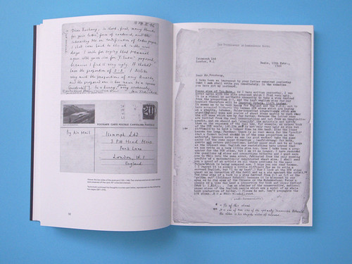
For many readers, especially those new to Froshaug, the core of the two books will be the selection of work – shown consistently at 33 per cent of real size – which occupies just 31 out of more than 500 pages. Here, in a series of exemplary captions, Kinross traces Froshaug’s evolution as a Modernist typographer, building on Tschichold and Max Bill in the 1940s, through to the famous Typographic Norms of 1964. Although he has spent years piecing together the catalogue, many items have yet to be found; there is evidence, for instance, that in 1951 alone Froshaug printed 180 jobs on his small press in Cornwall. Several early layouts for other printers, made in ink on detail paper, reveal Froshaug’s command of instruction to the compositor. Documents such as these, shown with frayed edges and fold lines, form a large part of the fascination of these books.

There are times, however, especially in the documents volume, when Kinross’s curatorial relish for the evidence at his fingertips leads him to over-egg the pudding. A spread is even devoted to Froshaug’s redesign of the RCA’s internal telephone directory – surely a minor work. If the point about his logic and care as an information designer is not clear before then, it will never be clear. As a critic, Kinross is not given to easy praise, but when he is on his subject’s side, as here, he cannot resist bursts of commendation: one piece has a feeling of ‘full-out endeavour’; another is ‘wonderfully modest and true’. Even Froshaug’s withdrawal from designing, by the 1970s, is seen as another sign of his brilliance: he ‘got through’ typography quicker than most. Touches like this add up, in places, to a tone of undue reverence. Contemplating the display of relics, one sometimes feels Froshaug is being offered up as some kind of typographic saint.
Yet, as those who knew him so readily report, he was far from being a saintly man. His private life was messy, with a complicated trail of wives, girlfriends and children at a time when anything other than a stable marriage was frowned upon. (Kinross hints at this side of him by including an amusing account of Froshaug and a friend discovered making love on a beach by a man with a large moustache.) A difficult character – ‘capricious, forgetful, indiscreet’, according to one head of school – he tended not to stay long at the colleges that employed him. Many projects begun with enthusiasm were left unfinished. They include a proposed translation by Ruari McLean of Tschichold’s Typographische Gestaltung, to be published by Froshaug’s company, Isomorph, and Source Papers in the Structure of Science, a series of books that he was to have edited. In his late forties, he studied architecture for two years; this also came to nothing. Kinross notes the tendency, and assembles some absorbing documentation, but his reluctance to engage with Froshaug as a biographical subject, bearing a rich and doubtless material personal history, means that he never fully gets to grips with the substance of a remarkable life. He is too inclined to cast every facet of his mentor in the most positive light.
Kinross believes that Froshaug surpassed Tschichold – his early master – in his quest to find the proper typographic syntax to express a text’s full meaning. He goes even further. Everywhere, he writes, Froshaug is ‘clearer, sharper, more extreme’. It is evident, then, that for Kinross, Froshaug is a figure at least as significant as Tschichold. Yet Tschichold’s influence, then and now, is much more widely felt. Froshaug had a determining influence on British post-war typography, but Kinross offers no evidence, despite Froshaug’s time as a teacher at Ulm, that he had significant influence abroad. Tschichold disseminated his ideas in books now regarded as classics. Froshaug never produced the book about typography that Kinross, among others, urged him to write. In the articles, finished and unfinished, collected by Kinross, Froshaug’s prose is cerebral, erudite, impressive, but much less likely, I suspect, to engage modern readers – even those in sympathy – than Kinross must hope. He could write lucidly, yet at other times he is awkward, elliptical, needlessly hard work. If this seems harsh, return to his designs, which always achieve a generous, lightly sprung grace in complexity.
It is no small achievement of this magnificent project that its typesetting and page design by Kinross himself (with advice from another of his heroes, Karel Martens) more than live up to Froshaug’s concern with making, with ethics and technics, that Kinross identifies as central to his practice of printing and design. It is one of the most intelligent, superbly thorough, engrossing and important design books to be published in years.
Cover and spreads from Anthony Froshaug: Typography & texts / Documents of a life, edited by Robin Kinross (Hyphen Press, £40).

Rick Poynor, writer, founding editor of Eye, author of Design Without Boundaries, London
First published in Eye no. 38 vol. 10 2000
Eye is the world’s most beautiful and collectable graphic design journal, published quarterly for professional designers, students and anyone interested in critical, informed writing about graphic design and visual culture. It is available from all good design bookshops and online at the Eye shop, where you can buy subscriptions and single issues.

