Summer 2014
Book of revelations

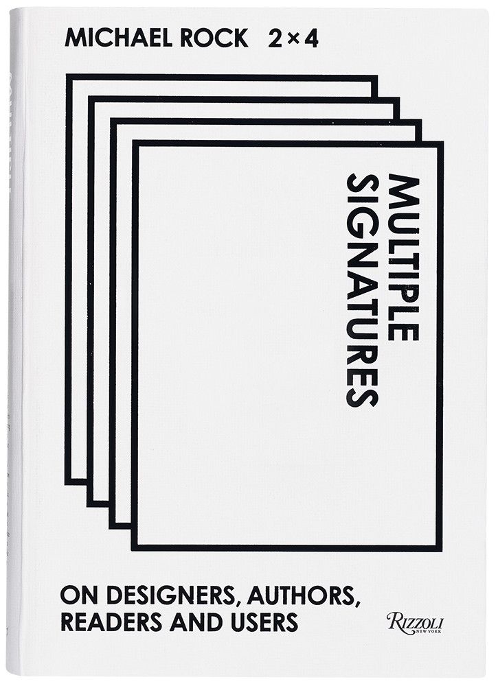
Multiple Signatures: On Designers, Authors, Readers and Users
By Michael Rock / 2x4<br>Designed by Michael Rock and Yoonjai Choi<br>Rizzoli, £22.95, $35<br>

The uncontroversial premise of Multiple Signatures is that design is a collaborative act, and so a book marking the highly successful career of Michael Rock and his 2x4 design partnership should also be a collaboration. The book is delivered largely in words – safe, perhaps, in the assumption that if readers do not already know 2x4’s designs, an image-rich website with the practice’s work for Los Angeles County Museum of Art, Kanye West’s design consortium Donda, and many others is just a few clicks away. Multiple Signatures gathers a number of different voices – including Rock and his partners Susan Sellers and Georgie Stout, as well as prominent designers, thinkers and architects. It is a glittering cast including Koolhaas, Poynor, Van Toorn, Lyotard from beyond the grave, and Michael Speaks, editor of ANY, the architectural magazine which 2x4 designed in the 1990s.
Multiple Signatures also features a number of talks Rock has given over the years. Sometimes the slides from these talks appear as images set into the columns on the page; otherwise they appear as terse descriptions of the slides used: ‘News photograph of a smug President George W. Bush’. Yes, words will do.
Unexpected texts appear too: Elizabeth Rock and Michael Rock produce a pastiche of an email exchange between the studio and a client looking to market fashion to brainy, and therefore dowdy, feminists: ‘This girl is turning off the TV. This girl is hitting the books. AND reading them. ALL the way through. Real books, not Audio or podcasts.’
Rock includes a few briefs that he has set his students: instructions to read Borges or investigate the sestina structure of a John Ashbery poem. Some 2x4 projects which are engaged with words are featured, too. One – from a brief to strategise the future for techno magazine Wired – involved writing a program to chart the rise and fall of buzzwords in the magazine over its first decade, a smart way of measuring newness.
Spread from the essay ‘It is what it is (or are we done yet?)’. Photograph by Luke Steiner.
But what is Multiple Signatures about? Graphic design, of course, but what that is has changed considerably in the two decades since 2x4 was founded. In conversation with Poynor, Rock says: ‘If the product of design becomes increasingly invisible, the critical project is less one of unmasking than of revealing.’ For Rock, that means drawing graphic design into ‘bigger socioeconomic and historical arcs. The design object must be seen as an index of something bigger.’
Sometimes Rock struggles to bring his interlocutors back to the subject in hand. A conversation with the London-based designer Paul Elliman, entitled ‘Voice as Brand’, has Rock repeatedly asking about the branded voice in pop, on the subway, the branded voice in the city and as the spokesperson of the corporation, while Elliman keeps digressing – brilliantly – on the sounds of Tourette’s Syndrome, glossolalia, the writings of F. Scott Fitzgerald and other, often esoteric themes. But that reinforces the logic of the format: conversations don’t need to have a point. For me, the most engaging piece in this anthology is ‘If You Don’t See The Fnord It Can’t Eat You’, Rock’s freewheeling and metaphor-rich essay on conspiracy theories.
The theme that emerges most strongly in Multiple Signatures is 2x4’s relationship with architecture and Rock’s particular interest in digital skins and screens, blow-ups and other supergraphic surfaces that increasingly form our environment. This last represents a new scale of task for graphic designers, one which means working closely with architects. (2x4 has collaborated with the architectural practice OMA on the Prada Store in New York and the Guggenheim Las Vegas, among other projects.)
Rock’s enthusiasm for the task of rescaling graphic design for architecture is clear.Former 2x4 associate Lucia Allais adds an ambitious imperative: ‘… the goal is to make you think about images, their origins, their intentions, their material presence … What is at work here is not so much the education of your eye as the rediscovery of your image memory. 2x4 would like to call forth every image you have ever perceived and make it strange again by asking you to look at it rather than through it.’ This is the modernist challenge of ostranenie (making strange), scaled up for the 21st century. But she introduces a note of criticism: increasingly, she says, 2x4’s supergraphics operate as temporary ‘cinematic’ walls in ‘non-spaces’, such as the deserts in Qatar, to distract from what is being done behind them. Reserved in tone, circumspect in her argument, Allais provides an unexpected illustration of Rock’s call for design critics to reveal their subjects.
David Crowley, head of Critical Writing in Art & Design programme at the Royal College of Art, London
First published in Eye no. 88 vol. 22 2014
Eye is the world’s most beautiful and collectable graphic design journal, published quarterly for professional designers, students and anyone interested in critical, informed writing about graphic design and visual culture. It is available from all good design bookshops and online at the Eye shop, where you can buy subscriptions and single issues. You can see what Eye 88 looks like at Eye before you buy on Vimeo.


