Autumn 2012
Carve his name with pride

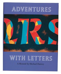
Adventures with Letters: A Memoir
By Michael Harvey; foreword: Alan Powers; Photography, design and typography by Michael Harvey; 47 Editions, £30

Michael Harvey, the British lettering artist and designer, has worked wholly within the ‘English lettering tradition’, as delineated by Alan Bartram. At the same time he has constantly pushed against its boundaries in an attempt to keep it fresh and vital.
For more than a century, lettering in England has been dominated by the work and teachings of two men: the calligrapher Edward Johnston (1872–1944) and his protégé Eric Gill (1882–1940), the sculptor, printmaker, lettercutter and type designer. The latter hovers over Adventures with Letters, Harvey’s memoir of his career as letter carver, book jacket designer, type designer and teacher. Gill’s Autobiography, which Harvey read while working as a draughtsman at the engineering firm Drawing & Tracing in the early 1950s, gave substance to his inchoate longing to ‘make things instead of drawings for others to make’; and Gill’s letters – both cut in stone and cast in metal – provided his early models.
Yet it was the tradition created by Gill that Harvey increasingly fought against once he got over his youthful infatuation with the ‘Master’. The turning point in his life came in 1955 when he became an assistant to Reynolds Stone, the noted wood engraver and letter carver. Stone slowly drew Harvey away from Gill, opening his eyes to other lettering traditions – even though they were not those he himself preferred – most notably the work of Georg Trump and Hermann Zapf. Harvey incorporated some of their features into his letter carving, though he mostly kept to the Gill / Stone model on the grounds that ‘in churchyards... conventional letters and layouts are the most suitable, like wearing one’s best suit’.
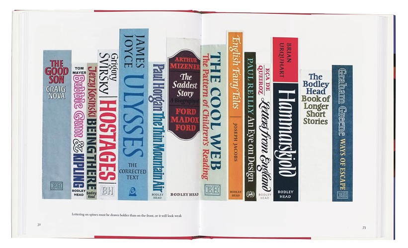
Harvey left Stone in 1961, hoping to do lettering for architects, but book jackets were to become his most visible activity for the next 30-odd years. It was in his jacket designs that Harvey discovered his own voice within (and sometimes without) the Gill tradition, with letters influenced not just by Trump and Zapf but also by the Dutch jacket designer Helmut Salden. In the beginning his jackets were influenced by various graphic design trends, such as Zipatone screens, rough-textured lettering, and lettering positioned within panels or against odd shapes; but by the middle of the 1960s they gained simplicity as they relied almost entirely on direct lettering rather than tricks. His endless inventiveness kept them from becoming staid or predictable.
Zephyr (Ludlow, 1966) was Harvey’s first typeface but his work as a type designer did not really begin until he created Ellington for Monotype in 1990. It took him seven years, but digital tools eventually made type design easier and faster and he embraced the technology, designing first for Adobe and then for Fine Fonts, the company he set up in 2000 with Andy Benedek.
Most of Harvey’s faces have roots in his book jacket lettering: Andreas (1994), for example, was based on a title drawn for Yale University Press. Other notable examples include Moonglow (2000), his last face for Adobe; Aesop Script (2000), Balthasar (2007) and Mentor (2004), all three for Fine Fonts. All Harvey’s professional activities have influenced one another, all united by the practice of drawing. ‘Drawing frees the hand from the demands of the broad-edged pen, the sign-writer’s brush,’ he writes. ‘The pencil is neutral. Eye and mind are in control.’ Drawing rightly receives its own chapter in Adventures with Letters.
The book provides a solid showing of Harvey’s book jacket designs and fonts, as well as a basic overview of his work as a letter carver. It also includes a good selection of his varied work for the concrete poet Ian Hamilton Finlay. The book is a memoir not an autobiography, emphasising his professional work – how and why a design came about – rather than his personal life.
In the postscript Harvey offers up strong opinions about his craft, backed by the experience of hand and eye. For instance, he passionately defends the bygone practice of learning by copying, saying that it spurs individual creativity rather than stifling it: ‘A model is not an end but a beginning. Copying a good model is a good start … No matter how much one tries to reproduce another person’s style we add something of ourselves.’
Harvey’s work respects tradition while not being enslaved by it. Despite his low profile in the world of graphic design, it could be argued that Michael Harvey is the most important figure in British book-jacket design of the 1960s and 70s, and the leading British type designer between the death of Eric Gill and the millennium.
Top: spread of books designed by Harvey, illustrating his maxim that ‘Lettering on spines must be drawn bolder than on the front, or it will look weak’.
Eye is the world’s most beautiful and collectable graphic design journal, published quarterly for professional designers, students and anyone interested in critical, informed writing about graphic design and visual culture. It is available from all good design bookshops and online at the Eye shop, where you can buy subscriptions, back issues and single copies of the latest issue. You can see what Eye 84 looks like at Eye before You Buy on Vimeo.


