Winter 2011
Consequences for the comic artist

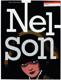
Nelson
Edited by Rob Davis and Woodrow Phoenix<br>Designed by SuperAdaptoid at Detonator<br>Blank Slate Books, £18.99/$ 20.99<br>

Nelson is, according to Rob Davis’s introduction, ‘a testament to what comics truly are’. But what, truly, are they? It is easy to think of comics and graphic novels as being more or less the same thing; but whatever the similarities in form, the two media have essentially opposed sensibilities. Commercial comics are collaborations – loyal readers get used to having beloved characters passed between writers and artists (and for fans of, say, Judge Dredd, observing fresh approaches to an unchanging iconography is part of the fun). Graphic novels are often the product of a sole auteur, and it is striking how many of the most celebrated examples – Maus or Alison Bechdel’s Fun Home – drag autobiography to the edge of solipsism.
The clash of these two sensibilities gives Nelson much of its interest. Davis’s idea was to assemble a team of comic artists to write and draw a single life, each taking a date from a single year, beginning in the year of his own birth, 1968. In the event, he got more than he bargained for: 54 artists to illustrate 44 years, so that some years get a double dose. The artists range from the veteran (Posy Simmonds) to the tyro (Josceline Fenton, a student at the London College of Communication); some have backgrounds in newspaper editorial cartoons or children’s books, others in Hollywood fodder such as Batman or Mike Mignola’s Hellboy.
And the consequence is that Nelson is a messy, occasionally dull or self-indulgent read, but with a number of highly enjoyable contributions and some eye-opening clashes of style. Part of the fun for the artists seems to have been turning on its head what has gone before. After Davis’s opening chapter sets up the birth of a child called Nelson, Woodrow Phoenix’s sequel turns this into two children, a girl called Nel – our heroine – and a brother, Sonny, who dies shortly after. But there are also satisfying continuities: several artists take up the idea of the missing twin, who becomes an absence, and at other times a mysterious presence, in Nel’s life.
The book follows Nel through school, the break-up of her parents’ marriage, art school in Manchester, rave culture, a dreary job in graphic design, a daft job on a fanzine, an affair with a rock star, drink and depression, a new career in teaching and, as she reaches her forties, steadiness and contentment.
The abrupt switches in narrative direction and style sometimes feel arbitrary – from Duncan Fegredo’s monochromatic adult comic book to Philippa Rice’s naïve children’s story is a leap – and too many of the artists drift into portraying angst or artistic frustration, as though that were somehow more respectable than happiness (Paul Harrison-Davies’ idyll of summer 1977 stands out). Period details and retrospective ironies are overworked – Hunt Emerson has the bad idea of having Nel book a break in New York in September 2001. But from it all emerges a surprisingly coherent and attractive personality – bolshie, sexy, uncertain, arrogant – and a story that mimics the muddle of real lives more closely than most novels.
Cover design: Woodrow Phoenix; cover art: Rob Davis.
Top: The protagonist’s life as drawn by Jon McNaught.

Robert Hanks, journalist, critic, broadcaster, London
First published in Eye no. 82 vol. 21 2012
Eye is the world’s most beautiful and collectable graphic design journal, published quarterly for professional designers, students and anyone interested in critical, informed writing about graphic design and visual culture. It is available from all good design bookshops and online at the Eye shop, where you can buy subscriptions, back issues and single copies of the latest issue.

