Spring 2019
File under undefined

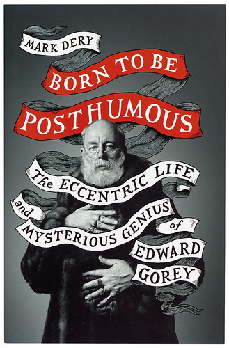
Born to Be Posthumous
By Mark Dery. Cover design by Jim Tierney. Book design by Marie Mundaca. William Collins, £18.99
Edward Gorey (1925-2000) spent most of his life trying to remain uncategorised and undefined. Despite being celebrated for his illustrations and book designs, Gorey thought of himself firstly as a writer, and considered many of his illustration commissions unworthy of attention. As a theatre designer he preferred the small scale of local theatre to the Broadway stage where his 1977 production of Dracula had been a great success. In his personal life he behaved like an introvert yet he dressed so flamboyantly that his apparel would raise eyebrows and jeers on the New York streets. He grudgingly described himself as ‘probably gay’ yet he never indulged himself during the heady years of gay liberation. As for the miniature books that made him famous, their combinations of drawings and text also defy easy categorisation, where the gleeful absurdities of Edward Lear shade to dark and melancholy adult dreams.
Such a bundle of contradictions offers a tempting target for an inquisitive biographer. Mark Dery’s Born to be Posthumous is a detailed and enlightening study of the elusive artist, following Gorey from a precocious childhood in Chicago, through his aimless years at Harvard, where he studied French literature, to a settled, solitary-by-choice life in New York City and Cape Cod. Gorey had always been a doodling illustrator but his professional career began when a publisher friend, Jason Epstein, offered him the position of cover artist and designer of Doubleday’s Anchor paperbacks in 1953. Anchor Books was Doubleday’s entry into the booming paperback market, and Gorey’s covers immediately set the imprint apart from the oil-painted styles of the time: illustrations were line art or densely shaded drawings, while colours were few, and applied as flat overlays. Gorey’s obsession with Victorian and Edwardian art and decor was distinctly unmodern but this suited Anchor’s reprintings of classic novels, poetry, essays and popular works of history, many of which were appearing in paperback for the first time. The work established Gorey as an illustrator; the imperatives of the job improved his figure drawing and his trademark cross-hatched shading, while his design role engendered the hand-drawn lettering (usually italic serifs) which became a feature of his own books. When he was too busy to illustrate a cover himself he commissioned artists like Leonard Baskin and Philippe Jullian whose drawing styles complemented his own. Dery points to Gorey’s fondness for Japanese prints as the source for his use of colour, a predilection that later found its way into his own books.
Cover of Born to Be Posthumous. Design: Jim Tierney. Photography: Richard Corman.
Top. An illustration from Gorey’s wordless picturebook The West Wing, 1963.

The four years that Gorey spent with Doubleday were invaluable, giving his work a nationwide visibility and leading to commissions elsewhere. Gorey complained about the work as he complained about everything else but his schooling in the processes of book production led directly to the creation of his own unique volumes. The first of these were either self-published or produced with the assistance of the Gotham Book Mart, a legendary New York store that championed Gorey’s art.
The typical Gorey book is small in size and page count, usually a landscape duodecimo volume of 32 to 48 pages. In the early titles Gorey uses black humour to undermine the idiom of the children’s book or sentimental Victorian story. The most celebrated example of this is the oft-parodied Gashlycrumb Tinies (1963), an abecedarium presenting in pictures and rhyme the untimely deaths of 26 infants. Gorey’s art tends to be classed with that of Maurice Sendak, Charles Addams or even Dr Seuss but his appeal was never as broad or as easily defined. A closer contemporary would be Ronald Searle, an artist with a similar taste for black humour and decayed Victoriana.
Children’s books may have provided the template but many of Gorey’s later productions, while they maintain their touches of humour, are simply melancholy or strange, presenting visual narratives in a manner for which no other outlet existed in the 1960s. The West Wing (1963), 32 wordless drawings of rooms in a gloomy mansion, is unlike anything else of the time. The closest comparison would be Max Ernst’s collections of collage engravings (Gorey favourites) or Max Klinger’s pre-Surrealist etching series, Paraphrase on the Finding of a Glove (1881). By chance or design (Dery doesn’t tell us which) Gorey discovered a medium for combining words and pictures with which he could reach places untouched by short stories, poems or comic strips. That he found success in doing so is a strange story in itself, and one which Dery enjoys recounting.
Gorey’s ultimate success is to have had his name become a descriptor. But ‘Goreyesque’, like ‘Kafkaesque’ before it, is only a shortcut to a stereotype; Gorey’s art is more than merely Goreyesque. Dery doesn’t solve all the enigmas of Edward Gorey but he does give us a more rounded portrait of an uncategorisable artist.
John Coulthart, artist, designer and writer, Manchester
First published in Eye no. 98 vol. 25, 2019
Eye is the world’s most beautiful and collectable graphic design journal, published for professional designers, students and anyone interested in critical, informed writing about graphic design and visual culture. It is available from all good design bookshops and online at the Eye shop, where you can buy subscriptions and single issues. You can see what Eye 98 looks like at Eye Before You Buy on Vimeo.

