Spring 2013
Glorious transit

Vignelli Transit Maps
by Peter B. Lloyd and Mark Ovenden<br>RIT Press, $34.99<br>

Let’s face it, graphic design is short of real drama. There are no good design roles in films (Robert De Niro’s girlfriend in Heat? Really?). The high point of most design biographies is a studio relocation or a sculpture commission.
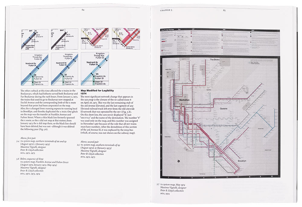
But Vignelli Transit Maps by Peter B. Lloyd and Mark Ovenden is infused with jeopardy. It shows a New York City project of the 1970s – Massimo Vignelli’s map of the New York City subway – buffeted by forces that, after less than a decade, had the map replaced. There were transport authorities to deal with, as well as a battle between those pitching an abstract diagrammatic approach and those requiring above-ground cartographic landmarks.
This is a book with many facets: a good book on map design; a concise look inside the Unimark NYC studio, where Vignelli worked; and good journalism, with the authors getting access to those who worked on the map (Joan Charysyn’s perspective is well represented). There are also gems of Vignelli’s Modernist wisdom, including the reductive ‘One more effort to erase the effort.’
However, Lloyd and Ovenden avoid any discussion of the tensions in Modernist claims of utility. The map is undoubtedly simplified and stripped of decoration, but looking at some of the design decisions I question whether the brief was straight utility. Or did the primal Modernist urge to speak to a stylistic posterity compromise such features as station visibility (black on blue), typeface and size?
The authors leave it until later to mention the map’s cultural resonance. Mark Rozzo of Men’s Vogue, which republished the map in 2008, called it ‘rich nostalgia for people who lived in or visited New York in the 1970s.’
That is why this map and book are important. There are better map books, but few maps become cultural landmarks themselves. Good metro maps embody the spirit of their cities. The London underground map is British pragmatism at its best; Vignelli’s map is a portrait of New York in its imperfect 1970s prime.
Max Gadney, founder and design director, After the Flood, London
First published in Eye no. 85 vol. 22 2013
Eye is the world’s most beautiful and collectable graphic design journal, published quarterly for professional designers, students and anyone interested in critical, informed writing about graphic design and visual culture. It is available from all good design bookshops and online at the Eye shop, where you can buy subscriptions, back issues and single copies of the latest issue. You can see what Eye 85 looks like at Eye before You Buy on Vimeo.


