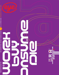
Spring 2009
Grandiose gaiety

Antoine+Manuel Compilation, vol. 1
Antoine+Manuel Editions, Paris (www.antoineetmanuel.com), Euros 29In comparison to, say, London, Barcelona or Berlin, Paris is often seen as a ‘museum city’, an old-world relic. As if to counter such views, museums there have recently staged innovative shows such as the Grand Palais’s thought-provoking ‘Picasso and the Masters’ or the Louvre’s conceptually challenging ‘Pierre Boulez. Œuvre. Fragment’. The usually sedate Musee des Arts Decoratifs has taken an even more drastic step: it has morphed into a contemporary gallery, presenting as an installation the unusual talent of graphic artists Antoine+Manuel.
The show is the result of a new proactive policy toward graphic design, and poster artists in particular. But this is not a pedagogic endeavour: visitors to the third-floor gallery where it is hung are pretty much on their own. The material is not presented in chronological order; neither is it labelled, nor displayed with much concern for the visual integrity of each piece. Posters are layered on top of each other, from floor to ceiling. A preliminary sketch might be in one room, the final design in the next, or vice-versa. Personal drawings and photographs are taped here and there, and one-of-a-kind prototypes sit next to mass-produced artefacts. Deliberately staged to replicate the atmosphere of a studio visit, the show is the next best thing to a voyeuristic escapade – a far cry from the traditional museum experience.
More than an exhibit, this is a manifesto: graphic design, no longer a mere discipline, can now be presented as entertainment, in the same league as contemporary art or living performances. Amelie Gastaut, the show’s curator, elected not to frame the exuberant production of Antoine Audiau and Manuel Warosz within a scholarly discourse. Instead, she stepped back and gave them carte blanche to design the setting of their retrospective. They, in turn, took for granted that their work should speak for itself. One can argue that the curiosity of visitors might have been better served by a more systematic or didactic presentation, but the museum has embraced the flamboyant option: to disturb expectations – and epater les bourgeois – with a delicious display of serendipitous virtuosity.
Those unable to experience full immersion in the A+M pictorial and graphic universe can at least read about it in the lavish catalogue self-published by the artists. A team since 1993, Audiau and Warosz are illustrators and type designers, and their favourite medium is collage. They put together artwork that combines paint blotches, marker doodles, rough sketches, slick computer renderings and photographs of 3D models. They each develop personal imagery based on idle reverie, childhood impressions and abstract hallucinations, to create a surrealist macrocosm that flirts with disaster yet never crosses into nightmare. Belonging to a generation of graphic designers who ignore historical references in favour of exploring their own imaginations, they can be compared to Jaime Hayon, Geneviève Gauckler or M/M (Paris). Heirs of Haruki Murakami rather than scions of Grapus, they are part of a stable of hot young creators who design decorative patterns and cartoony motifs for Domestic, the maverick wallpaper and room stickers distributor.
Four major clients gave them the chance to develop their visual vocabulary. For each, A+M reinvented themselves anew, discovering in their experience yet untapped sources of inspiration. For the Collection Lambert, a contemporary art museum in Avignon, they created controversial exhibition posters using coloured pencils, markers and hand-drawn letters; for the dance venue Centre Choregraphique National de Tours they came up with variations on a leafy motif inspired by computer circuits; for fashion designer Christian Lacroix they designed mysterious Rorschach-like invitations as richly textured as the most embellished couture gown; and for the Comedie de Clermont-Ferrand theatre they doodled freely, arranging drawings and decoupages into boisterous pictorial bouquets.
Antoine+Manuel are part of the post-ironic age and, mercifully, do not indulge in the endless visual puns of their predecessors. One exception, though: they have had fun with Helvetica, imposing ligatures on some of its staid letterforms, turning the familiar typeface into a slightly disconcerting hybrid. Nonetheless, typography is a serious business for A+M, as evidenced by much of their personal work, from abstract paintings to small decorative artefacts. No matter how loosely drawn or whimsically conceived, the end result – be it an animated mural for the World of Coca-Cola museum in Atlanta, Georgia, or a limited-edition coffee table – is always a superlative visual treat.
If the Arts Decoratifs retrospective does little to explain the evolution of the duo’s career, it makes clear that their work, however complex or off-putting (at least to the handful of graphistes who criticise them for promoting style rather than substance), is nonetheless a joyful exercise in graphic communication. Recapturing a sense of levity could well be what Paris needs to reclaim a leadership position on the contemporary art and design scene. Remember Jules Cheret, Toulouse-Lautrec, Pierre Bonnard, Alphonse Mucha, Cassandre, Carlu, etc.? The heyday of French graphic design was characterised by its gaiety.
First published in Eye no. 71 vol. 18 2009
Eye is the world’s most beautiful and collectable graphic design journal, published quarterly for professional designers, students and anyone interested in critical, informed writing about graphic design and visual culture. It is available from all good design bookshops and online at the Eye shop, where you can buy subscriptions and single issues.
