Spring 2013
Hardcore fluff

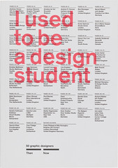
I Used to Be a Design Student
By Frank Philippin and Billy Kiosoglou<br>Designed by Brighten the Corners<br>Laurence King, £17.95<br>

Debates about education seem these days to have been reduced almost entirely to questions of employability, while students have been reduced to employees in waiting (and, given the economic climate, waiting, and more waiting).
I Used to Be a Design Student is a modest contribution to such debates: Frank Philippin and Billy Kiosoglou, who together form the design studio Brighten the Corners, have asked 50 graphic designers - from Ken Garland, who has been practising for 58 years, to Hyoun Youl Joe, only seven years in the game - to pick two of their own projects, one from student days and one from their professional life, and answer a set of questions about processes, outcomes and what (concept, look, attitude) connects them.
The plan, arising from a talk the pair gave at their own alma mater, Camberwell College of Arts, is to ‘demystify’ the transition from student to designer, to reassure students that their work will lead somewhere. Each contributor is asked to supply ‘a piece of sound advice + a single warning to a design student’ (Daniel Eatock’s warning is intensely practical: ‘Scalpels are very sharp’), followed by ‘a valuable quality for a design student + a design professional’. Supplementary questions are intended to give a more rounded impression of a designer’s life: what time did you / do you get up in the morning? What was / is your preferred mode of transport? How much did you / do you weigh? What designers, films, books influenced you then / influence you now? (It would be interesting to see comparative data in other fields: are graphic designers thinner than, say, quantity surveyors or surgeons? More likely to ride bicycles and watch The Wire?)
Designers are also asked whether they teach (most do, it seems), and whether it is possible to teach design (up to a point, seems to be the consensus).
The book itself is laid out beautifully: each designer gets two double-page spreads - one of text, one of pictures - while the responses to the supplementary questions are set out in a series of charts, printed in white on black. The format is seductively browsable, and makes it easy to spot aggregate trends: interesting to note, for example, that whereas the average rising time for students was 08:46, as professionals they have had to up their games, rising at 07:22.
The format puts misleadingly hard edges on what is essentially fluffy - though that in itself may be a useful lesson about the real function of graphic design. The other useful lesson may be found in the chart of responses to the question ‘What do you dislike about working as a designer?’ Common themes include financial insecurity, bad clients and the spillage of work into personal life. But I suspect that students will be struck less by the aggregate facts than by individual answers - the stray name-drop or brilliant drawing that sparks recognition or inspiration, the warning that has some personal application.
And one important message emerges: in responses to the request for ‘a valuable quality’, several ideas recur: hard work, punctuality, a thick skin. But the word that crops up most often is ‘curiosity’. It is not a concept that fits easily into any educational model that revolves around obvious employability: I Used to Be a Design Student is a celebration of curiosity, and a stimulant to it.
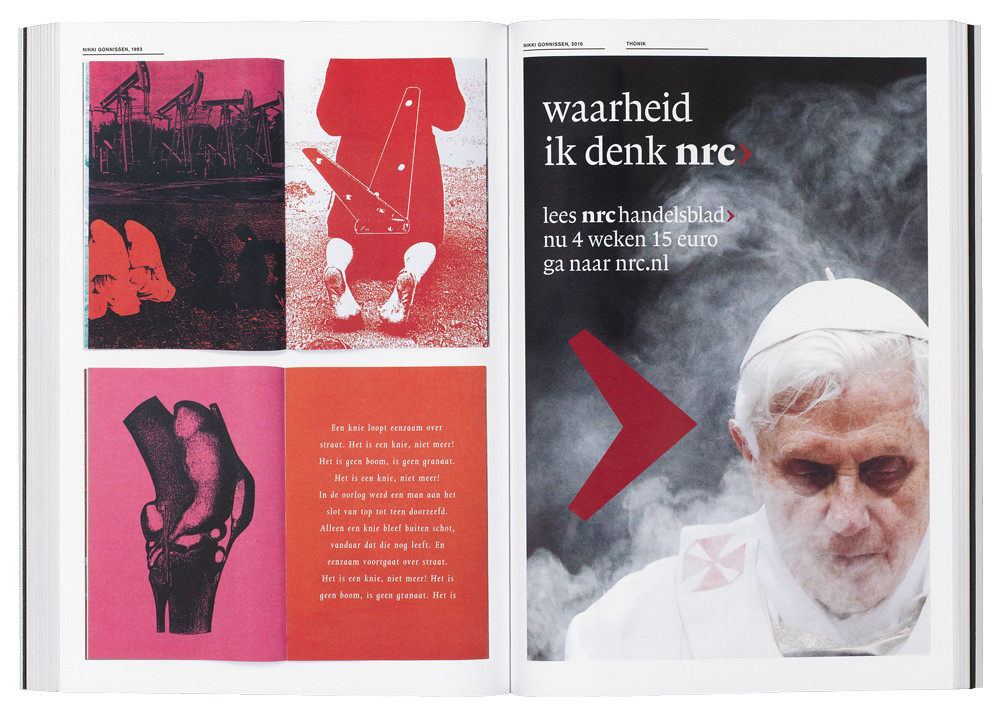
Top: the screenprinted images, by Nikki Gonnissen of Thonik, Netherlands, were part of a self-initiated project at the Hogeschool voor de Kunsten Utrecht (1993) and a 2010 campaign for NRC Media.
Eye is the world’s most beautiful and collectable graphic design journal, published quarterly for professional designers, students and anyone interested in critical, informed writing about graphic design and visual culture. It is available from all good design bookshops and online at the Eye shop, where you can buy subscriptions, back issues and single copies of the latest issue. You can see what Eye 85 looks like at Eye before You Buy on Vimeo.


