Winter 2017
Inspired information

Information Design: Research and Practice
Edited by Alison Black, Paul Luna, Ole Lund and Sue Walker, Centre for Information Design Research, University of Reading<br> Routledge, £55<br>

In her 2014 book Graphesis Johanna Drucker describes information visualisations as ‘intellectual Trojan horses’ – they may appear observer-independent but they are in fact interpretations masquerading as representations. According to Drucker we need to accept the fundamentally constructed nature of data and acknowledge that phenomena such as nations, genders, populations and time spans are not self-evident, stable entities. Following this critical approach Drucker calls for ambiguity and uncertainty to be incorporated into the design of information either by being represented or by forming the basis upon which a representation is made. Few of the projects described in the new publication Information Design: Research and Practice use this latter strategy – they do not seek a non-standard format to show their constructedness. Given the context of many of the designs this is not surprising. Who wants to be confronted with ambiguity when looking for a gate at an airport? But in other contexts, science or news for instance, it makes sense to examine the data one is working with and show that it is being questioned.
This book aims to capture the current status and history of the field. Described in Erik Spiekermann’s foreword as a ‘bible’ of the discipline, the publication is certainly ambitious, containing 50 illustrated essays on 750 well designed pages (the edition is less convincing as a physical object). The book starts off with chapters on historical practices, predominantly based on archival research, listing cases of experimentation and innovation that shaped the field. Part two deals with the theoretical approach, the dialogue between cultural context and the perceptual and cognitive constraints of users. Tools and methods for responding to different requirements are listed in the third section. The book concludes with a series of applications for information design. While the majority of texts in the publication are by academics, many of the essays in this last part are written by practitioners.
True to the nature of the book’s subject matter, the introduction starts with a straightforward definition: ‘Information design makes complex information clear with the needs of users in mind’. In the essays that follow it becomes apparent that the contexts in which the discipline operates are diverse. With five articles apiece, health and wayfinding stand out. The book also shows that the forms that information design can take are manifold. Not surprisingly, given the editors’ connection to the University of Reading, many essays address text and typography. But here, as well, the full scope is covered, including symbols, diagrams and an insightful text by Judy Edworthy on the design of auditory alarms.
I had anticipated there would be more words devoted to maps, especially since in recent years the predominantly visual formats of information design have been covered extensively in books by publishers such as Gestalten and Taschen. A reason for this absence could be the crucial last part of the editors’ definition of the field. The diverse makers of maps and other infographics that clutter numerous Pinterest boards are clearly fascinated by complexity but are they equally interested in the user? This might account for the absence in the book of this kind of work. Another reason perhaps is that the effectiveness of a purely visual format is more difficult to test. In the book, much attention is paid to engagement with users. Testing is seen as a key part of that process: various articles mention iterative methods to create designs that fit the needs of people in a specific context. The impact of evaluation techniques from behavioural research on the field of information design becomes apparent in these texts.
I am a design testing sceptic, so the paragraph in Robin Kinross’s essay describing the difficulty of testing Isotype struck a chord with me. In the case he describes this was due to the quality of the work that was tested, but also to the fact that it is hard, if not impossible, to test Isotype’s larger ambitions of conveying knowledge and stimulating discussion. According to Kinross, one lesson information design could learn from Isotype is its emphasis on the diversity of the group transforming the non-visual into the visual. The critical discussion this stimulates allows ideas to grow. The subtleties of the visual configuration originate from this process of dialogue and adjustment rather than in testing.
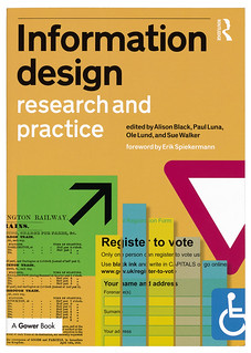
Cover from Information Design: Research and Practice.
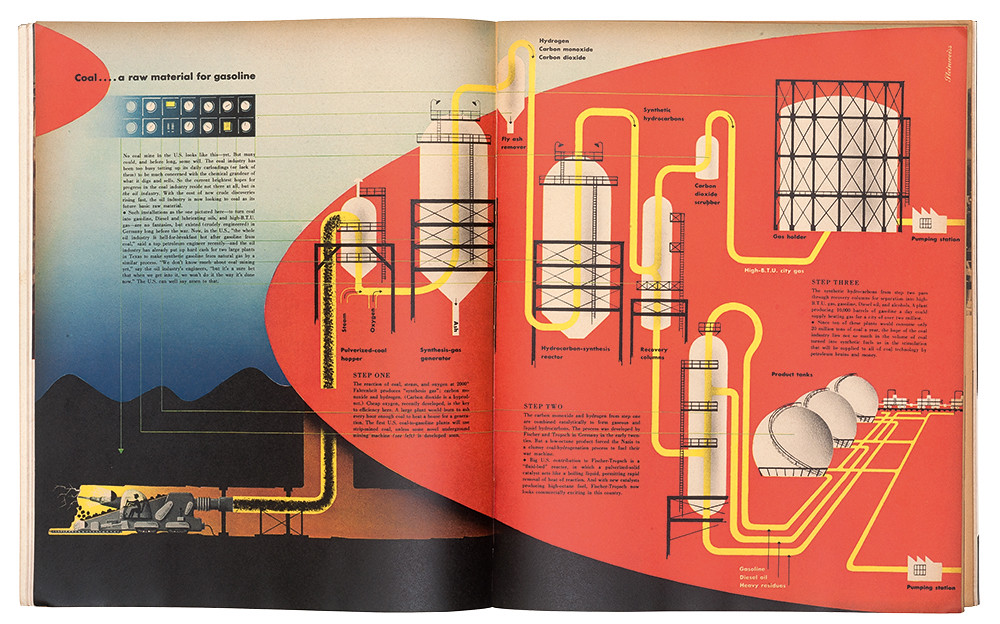
Top: ‘Coal’, 1947, a ‘graphic information’ spread by Alex Steinweiss, originally published in Fortune magazine, March 1947.

Joost Grootens, graphic designer, Head of the Master Information Design, Design Academy Eindhoven
First published in Eye no. 95 vol. 24, 2018
Eye is the world’s most beautiful and collectable graphic design journal, published quarterly for professional designers, students and anyone interested in critical, informed writing about graphic design and visual culture. It is available from all good design bookshops and online at the Eye shop, where you can buy subscriptions and single issues. You can see what Eye 95 looks like at Eye Before You Buy on Vimeo.

