
Winter 2005
Larger than life itself: 2x4 at SFMOMA
2x4 / Design series 3
SFMOMA San Francisco. 13 May–27 November 2005. Reviewed by Rhonda Rubinstein and David Peters
It takes a certain kind of designer to turn a 600 square foot museum gallery into a 1700 square foot imagery extravaganza. The kind of designer with the audacity to call an installation for the grand opening of one of the uppermost crusts of fashion stores – designed by Rem Koolhaas and frequented by the richest and thinnest among us – Prada Vomit. Those designers and that gallery are the 2x4 exhibition that squeezed itself into the petite design space at the San Francisco Museum of Modern Art.
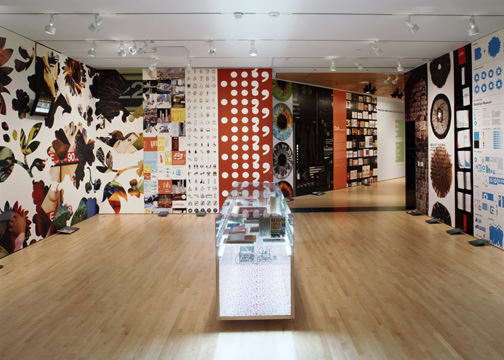
The third in a highly praised series devoted to emerging talent in design and architecture, the exhibition of the New York design studio 2x4 slinks out of its gallery on to the nearby freight elevator and hallway. There it lures unsuspecting art patrons to its promised land of branding, identity, publications, infographics, animations and especially environments. In the visual equivalent of surround sound, the work is wallpapered in floor-to-ceiling strips around and out the gallery. Sitting primly in the centre of the room a glass vitrine displays physical objects – books mostly, but alas no salesperson with a key is available to satisfy the inevitable tingling of tactile desire.
After succumbing to the pleasure of larger-than-life graphics, the intelligence of 2x4’s identity for the Brooklyn Museum, walls for the Illinois Institute of Architecture, environments for Prada, promotions for Vitra, publications for Anyone Corporation and branding for Nasher Sculpture Center gradually unfolds.
The firm’s collected works bring a delight to modernism, an irreverence to methodology and a humanity to monumental spaces. 2x4 was founded in 1995 by Michael Rock, Susan Sellers and Georgianna Stout, who met in the 1980s at the Rhode Island School of Design in Providence and who went on to assemble a collaborative group of designers, writers, programmers and animators in New York. The name was chosen to evoke the essential building block or its graphic counterpart.
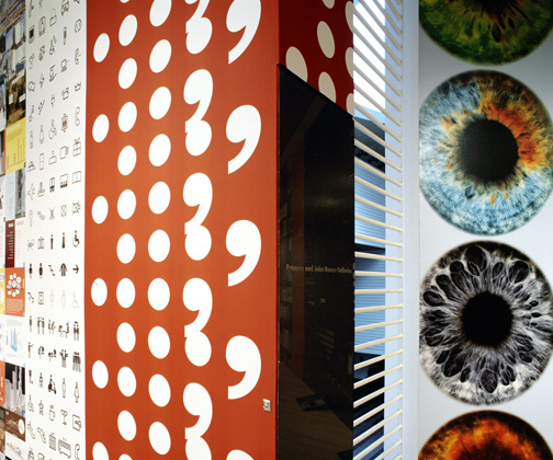
In 2x4’s work with OMA / Rem Koolhaas for the McCormick Tribune Center in Chicago, the idea of the universal student was turned into hundreds of pictograms to represent the range of activities on campus. And hidden amid the figures studying and thinking are a few iconic references to more memorable college transgressions. The pictograms appear in differing scales and contexts, the most outstanding being the application of hundreds of circular pictograms to the Center’s facade that, from a distance, become the face of Mies van der Rohe, the original campus architect. To enter, you must put your foot in Mies’ mouth.
2x4’s long-term collaboration with architects such as Koolhaas, ensures that it is involved early in the conception of a project so that the integration of architectural and graphic design is seamless – except of course, when the seams are intended to show. Thus when OMA designed the Prada flagship New York store, 2x4 was integral to developing the idea of an experimental retail space with changing wall graphics and video installations. The aforementioned Prada Vomit – wallpaper of oversize floral silhouettes containing close-ups of politely pornographic body parts – ran the length of the store’s 200 foot wall. One of 2x4’s wallscapes for the inaugural 2001 show adorns the freight elevator of SFMOMA next to the design gallery. Up close it is a stadium of spectators holding cards; from a distance these cards form a Maoist woman with outstretched arms. And when the elevator doors open, dissipating the illusion, the lowly broom of the working janitor is revealed. Such spatial immersions and depth illusions permeate both their work and its presentation.
In an accompanying lecture at SFMOMA, Rock characterised their work as ‘“Some Assembly Required”: there is, I think, a trope that keeps resurfacing, of products only partially constructed of clearly visible, and often incompatible, components.’
For Vitra, photographs of the Swiss company’s classic modern furniture are repeated in organic patterns that become exotic flowers on posters and kaleidoscopic animations in video. The Brooklyn Museum identity, a sans serif B, is reversed out of varying cyan dingbats reflecting the experimentation and reinvention as well as the diverse collection and audience of one of the largest art museums in the US.
With these achievements, Rock is conscious of his firm’s position at the crossroads of success. Joseph Rosa and Darrin Alfred, who curated the SFMOMA show, selected them for their poly-media approach and because 2x4 remains relatively unknown. (To see their work, get the show catalogue from SFMOMA or visit 2x4.org) Rock concluded his lecture by depicting the dilemma of all rising stars: will their increasingly large projects and ambition precipitate a decline in their creativity, exuberance and intelligence?
Rhonda Rubinstein, Exbrook, San Francisco
David Peters, Exbrook, San Francisco
First published in Eye no. 58 vol. 15 2005

Eye is the world’s most beautiful and collectable graphic design journal, published for professional designers, students and anyone interested in critical, informed writing about graphic design and visual culture. It is available from all good design bookshops and online at the Eye shop, where you can buy subscriptions and single issues.