Spring 2011
Multicultural markings
Typographic Matchmaking in the City
Propositions for a Pluralist Public Space, Edited by Huda Smitshuijzen AbiFares, Khatt Books (khattbooks.com), £41.50, €45Designers and typographers visiting Middle Eastern and Gulf states are often overwhelmed by the sheer beauty of Arabic scripts. Simple street signs, posters and newspapers present a level of calligraphy that we simply do not experience in the day-to-day typographical hubbub of western cities.
But as the opportunities to design in Arabic slowly begin to expand, some fairly fundamental issues arise. While both cultures write numerals in a similar way, virtually everything else is different.
At the most basic level, they write in different directions. There are few shared typographic measurements and equivalents such as x-heights. In Arabic, letters can be stretched or adapted with multiple ligatures, so the popular digital Arabic font Noori Nastaliq contains more than 20,000 characters, as opposed to a normal character set of less than 300 in a Latin typeface. There are multiple versions of Arabic letters – depending on whether they are placed at the beginning, middle or end of words – so an Arabic font might only be truly judged once nearly finished. Anyone developing a Latin typeface can easily concentrate on just a few letterforms to establish an initial ‘feel’. So any projects encouraging crossover and increased understanding of Arabic letterforms have to be applauded.
The default setting of current bilingual design schemes is to typeset in two languages, run names stacked or side by side, hope that they ‘sort of ’ match and go home. Few attempts at any genuinely intertwined schemes have been made, possibly due to pure laziness on the part of the international design groups that are plying their wares in the expanding Gulf market. But the lack of available inspiration, research and precedent is not helping either.
The work of the Khatt Foundation in Amsterdam is providing a unique cross-cultural bridge across this divide. The first ‘Typographic Matchmaking’ project encouraged typographic breakthroughs such as Peter Biľl’ak’s Fedra Arabic (developed with Tarek Atrissi; see Eye 75).
The second project, launched in February 2009 and recorded in this substantial 400-page tome, included architects and encouraged its multicultural teams to concentrate on urban solutions that would have three-dimensional impact.
As a ‘book on Latin and Arabic typography’, it falls in an odd middle ground, given that the first 150 or so pages are devoted to mainly typographic essays on and around the subject. Each of the five teams are then given essay space to introduce their ideas, before colour sections take us through sketches, roughs and finalised designs, as well as 3D visualisations of some of the concepts in public spaces.
You could choose to criticise the quality of some of these final outputs, but I am not going to. In fact I enjoyed the ‘notebook’ aspect of the illustrated sections, as it captured a feeling of ‘work in progress’ rather than fait accompli. If you take the time to read the explanatory essays and carefully examine the design steps, there are some genuinely insightful verbal and visual thoughts.
It helps, of course, that the Khatt Foundation has a treasure trove of Dutch designers to call upon, plus financial support from two Dutch institutions. The chances of a UK government supporting such a scheme must be nil!
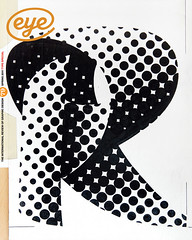
Anyway, back to the designs. Unsurprisingly, several teams grapple with the issues of intertwining the two languages, and two teams led by Max Kisman and Rene Knip respectively run scripts across or within each other, or develop parallel fonts that at least share common visual language (in Kisman’s case, his trademark ‘blocky’ designs; in Knip’s a dot matrix grid that unifies normally opposed letterforms).
While the end results do not quite astonish, the team of Erik van Blokland, Pascal Zoghbi and Joumana al Jabri entertained me with typographic forms made on the beach with poured wax, echoing the processes of land reclamation in Dubai and Amsterdam. The Kufam project team (with members from Holland, Lebanon and Germany) developed a bilingual font with a variant within it that picked up on urban cues by supplying a weight intentionally dissolved like graffiti. The Kashida project team (named after the linking horizontal strokes of Arabic) carried out a series of fascinating experiments in continuous typography merrily visualised with anything from fettucine to bent aluminium.
If you are searching for a ‘how to’ pick and mix guide for designing across cultures, or an easy read on Arabic typography (although that, as a book, would still be useful), this probably is not for you. But as a record of research, processes and genuinely insightful steps towards solving a recurring and sometimes intractable issue, Typographic Matchmaking is a fascinating and inspiring read. The next time I am being threatened with the ‘merely adequate’ in this area, I will use it as evidence to prove that ‘great’ really is possible.
First published in Eye no. 79 vol. 20 2011
Eye is the world’s most beautiful and collectable graphic design journal, published quarterly for professional designers, students and anyone interested in critical, informed writing about graphic design and visual culture. It is available from all good design bookshops and online at the Eye shop, where you can buy subscriptions and single issues.

