
Spring 2018
No fixed style
Daniel Streat
Paul A. Taylor
Simone Grant
Brian Griffin
Intro
David Altmejd
Book design
Graphic design
Music design
Reviews
Mute: A Visual Document
By Terry Burrows with Daniel Miller<br> Designed by Daniel Streat, Visual Fields<br> Thames & Hudson, £28, $45<br>
Among British independent record companies, Mute Records, founded in 1978 by ‘accident’, has never enjoyed the recurrent celebration that has accrued to Factory, which began in the same era. Mute’s founder, Daniel Miller, is a retiring, down-to-earth character; his portrait in Mute: A Visual Document shows only half his face, as though he is not entirely comfortable about claiming a starring role in a book chronicling a personal project that has stayed true to its mission for 40 years (Factory hit the buffers in 1992). ‘We’re a business,’ Miller says, ‘but we release records because we like the music – even if nobody else does!’
Mute accepted commercial realities, but wasn’t dominated by them. Artists on the label have always been given the time and freedom to develop and grow. Miller has provided this continuity to some of the most vital and enduring figures in rock music, most notably to Depeche Mode, one of his earliest signings, and Nick Cave & The Bad Seeds. He had the vision to see the potential of Laibach, Slovenian postmodernists who some misread as fascists. Their Opus Dei (1987) boasts one of Mute’s most savagely graphic sleeves – ‘a Teutonic god of war’, as a band member glosses it. Miller’s taste, schooled in the avant-garde German rock of Faust, Can and Neu!, embraced the noise music of Boyd Rice of Non, an even more controversial figure than Laibach, and the nerve-shredding operatic assaults of Diamanda Galás. He was astute enough to back Moby, whose album Play (1999) – unashamedly pitched at the advertising industry when it was slow to lift off – gave him another label-sustaining hit.
If Factory under designer Peter Saville’s visual direction, and 4AD under Vaughan Oliver’s, were labels graphically defined by their sleeves, Mute took a less prescriptive path. The label began with Miller’s warped electrobeat single ‘Warm Leatherette’ / ‘T.V.O.D.’. Designer Simone Grant’s sleeve – a sardonic marriage of crash-test dummies, cheesy clip art, amateurish box rules, white backgrounds, and a Letraset walking man seen from above (used for Mute’s logo) – was classic post-punk: semiotically loaded, with an informal, made-at-home vibe.
Miller attributes his background as a recording artist to his feeling that it would be wrong to impose a regular label designer on the musicians (although Mute has had an art director, Paul A. Taylor, since 1990). It was up to the artists to decide whether they wanted continuity of design from one record to the next, but there would be no consistent label style. Adrian Shaughnessy, whose design studio, Intro, worked for Mute, judges that a ‘flexible, non-dogmatic’ approach has usually resulted in covers that reflect the music. Given the number of releases – in excess of Factory’s – one might conclude that ‘no fixed look’ was the only way to go.
The catalogue-like presentation of covers in the book, often at a small size, gives ample opportunity to take stock. Reviewing the album covers of Depeche Mode, it is a surprise to find the designs rarely lived up to the initial impact made by Brian Griffin’s superb photographs for A Broken Frame (1982) and Construction Time Again (1983), despite the subsequent involvement of photographer Anton Corbijn as overseer. An exception is the two matching covers by Intro for Depeche Mode’s collected singles, which involved the designers taking LED display units on an expensive ten-day shoot in America. The copious photographic imagery alludes to the band’s electronic sound with great finesse, but by that time – the increasingly digital late 1990s – the era of the mega-budget was ending.
Not entirely, though. In 2004, for Nick Cave & The Bad Seeds’ Abattoir Blues/The Lyre of Orpheus double-album, Tom Hingston resisted the tendency to put Cave on the cover (which has served Mute well) and sheathed pastel inner sleeves in a cloth-wrapped slipcase inset with photos of lustrous blossom. It all looked a bit Martha Stewart, but the packaging was a counter-intuitive foil to the sonic abrasion within.
As an overview of its subject, Mute: A Visual Document falls between two stools. Miller didn’t want it to be a standard biography, and notes that it made sense to present the story visually. The book is chunky yet compact, its stitched spine exposed to the air and printed with the title. Page-filling dates and pull-quotes in coloured boxes punctuate Daniel Streat’s subdued sans serif typography. The text concentrates on delivering a concise, workmanlike narrative of the label. A music critic with a deep knowledge of Mute’s catalogue, a sophisticated point of view and some arguments to make would have served the label’s musical achievements better.
Miller’s commitment to electronics, and his career-long desire to stimulate and provoke the listener, needs to be assessed against the era’s musical and cultural context, and with a much sharper awareness of cultural theory. It is hard to believe that he wouldn’t have found more to say with greater probing. Why is the poster that politically motivated, post-punk maverick Mark Stewart designed for his own As the Veneer of Democracy Starts to Fade (1985) one of Miller’s favourites, as a caption points out? No reason is given and the book makes no attempt to assess the nature
of the visual output as an expression of the music, its ideas, and its spirit.
Following eight years under EMI’s ownership – with Miller still in control – since 2010 the label has been back in his hands as Mute Artists. Mute’s latest phase has produced one photo/graphic masterpiece: Yeasayer’s Amen & Goodbye (2016), by Canadian artist David Altmejd. One of the strangest and finest images to adorn a Mute release, like Sgt Pepper reconceived (not parodied) for the digital age, it is given pride of place at the front of the book. Mute shows every sign that it intends to be as challenging as ever.
Cover with Mute’s original logo, based on a Letraset walking man seen from above.
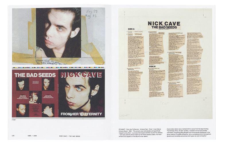
Top: Artwork and colour proof for the Nick Cave & The Bad Seeds album cover From Her to Eternity (1984), with a heavily retouched photo of the singer.
Rick Poynor, writer, Eye founder, Professor of Design and Visual Culture, University of Reading
First published in Eye no. 96 vol. 24, 2018
Eye is the world’s most beautiful and collectable graphic design journal, published quarterly for professional designers, students and anyone interested in critical, informed writing about graphic design and visual culture. It is available from all good design bookshops and online at the Eye shop, where you can buy subscriptions and single issues. You can see what Eye 96 looks like at Eye Before You Buy on Vimeo.