Summer 2024
Optimism and bias
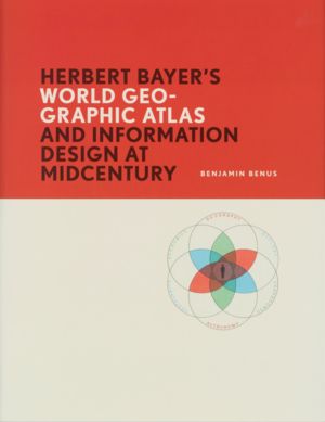
Herbert Bayer’s World Geo-Graphic Atlas and Information Design at Midcentury
By Benjamin Benus. RIT Press, $60. Designed by Marnie Soom.
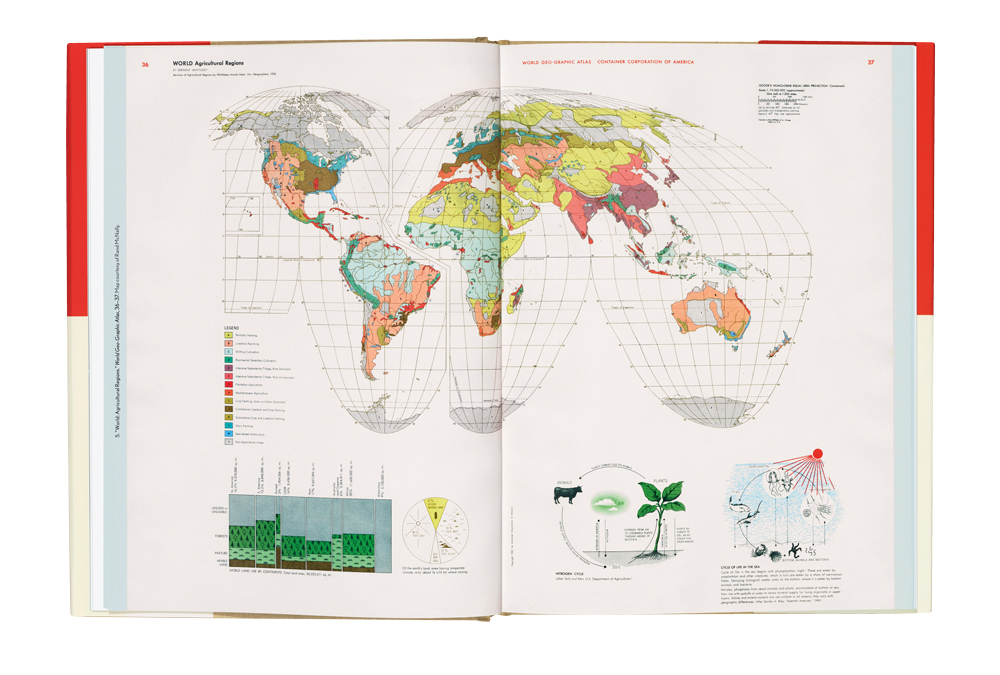
Far more people have heard of Herbert Bayer’s World Geo-Graphic Atlas than have encountered the hefty 40 × 29cm, 350-plus page book itself. This is because it was privately published in 1953 by Container Corporation of America (CCA) to be given as a corporate gift to its customers and friends (see ‘Big business, big world’ in Eye 82). Anyone who has had the opportunity to flip through the double-page spreads cannot help but recognise a masterpiece of graphic design. The experience of absorbing the graphics and text Bayer assembled is a tour through the highlights of Modernist information design. The book presents astronomy, geology and meteorology (among other sciences), as well as global natural resources, transportation and economics (among other topics), before descending into the sequence of maps we usually associate with an atlas. Even in this conventional part, maps of each state and country are punctuated with individual collages of images and economic data. Bayer manages to integrate complex combinations of maps, illustrations and data visualisation into a page flow of balanced white space, colour contrasts and typographic clarity.
Whether or not you have had that opportunity to handle Bayer’s book, there is a great deal to learn from reading Herbert Bayer’s World Geo-Graphic Atlas and Information Design at Midcentury by Benjamin Benus. Confronted with such a book, questions arise. Why did Bayer turn a corporate gift into an exemplar for new forms of visual education? How did he assemble so much scientific information? Why did a paper company sponsor such a project? By orchestrating evidence from several archives Benus produces a critical study that answers these and many other questions in a lively way as well as addressing the most difficult ones. Bayer, his collaborators and his corporate sponsors left many traces.
Bayer’s career went through many phases, from an Austrian student running the print shop at the Bauhaus in Weimar, to innovative type designer, to advertising designer in Berlin, to advertising and exhibition designer in New York during the Second World War, to corporate communications designer for American clients at the start of the Cold War era.
Benus looks at both the surface of the Atlas pages and beneath that surface to the graphic design process of a multi-year studio production. Reading this reminds me of Adrian Wilson’s The Making of the Nuremberg Chronicle, a study that opened my eyes to the entire process of book design. That study was dealing with a project that was 500 rather than 70 years old. Like Benus, Wilson was also blessed, or cursed, with enormous archives to sift through. Both these studies compare early sketches with final pages, go through contracts and accounting books, find the hand of the apprentice or colleague in some of the illustrations attributed to the master. Wilson’s study helped explain the rectilinear constraints of book design introduced during the transition from manuscript to print production, conventions that Bayer’s page designs were still operating within and occasionally violating.
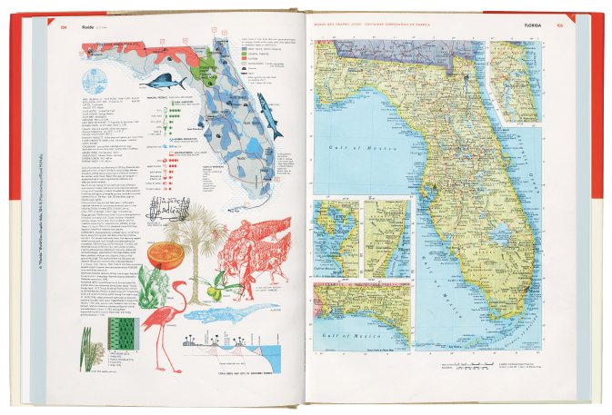
Right. The map of Florida faces a map of land resources, data charts of principal products, and a collage of images related to the state’s natural and cultural history. Top. Bayer combined physical geographic data with illustrations describing natural cycles. The form of the forests, pasture, and arable land per continent chart (lower left) was adapted from Otto Neurath’s methods.
Benus values Bayer’s work without being hagiographic. The book’s most lively material addresses questions of how and where Bayer appropriated and adapted the work of others, with and without acknowledgment. This produces some ‘wow’ moments, as we see Bayer rotate, flip and combine content from several scientific diagrams to create memorable new work. We learn how Bayer made use of the cartography of Erwin Raisz, the visual approach to geography education pioneered by J. Paul Goode and the dymaxion maps of Buckminster Fuller, among other contemporary sources.
An entire chapter is devoted to looking deeply into the way Bayer adapted the symbol systems and approach of Otto Neurath’s Isotype method. We see Bayer appropriate not only style but entire symbol systems and classification methods. Benus shows us ‘Produktive Flächen der Erde’ [‘Productive Areas of the Earth’], a chart from Neurath’s 1930 atlas Gesellschaft und Wirtschaft [Society and Economy] that becomes Bayer’s visual language to quantify land use in every state and country. The colour and names for the Atlas’s ‘World Population Racial Groups’ are copied directly from the diagram ‘Bevölkerungsstand der Erde’ [‘Population Level of the Earth’] in the same publication.
Why was Neurath’s work so useful and yet unacknowledged? Referring to the progressive socialist emphasis in Neurath’s work, Benus writes that ‘Bayer embraced Isotype’s aims of intellectual accessibility and inclusivity, while generally steering the Atlas’s analyses away from the interwar method’s emphases on political mass movements and class relations as principal factors in the shaping of world affairs.’ In elegant and even-handed prose, Benus communicates how Bayer produced the combination of refinement, appropriation, cultural bias and social optimism found throughout the World Geo-Graphic Atlas.
From our own historical moment, Benus’s research and reconstruction of the World Geo-Graphic Atlas allow us to reflect on the graphic design triumphs, the imperfections and blind spots of a 1950s global vision. Bayer applied Midcentury Modern, an optimistic International style, to describe a world where colonial empires still defined the political systems, ideology was the characteristic dividing ‘us’ from ‘them’, and the United Nations was ‘our’ vision of beneficial globalisation.
Benus notes how, as a finale, Bayer chose the conservation of resources as the crisis of the future. The book ends with diagrams showing the depletion of soil, forest and insect resources in America, juxtaposed with a dramatic prediction of world population growth. Seen from a moment enveloped in climate change anxiety, this choice may seem feeble, or radical, or prescient.
Paul Kahn, information designer, lecturer at Northeastern University, Boston, US
First published in Eye no. 106 vol. 27, 2024
Eye is the world’s most beautiful and collectable graphic design journal, published for professional designers, students and anyone interested in critical, informed writing about graphic design and visual culture. It is available from all good design bookshops and online at the Eye shop, where you can buy subscriptions and single issues.

