
Summer 2024
Peace, love and double-page spreads
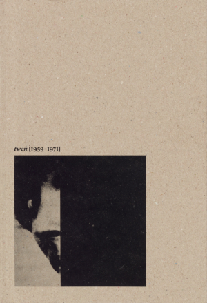
Twen [1959-1971]
Design: Julia Joffre. Essays by Hans-Michael Koetzle, Stéphane Darricau and Ricco. Published by Bureau Brut (in French with an English text insert), €28
Full disclosure: I’m a long-standing and fully paid up member of the Willy Fleckhaus (1925-83) fan club, writes Simon Esterson. Ever since I saw my first physical copies of his West German youth magazine Twen (see Eye 3) in my early days as a designer, I have held it up as one of the great examples of modern magazine design. Of course I couldn’t actually read German ….
Now Bureau Brut has published an elegant, small-format book, Twen [1959-1971], about Fleckhaus and the magazine where he was creative director and, as the book implies, editor in all but name.
There are three incisive essays. Hans-Michael Koetzle describes the origins of Twen as a publishing phenomenon: ‘brazen and provocative, with a penchant for the erotic.’ Art director / magazine connoisseur Serge Ricco (see Eye 97) traces Twen’s influence on magazines and art directors across the world, from Look in the US to Nova and Town in the UK. Finally, Stéphane Darricau investigates the history of Schmalfette Grotesk, Twen’s headline face designed by Walter Haettenschweiler, which began life on page 105 of the 1954 lettering manual Lettera. It didn’t exist as a font for typesetting and so Fleckhaus’s team had to photograph the alphabet and paste it up letter by letter. Fleckhaus’s instructions for his super-tight letterspacing were that characters should be a scalpel-blade width apart. Before long, every type foundry in the Western world was issuing its own bold condensed font.
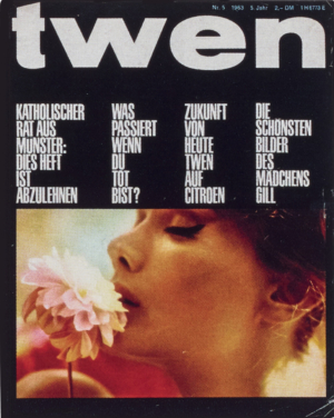
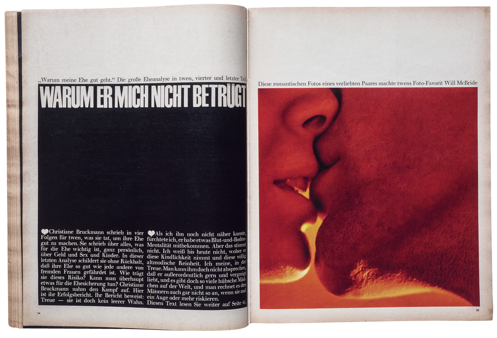
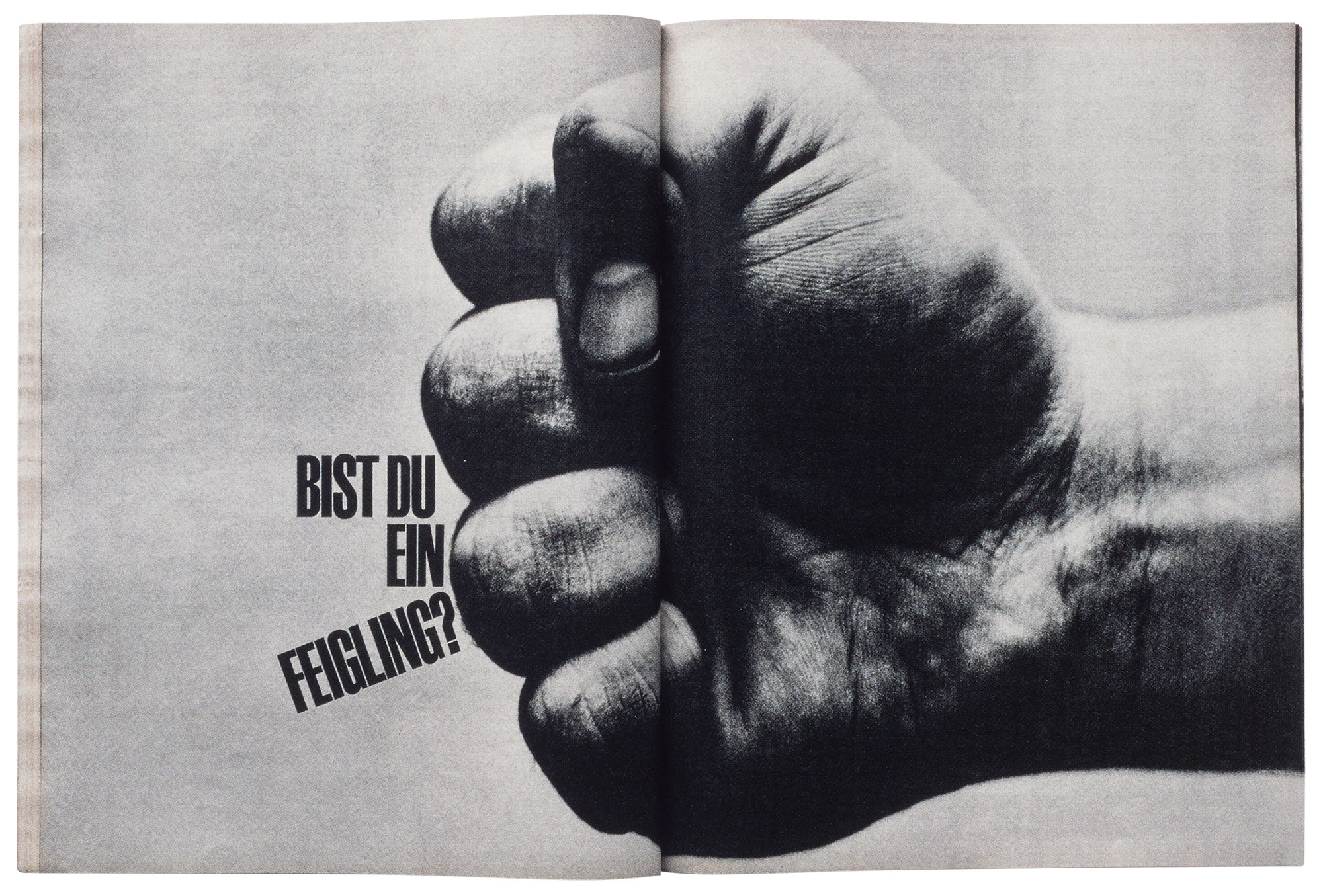
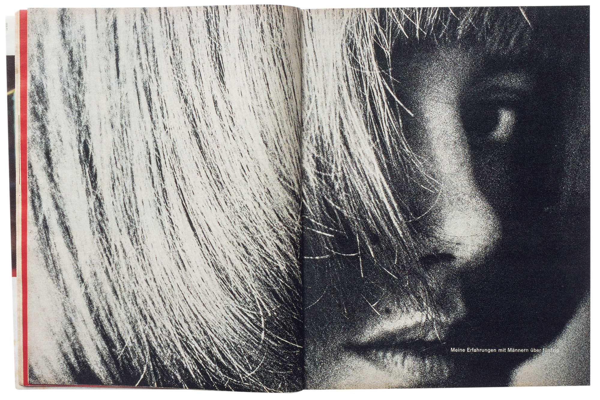
Between the essays, Ricco has assembled an archive of Twen covers and spreads (including those shown here) that demonstrate Fleckhaus’s genius. The double-page spread as the building block of the magazine’s editorial sequence. Tight picture cropping. Bold contrasts in the scale of pictures and type. The use of black and white space. The interplay of cut-out and squared-up images. The commissioning of photography and illustration to create a clear aesthetic for the magazine. The black front cover with the picture shining out of the darkness. Of course, all this was in the service of a 1960s German hippie, anti-establishment vibe and sometimes the style of fashion photography and the eclectic use of other typefaces (Times Bold with an extended shadow anyone?) and graphic devices reminds you about the particular optimistic and hedonistic mindset of that period.
Simon Esterson, art director, Eye, London
First published in Eye no. 106 vol. 27, 2024
Eye is the world’s most beautiful and collectable graphic design journal, published for professional designers, students and anyone interested in critical, informed writing about graphic design and visual culture. It is available from all good design bookshops and online at the Eye shop, where you can buy subscriptions and single issues.