Winter 2005
Peak practice: beautiful Swiss books

The most beautiful Swiss books 2004
Commissioned by the Swiss Federal Office of Culture, CHF25 <br>

As I write these words in my Zurich hotel room, fireworks are exploding outside to celebrate National Swiss Day. Inspired by the supposed founding of the country in 1291, these countrywide festivities often appear to be trying a bit too hard to convince the nation of its unified identity. No country is a single whole, but among its European neighbours, Switzerland is unique. It is the nation as amalgam. The cultural products that emerge from this society cannot – if they ever can anywhere – be interpreted against a single socio-political backdrop. Any object labelled Swiss is more accurately symptomatic of one of the four language regions. So to speak of the ‘International Typographic Style’, is really to refer to the work of a relatively small group of designers in the German-speaking region of northern Switzerland.
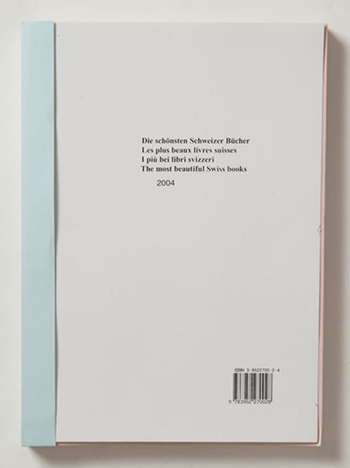
Yet, if a publication attempted to personify the diverse range of Swiss design practices and allegiances today, then The Most Beautiful Swiss Books 2004 would probably be it. This weighty catalogue (produced since 1999 to accompany an annual competition), commissioned by the Swiss Federal Office of Culture and designed by London-based Laurent Benner and Jonathan Hares, aims to give a genuine insight into the diversity of traditions and developments that is contemporary Swiss book design.
Seemingly deconstructing the mechanics of book production and instilling the idea of critical distance from the polished designs featured, the catalogue has the appearance of a collection of bound, untrimmed proofs. All of the 33 featured publications are reduced to one folio (eight pages) that seeks to ‘thematise’ each book. One of the most distinctive characteristics of these abbreviated examples is how the unique physicality of each title has been carefully duplicated. Working closely with the original printers of the award-winning books in Germany, Switzerland, the Czech Republic, Lebanon and beyond, Benner and Hares have created a unique object, which extends the reproduction to a satisfying materiality rarely seen in compilations. As the designer and member of the Jury Committee, François Rappo, declares in his catalogue essay ‘Sampling’, it is a decision that in many ways responds to our increasingly digitalised cultural forms. ‘The current selection continues the trend of recent years: the highlighting of the physical nature of books as a medium, which becomes more and more concrete due to its communicative, easy reading and handling qualities,’ he notes. It is unsurprising, therefore, that among the most successful of these condensed versions are works in which the paper stocks were foregrounded as a central experience of the original design. Thus, with such books as Intersection: 4 Cities / 360 People or Liberté à Quatre Sous, the reader acquires a tangible sensation that mirrors the undulating topography of the Swiss design landscape. The smell and feel of the paper, the sumptuous values of silkscreen printing, the richness of the photographic reproduction – all inspire you to seek out the original designs.
In this book Benner and Hares have taken on the task of thoughtful and considerate intermediaries. Like the Swiss state itself, their design acts, as Rappo notes, ‘as a go-between among the many participants of the various graphic processes.’ Obviously, the central communicative element of original format is often lost in the creation of any anthology. And while all of the books are reproduced at their original size, the 33.5 x 24cm format of the catalogue frequently means they are surrounded by a sea of white space that impacts upon the original Gestalt. This is a small criticism, however. With the traditional and the experimental placed side by side, TMBSB is an intelligent narrative that obliges the reader to see the continuing legacy of principled book design in Switzerland.
Kerry William Purcell, design historian, London
First published in Eye no. 58 vol. 15, 2005
Eye is the world’s most beautiful and collectable graphic design journal, published for professional designers, students and anyone interested in critical, informed writing about graphic design and visual culture. It is available from all good design bookshops and online at the Eye shop, where you can buy subscriptions and single issues.

