Spring 1992
Precision of a purist
Jean Widmer
La Maison du livre, de l’image et du son, Villeurbanne, France. 4 October to 30 November 1991Jean Widmer is a rare instance of a Swiss graphic designer who gets little publicity in France, but is unquestionably well known abroad. This exhibition, organised by Widmer himself, was the first French retrospective of his work. The refined design of the exhibition space allowed a clear reading of the projects, which included press advertisements, visual identities, corporate logos, pictograms, traffic signs, and posters for the Centre de Création Industrielle (CCI) at the Pompidou Centre.
Widmer studied graphic art at the Kunstgewerbeschule in Zurich under the direction of Johannes Itten, who taught at the Bauhaus and then at the Ecole (Supérieure) des Beaux-Arts in Paris. From 1955-59 he was an art director at the SNIP advertising agency. This was followed by two years as an in-house art director of the Galeries Lafayettes department store. For the next ten years, Widmer art directed the monthly magazine Jardin des Modes. In 1962, he set up a graphics studio at the Ecole Nationale Supérieure des Arts Décoratifs in Paris, where he still teaches. He established his own company, Viseul Design, with his wife Nicole, in 1970.
Widmer’s early work at SNIP and the Galeries Lafayettes achieved its impact mainly through a combination of typography and photography. The last ten years have been dominated by a freedom of expression and imagination – by audacious, humorous and emotive designs. They have also been a boom period for the refined advertisement. After a period in the fashion world, in which Widmer calmly revolutionised the pages of the French glossy magazine, he set out to distance himself from consumerism and concentrate on signs. There was a kind of turning point in 1969 when he established his own distinctive, original signature with his identity for the CCI – a combination of almost mathematically stylised objects and vivid colours. This shift of focus towards cultural images and public projects continued with the design of a perfect logo for the Pompidou Centre.
The same taste for simple, refined images was evident in the 550 pictograms Widmer designed in 1972 for motorways in the south of France. In the 1980s, he created a logo for the Institut du Monde Arabe, which can be read from left to right, or right to left, and, most recently, he designed a classically restrained identity for the Jeu de Paume, also in Paris.
Widmer is an incorruptible purist who has always had the ability to clear, seductive images free of any visual or editorial pollution. Whether designing for himself or teaching his students, he boils his solutions down to the essential. The dialogue with young designers he has been able to sustain at the Ecole Nationale has been important to him, and he has acted as something of a Pygmalion to many of his students, who sometimes go on to become colleagues as well as competitors. Widmer gives each of his students the means of freedom, while ensuring that they learn the basic principles which will allow them to extract the maximum impact from an image.
This exhibition succeeded in giving a strong impression of the consistent quality of Widmer’s design and the technical precision he uses in the service of a rich visual culture. Another constant in Widmer’s work is his unrelenting preoccupation with meaning, which enables him to create a fresh and sometimes naive means of expression, while drawing on a solid artistic and cultural tradition. Even the older images are by no means dated; they seem to cross the years with no original and unique modernity.
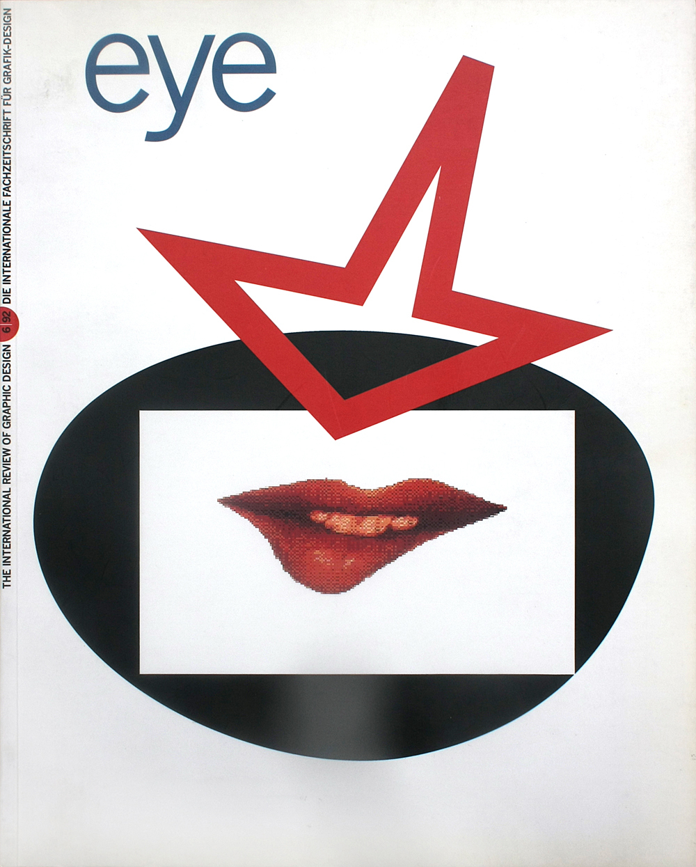
First published in Eye no. 6 vol. 2, 1992
Eye is the world’s most beautiful and collectable graphic design journal, published for professional designers, students and anyone interested in critical, informed writing about graphic design and visual culture. It is available from all good design bookshops and online at the Eye shop, where you can buy subscriptions and single issues.

