Winter 1994
Qwerty
Qwerty
By Stephen Banham The LetterboxThe driving force behind Qwerty – all A7 of it – is Stephen Banham, a 26-year-old graphic designer and lecturer in typography at Melbourne’s RMIT School of Advertising and Art Direction. A six-part project based on Australian typography, both experimental and applied, ‘Qwerty is an attempt to overcome an incredible cultural cringe that Australian design professionals and design students feel,’ explains Banham. ‘The population is pretty Eurocentric, so we feel a long way from where it’s all happening. I’m trying to promote Australian type over here and get it out into the international arena.’
Qwerty, which brazenly borrows its name from the first six letters of the English keyboard, is charmingly eccentric, highly collectable and seemingly confident. Each copy comes encased in a resealable plastic bag, which also contains a personalised ‘typographic token’. One of these was a numbered fragment of a lavish Australian fruit box – in theory, if all 200 owners of the issue met up, they could piece it back together.
Qwerty is non-profit-making and – apart from a small international subscription base and free list – sells in four specialist design bookshops in New South Wales for a modest A$8. Just 200 copies of the first three issues were printed, though the run for ‘R’ was upped to 250 because Banham found he was giving so many promotional copies away. ‘Forget not making a profit, it was making a loss,’ he says. ‘R’ was also unusual in that it was printed letterpress; ‘Q’, ‘W’ and ‘E’ were produced offset, with a degree of rubber-stamp customisation.
Banham and a small band of typographic evangelists at the Letterbox, an organisation he founded back in 1991, are currently putting issue 5 (‘T’) to bed. Subtitled ‘Big is Beautiful’, it documents the largest type in Australia from A to Z, a cause helped by the discovery of a two-mile-long sign in the desert with 600-foot-characters – an advertisement for Readymix Concrete. Previous issues have addressed hand-rendered type; vernacular design; stencilled type; and the effect of the recession on typography.
In the hope of fostering a spirit of debate and interaction, contributions are solicited from readers during the magazine’s four-month production cycle. These offerings have inadvertently altered Qwerty’s aesthetic: from the somewhat predictable potted profiles of local design companies in issue 1, it has become progressively more abstract and idiosyncratic.
Both Qwerty and the Letterbox were born out of frustration with the type scene in Australia. According to Banham, the only other home-grown graphic design magazine is regressive and bows to established mainstream commercial practices, while much of the student work produced is superficial and vogueish.
Banham graduated in graphic design from Melbourne’s RMIT, then worked on the Murdoch-owned Herald and Weekly Times before heading off to Berlin for four months, drawn by the work of Erik Spiekermann. Inspired by his several visits to Meta Design, he returned to Melbourne to form the Letterbox. As well as publishing Qwerty, the organisation stages typographic exhibitions and produces commercial work. Monies from the paying projects are used to fund Qwerty and the type shows.
Jim Davies, design journalist, London
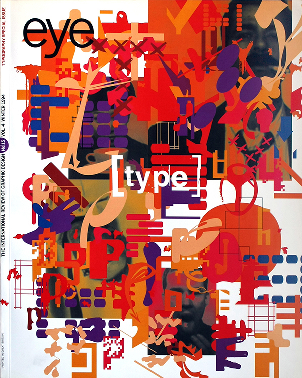
First published in Eye no. 15 vol. 4, 1994
Eye is the world’s most beautiful and collectable graphic design journal, published quarterly for professional designers, students and anyone interested in critical, informed writing about graphic design and visual culture. It is available from all good design bookshops and online at the Eye shop, where you can buy subscriptions and single issues.

